• English
  • 简体中文
  • 繁體中文
  • 한국어
  • ภาษาไทย
  • Bahasa Melayu
  • 日本語
pixivision
Make it interesting
Explore
  • Illustrations
  • Manga
  • Novels
Create
  • Tutorials
  • Behind the Art
  • Materials
Discover
  • Interviews
  • Columns
  • News
  • Top
  • Illustrations
  • pixiv's High Schoolers Illustration Contest 2021 Results - A record edition with 1,100 entries!
Illustrations
2021.10.31

pixiv's High Schoolers Illustration Contest 2021 Results - A record edition with 1,100 entries!

pixiv's High Schoolers Illustration Contest 2021 for high school students was held starting from July 31st, 2021.

This year's contest, now in its 4th annual edition, welcomed a distinguished panel of illustrators and corporate sponsors, as well as attracted a total of 1100 entries.


For yet another year, the jury ended up wondering whether the participants were really just high school students! We're proud to announce the talented winners of the contest.

About pixiv's High Schoolers Illustration Contest 2021

This is Japan's largest digital illustration contest that allows any high school student to participate as long as they're on pixiv! Every year, famous creators and corporate sponsors who have given their support will judge submissions and offer their professional critiques. In addition to the prize money and special items provided by each corporate sponsor, there are also chances for works (and their creators) to participate in additional pixiv projects and visual productions. The award ceremony was held on October 30.

Here's a look at the eminent board of illustrators who have been judging the contest's entries
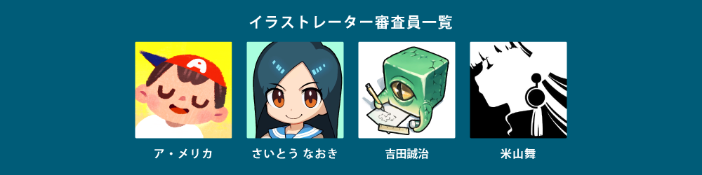
The 4 illustrators from the left: Amelicart, Naoki Saito, Seiji Yoshida, Mai Yoneyama

First prize: 100,000 JPY (approx. 1000 USD)

This award is given to the most outstanding work among the entries in this contest. After a fierce battle that even outleveled all previous editions, the winner of the pixiv's High Schoolers Illustration Contest is...

家主の居ぬ間に

by 庄一

The jury's critique

吉田誠治
It's brilliant how the author has expanded on the theme of "dancing" by depicting the interiors of a mansion and mouse maids. The limited use of colors is also remarkable; although they only used bright colors in yellow tones, it's very fine work. The main character has some red accents, while blue details are used for the mouse in the foreground so that the latter doesn't overshadow the first.

I also selected this work for the lighting. For example, you can clearly see how the artist carefully picked each leaf that the light should shine on. The silhouette of the mirror stand at the back of the room also stands out thanks to the lighting. On the other hand, secondary elements are in shadow because they're not vital, so they don't pack as much detail ー but the author didn't shy from laying out all the features of the elements that should catch the viewer's attention.

米山舞
I watched the making-of video of this artwork, and I was amazed by how the artist drew the perspective lines by themselves, doing everything from scratch. I was a member of the jury in the past years too, so I was able to see how this person managed to pick up many good habits and has taken them up over time, letting their style evolve. Their ability to find and render things that look good is astounding. They seem to have good knowledge about pictures and have learned to assess and control everything from lenses and scenes to the way the light comes in.
The amount of detail is also completely different from last year's illustration. Could they have been researching the sub-surface (note: the way light passes through the surface of a translucent object, diffuses, and is then emitted) of the nose and the back of the ears? This illustration is made up of so many finely painted elements that it takes a long time to take it all in.

ア・メリカ
When drawing deformed characters with short arms and legs, it's very hard to create cute proportions and poses. The characters here all do a great job capturing the moment, especially the maid to the left, whose back view must've been particularly difficult to draw. I was impressed by how well the artist portrayed the various shapes: the soles of the shoes, the bent knee, and the duster in the maid's outstretched right hand... All these elements draw the viewer's attention and make the character in the foreground more realistic.


Cuteness and realism are like a seesaw game; if you paint too realistically, you often have to sacrifice cuteness. Drawing a deformed character with a tiny body is a much more difficult skill to master than one might imagine, but the artist's ability to create the perfect balance is amazing. As for the background, the flawless color scheme and lighting show impeccable technical and expressive power.
さいとう なおき
When I saw the entry's title, While The Master Is Away (家主の居ぬ間に), I couldn't help but wonder who the landlord was, and discovering the cat in the portrait was a lot of fun. This artwork blew me away to the point that I didn't pay any mind to the artist's technical skills. Instead, I wondered about the story behind the picture, about what kind of life these mice lead. This may be a contest, but nevertheless, it was the fun element that caught my attention first, rather than the author's technical prowess ー that's what makes this art piece so entertaining and wonderful.

Illustrators Jury Awards: 20,000 JPY Amazon gift card (approx. 200 USD)

These are the works that each illustrator in the jury has selected as the best!

Amelicart Award

お留守番組

by あかぎ

ア・メリカ
I love the quiet atmosphere and emotional narrative of this work. The artist is very good at separating the parts that the viewer needs to see from the others. Their composition skills and impeccable color selection are extraordinary. Reminds me of Norman Rockwell. Using warm colors (red and yellow) as the main colors and cool colors (blue) as accents has a contrasting effect that makes this artwork feel warmer and the space where it's set look deeper. It's a great example of how the use of color can tell a story.

米山舞
The color choice is really something. It looks like a freeze-frame picture, but the way the colors are placed is very creative and shows good taste. The artist has also picked some good spots for the color black. It takes courage to put this color in such a prominent place on the canvas, and I think it looks great.

さいとう なおき
The color placement shows some rhythm. Black is placed next to red, and green is right at the edges, a combination that makes the colors collide and stand out ー which makes the viewer get a splash of energy just by looking at the picture.

吉田誠治
Although the composition is plain, the use of colors and solid shapes is quite compelling. The combination of the two elements makes this artwork look very mature. The subjects have a good presence, making this work all the more convincing. There is a letter in the lower left, and I wondered what it was — maybe it came with a gift? The fact that there seems to be a story behind this illustration makes it even better.

Naoki Saito Award

フライデーナイト・フィーバー

by 芝刈り糖分

さいとう なおき
The artist was able to merge the themes of high school students and dancing and turn the outcome into something personal. The complete desperation of the girl looks very real. She's screaming inside and expresses that by scattering papers and handouts on the train, without forcing herself to be all optimistic — she doesn't have it in her.
For the author, drawing someone who is just tired of life is a sympathetic mechanism that seems to ask the viewer, "It's not just me, right? You guys feel so too, right?" The thought that the artist created this mechanism to connect with the world gave me goosebumps.
Even though no one is actually dancing, it somehow looks like they are. These people are just turning their heads back and thinking about how exhausted they are, but for a fleeting moment, it looks like they are caught in a dance, don't they? I also think it's quite original how the artist took the theme of dancing and assigned it to a specific time slot which, as per the work's title, is Friday night.
The gestures of the people around the high school student are also quite lifelike, aren't they? The way the businessman's foot is laying on the side in the lower-left corner, and the stiffness of his shoe. The colors are carefully planned, with a bit of blue on the faces and shoes. When you zoom in, you can see that there are a lot of colors in this illustration.

ア・メリカ
I like the way the characters are shaded. The entire scene is lit from a light source on the ceiling, so the shadows fall on the characters' feet, as they should. However, to add something more, the artist added a crisp shadow on the right side of the main character in the middle. I think these kind of small lies are essential for illustrations, but it's absolutely necessary to adjust these untruths so that the viewer doesn't feel uncomfortable, and the author has achieved that beautifully. I like the way they've arranged the canvas by repeating such detailed adjustments.

Mai Yoneyama Award

踊子草

by 晴

米山舞
Good observation work. The kimono and parasols are very well-drawn from all angles. The illustration's title, Odoriko-so (踊子草) refers to the name of a flower that looks somewhat like a dancer (踊子, "odoriko" in Japanese) holding an umbrella in their hand, just like in this artwork. It takes a great deal of skill to take that idea and make it into a picture. Odoriko-so, or white nettle, is a spring flower, and the colors of this illustration are surely reminiscent of the season. The atmosphere is really nice too. I like how the dancers sway, with their hands all folded in different directions.

When I think of dancing, I tend to focus on the dynamism of the situation, but the artist has chosen to place importance on careful observation instead — creating a piece that is coherent with the theme and shows outstanding technical skills.

I imagine the artist began by observing how petals move when spinning a flower around, and then replaced the petals with human figure; it's not easy to draw something like this.

吉田誠治
Great work on the dancers' perspective. I think this is probably the entry with the most complicated perspective in the entire contest. Even though the artist doesn't use any straight lines, the result is that of a wide-angle lens. I guess they've done a fair bit of research — even a pro would have a hard time drawing fingers like this.

さいとう なおき
You can even discern the legs of the woman in the back, even though they're not clearly visible. Normally, you wouldn't notice something like this... it's like you're able to see beyond the picture.

The art style and other aspects of this work are unlike any other illustration we have selected so far, but I can tell that the artist showed confidence and successfully portrayed something valuable to them.

Seiji Yoshida Award

咲溢れる花のような君へ

by 無加糖OCHA

吉田誠治
This artwork is very complex and includes many different elements and even buildings in the background. The perspective of the picture is slightly distorted to prevent the drawing from looking too stiff, but the distortion doesn't look unnatural at all and makes the picture look dynamic overall. The way the artist placed various objects in the foreground is also remarkable — it creates a lively and fun piece, with a lot to see.
An illustration needs to convey some kind of emotion, and this picture conveys all sorts of exciting, cheerful, and positive feelings. It takes some skills to portray even the smallest details without resorting to blur, and the artist was perfectly able to pull this off. The many elements are well unified and all communicate the same sense of fun and excitement.

ア・メリカ
The amount of detail in this artwork is so skillfully arranged that my eye was drawn to each and every little particular. The building has no walls, so it's like a dollhouse, right? That's why the two girls sitting are also deformed like dolls. It's really a fun piece to look at.


I love how this artwork features dolls of various sizes and yet all of them are combined into one single setting. It's difficult to draw different-sized dolls and make them all fit together, but amazingly enough, the artist has done a great job to pull off something so difficult with such dexterity.

Corporate Awards

These awards are sent to the most noteworthy work selected by each sponsor.

Elecom Award

かごめかごめ

by みくしー

Elecom representative: We were impressed by the originality of the contrast between stillness and motion, and how that contrast manages to bring a lively dance scene to life.

The bold trimming and the fact that you can't see the faces of the dancers also caught our attention.

This beautiful artwork looks like it comes straight out of a movie — it has a story. We will continue to support the artist and wish them all the best!

Prizes:

・Completely wireless Bluetooth headphones
・Mobile battery (10000mAh/USB Power Delivery compliant)
・"off toco" 2STYLE camera backpack
・Ultra-strong cleaning cloth


Orbital2 Award

黎明の踊り子

by gaku

Orbital2 representative: The cute characters and their vigorous movements look very nice. The illustration is packed full of detail, but the clever use of lines and shapes lets us imagine a world outside the frame and shows a proficiency beyond that of a high school student.
As an illustration, this work is impeccable.
A piece of advice would be to add more playful elements to the theme to create an artwork that fascinates the viewer and draws them in.
We hope they'll keep drawing wonderful things.

Prize:

Orbital2

KADOKAWA Kitora Award

IDOLL

by めめまぶ

KADOKAWA Kitora representative: The idol is portrayed as a ball-jointed doll, while the girl holding her has a rather stiff expression on her face; overall, this piece feels very real — it's like we're allowed to take a peek at an idol's true nature.

The entry's title IDOLL is also suggestive and choosing to draw the secret life on an idol is a unique take on the theme of dancing.

Not only does the illustration have a strong message and an interesting setting, but the drawing technique is also flawless. This spectacular work left us moved.

Prizes:

・3 art books ("VISIONS 2021 ILLUSTRATORS BOOK" (by pixiv), "KEMONO FABRIC TOKYO MOGUMO Artworks", "Aikiyo Ogipote Art Works Book")

・2 books about illustration (Toshi's "Kamiaza Sakuga (Divine Drawing Techniques)" and Torako's "Irasuto de Okane wo Umidasu Hiketsu (The Secret to Generating Money through Illustration)")

CLIP STUDIO PAINT Award

昔見た夢

by 咎め

CLIP STUDIO PAINT representative: The skillful composition of the work shines through as if the viewer's gaze is drawn deeper and deeper into the world, as they relive the artist's dream.
The mysterious stage is portrayed from a perspective that can't be from the human eye, yet it's depicted in such detail that we can almost feel even the humidity and scent of the place, forgetting about time as we watch.

Prize:

・One 2-year version of CLIP STUDIO PAINT EX's 2-device plan
*Choose 2 devices from Windows / macOS / iPad / iPhone / Galaxy / Android / Chromebook.

Copic Award

dusk of summer

by 秋音ユウ

Copic representative: The composition in this work, which lets you take in the entire background, between the sky, the waves, and the city, and the use of colors are truly remarkable.
The artwork conveys the enthusiasm of the artist as they draw a scene from their mind. It's also wonderful to see how the three girls are drawn in such a way that you can guess their individual personalities at a glance.

Prizes:

・Copic Sketch - Basic 72-color set
・Copic Sketchbook L

CHUNITHM Award

正から負への走光性

by はちゅ/Gekko

CHUNITHM representative: We looked at the illustrations from the three different perspectives: character, idea, and scene. We selected this one because we felt it's very well balanced.
The idea of a moth falling from a moth light, which is generally a negative image, was elevated by the character design, the scene, and composition.


We loved the idea of sublimating the theme and the solid groundwork that supports it.
The way the moth was designed as a female character instead of a repelling insect is worthy of praise.
The presence of photography effects to express the moment of the crash and the use of teal and orange to draw the viewer's eye to the characters are also excellent.

Prizes:

・CHUNITHM ALL JUSTICE COLLECTION ep. I

・CHUNITHM ALL JUSTICE COLLECTION ep. II

・CHUNITHM Visual Collection

Monster Strike Award

踊るタコは食うタコ

by Tade

Monster Strike representative: This work captures the theme of dancing in an interesting way.
The sheer size of the octopus, the outstretched tentacle in the foreground, and the sense of scale with the humans climbing up the cephalopod all add up to a wonderfully rendered scene and atmosphere.
The story seems to unfold from the outstretched tentacle in the foreground, which serves as a solid line of sight, leading the viewer's eyes to the octopus in the center of the screen.
Not only is the octopus huge, but what's fun is how the relationship between predator and prey is reversed ー it's the octopus that's supposed to be eaten by humans, and not vice versa.

Prize:

Pioneer x Monster Strike Wireless Headphones SE-MS7BT Gabriel

Wacom Award

私だけの晩餐会

by せおのき

Wacom representative: We thought this work does a great job with storytelling.
The swaying of the girl's hair gives the impression of movement, as if she's dancing, while the light and the overall feel of the picture make it seem as if time has stopped.
The expression on the character's face is fascinating, and makes you wonder about what happened to her! We hope the artist continues to create wonderful works with a story.

Prizes:

・Wacom One LCD Pen Tablet 13

Next Page : Next Page : Awards of Excellence and a final comment from the judges!
12
Share this article
  • Share
  • Post
  • Share
  • Post
Follow pixivision on Facebook!
Find us on X too!
Follow @pixivision
Stay updated with pixivision's daily features!

Newest articles tagged Illustrations

  • Drawings of Everyday Life - Extraordinary Ordinary

    Drawings of Everyday Life - Extraordinary Ordinary

  • Drawings of Summer Dresses - Soak Up the Sun

    Drawings of Summer Dresses - Soak Up the Sun

  • Drawings of Watermelons - Slice of Summer

    Drawings of Watermelons - Slice of Summer

  • Drawings of Singing - Hitting a High Note!

    Drawings of Singing - Hitting a High Note!

View more▶︎

Follow pixivision's
official accounts!

p-chanMonthly Ranking
  • Illustrations

    Fan Art of Kisaki (Swimsuit) from B...

  • Illustrations

    Drawings of Patterned Bikinis - Pre...

  • Illustrations

    Drawings of Pools at Night - After ...

  • Illustrations

    Drawings of Flared and Frilled Biki...

  • Illustrations

    Drawings of Streaked Hair - Lucky S...

p-chanFeatured
  • Illustrations

    Fan Art of Tanjiro Kamado, Zenitsu ...

  • Illustrations

    Fan Art of Haru Urara from Umamusum...

  • Illustrations

    Drawings of School Uniforms with Ca...

  • Interviews

    How illustrator Namie conceptualize...

  • Illustrations

    Drawings Emphasizing the Beauty of ...

Follow pixivision's
official accounts!

  • Top
  • About pixivision
  • Suggest a theme
  • English
  • 简体中文
  • 繁體中文
  • 한국어
  • ภาษาไทย
  • Bahasa Melayu
  • 日本語
  • pixivision
  • About pixiv Inc.
  • Terms of Use
  • Contact Us
  • Advertising
  • Privacy Policy
©pixiv