「コピックはわりとやり直しがきく」COPIC AWARD受賞者に聞いたコピックへの愛とテクニック
世界中の人が参加するイラストコンテスト「COPIC AWARD」で、今回pixiv賞を受賞したのは、大学生の平野優花さん。
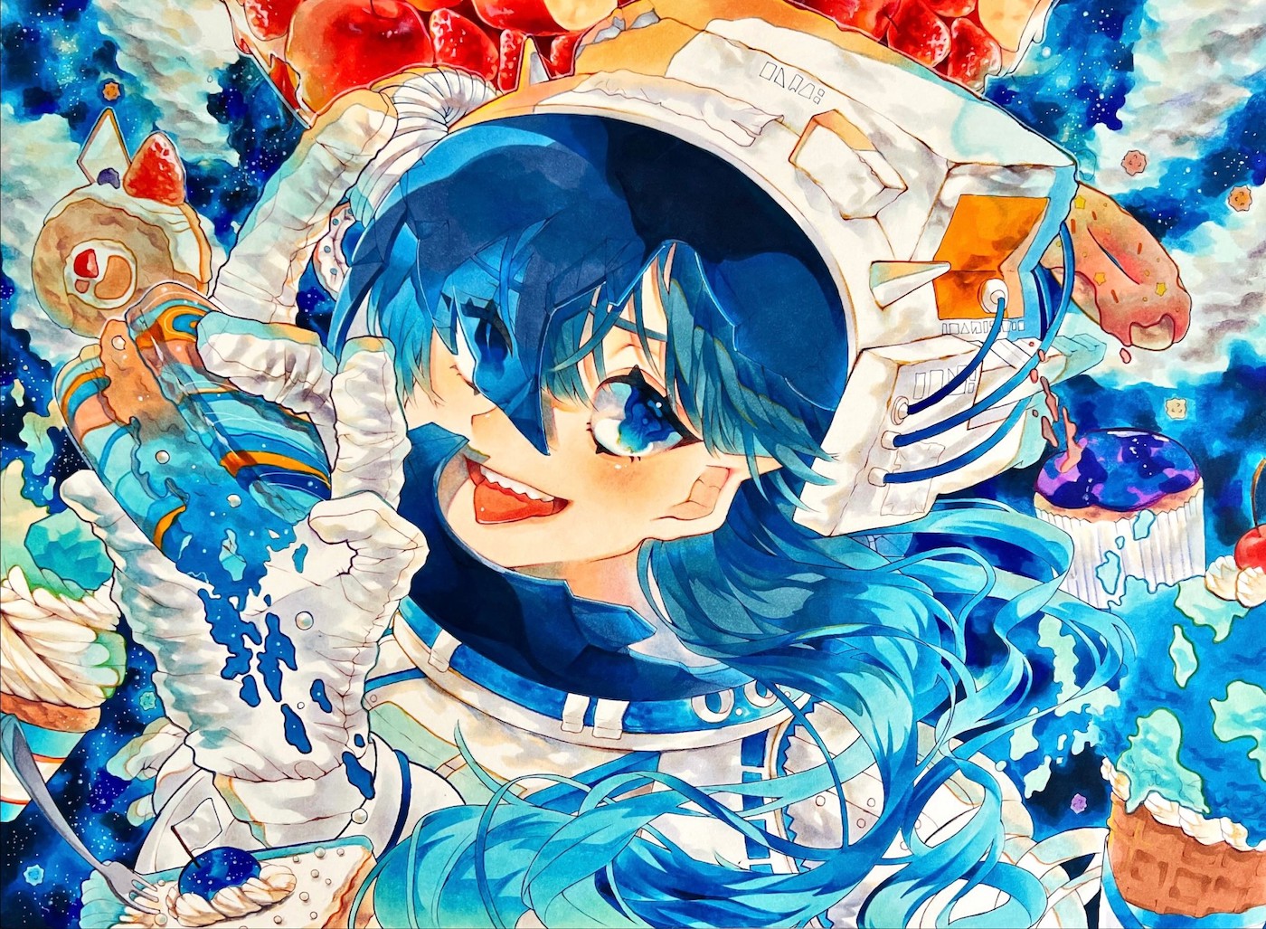
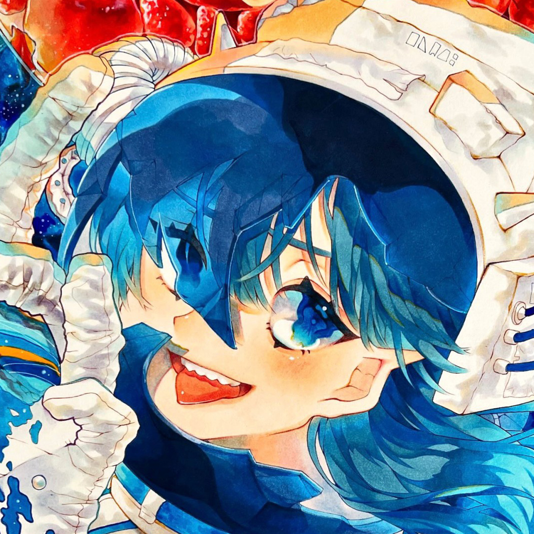
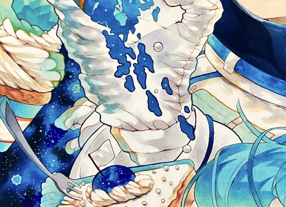
受賞作品は宇宙とお菓子を描いた青が印象的なイラストです。
コピック、アナログといえば一発勝負の難しいものと考えられる方もいるかもしれませんが、平野さんいわく「わりとやり直しがきく」そう。
今回は作品に込められた思いと印象的な色使いについて、そしてコピックのテクニックをうかがいました。
アナログなら描いたものが手元に残る
── pixiv賞受賞おめでとうございます! 応募されたのは初めてですか?
応募しようと思って4年目ですが、実際に応募したのは初めてです(笑)
何かの賞にひっかかるとうれしいなとは思っていましたが、pixiv賞とは意外でした。pixiv賞ってpixivに投稿されている作品が対象だと思っていたので。
── イラスト歴は長いのでしょうか
ちっちゃい頃から描いてはいました。SNSにアップするようになったのは中学生の頃からで、現在大学生です。
── ずっとアナログなんですか?
中学から高校入るくらいまではデジタルで描いていました。
けど、高校1年生のときに参加した日本デザイナー学院さんのオープンキャンパスで、コピックを使われているイラストレーターさんに絵を教えていただける機会があり、またコピックを練習するようになりました。その後、コピックを使った別のコンテストでも優勝し、やっぱりコピックって楽しいなといまもアナログで描いています。
デジタルのほうが便利だし仕事に繋がりやすいのはわかっているのですが、質感と何よりも描いたものが手元に残るところが好きなんです。
── 中高生にとってコピックを集めるのはハードルが高かったかもしれませんね。
── いまは結構な本数を持ってるんじゃないでしょうか
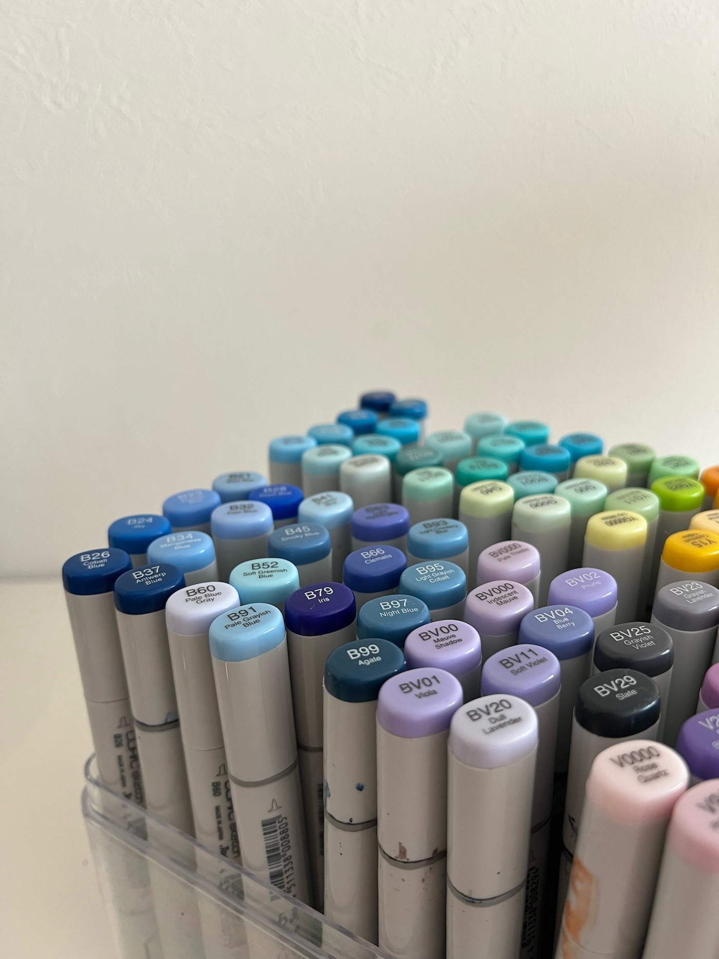
多いときは300本から400本は持っていました。でも、自分が使わない色がだんだんとわかってくるので、今はだいぶ絞って200本くらいですね。
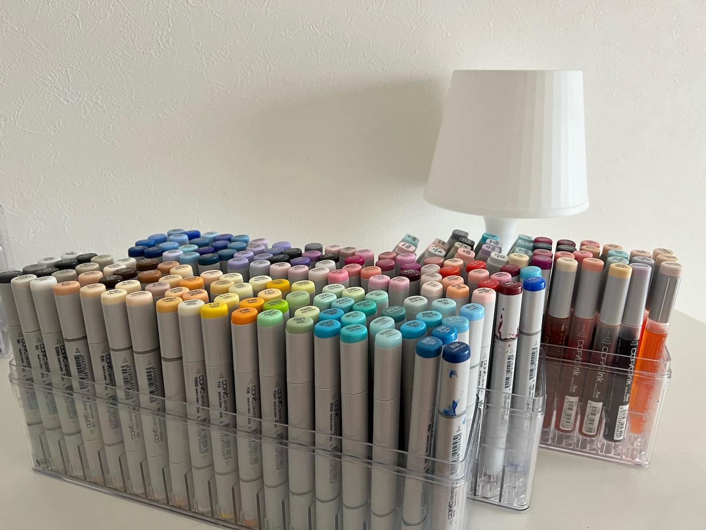
平野さんが現在もっているコピック
── 使わない色、使う色は何色でした?
使わないのはピンクやイエロー系ですね。結構明るい色なので使いどころが難しくて。使うのは赤系、紫系、あとはやっぱり青ですね。
カラフルにするなら色は散らかさない
── 受賞作も青をメインカラーにされてますよね。
好きな色ですし、青はグラデーションが作りやすいんです。塗るだけで宇宙や空、海を描けるところがいいですよね。
── メインカラーを据えながらもカラフルに仕上げるのってバランスが難しそうです。
カラフルなものって一歩間違えると画面がうるさくなってしまいますよね。私は宇宙服や手袋、クリームなどの白い部分のハイライトや影を青とオレンジのグラデーションにして、この2色がイラスト上でケンカしないようにしています。
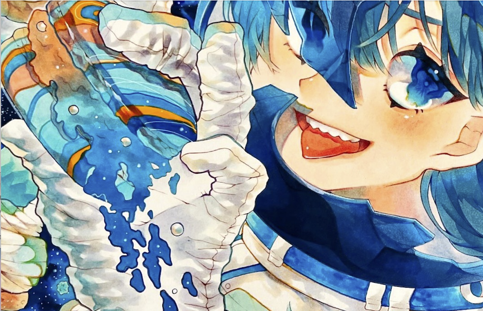
あと、色を散らかさないようにオレンジの近くにはなるべくオレンジのものを集めてます。ケーキとマカロン、ヘルメットのオレンジ色の装飾とドーナツ、とか。
── 今回の作品のコンセプトを教えてください。
「お菓子の惑星を喰らい尽くす悪役の女の子」というコンセプトです。悪役なので、表情もちょっと不敵な感じにしました。
この絵は、もともと高校生の頃に同じコンセプトで描いた絵をリメイクしたものなんです。誰の評価も気にせず楽しく描いた絵だったので、それをまた描きたかったんですよね。だから「このタイミングだ!」って思って描きました。そういう、思い入れのある作品が受賞という評価を受けてすごくうれしいです。
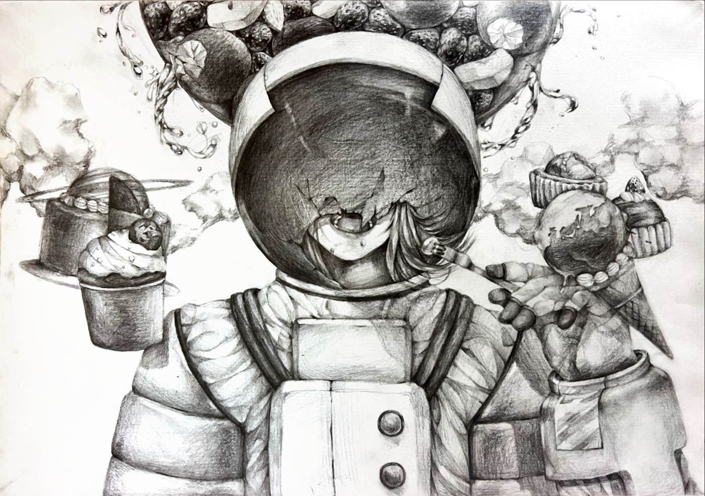
受賞作の元となった作品
── モチーフは同じでも、雰囲気が全然違いますね。
インパクトを出したかったので、ヘルメットを割って顔を見せました。どういう表情をさせようかと考えたのが一番楽しかったですね。ポーズも髪の毛や顔の向きなどで躍動感を意識し、「瞬間の表情」を目指しました。
── 制作期間はどれくらいかかったのですか。
とりかかったのは1ヶ月前から。デジタルで下描きしたんですが、大学が忙しくてそこから放置しちゃって……。締め切り3,4日前から「やばい!」って下描きをトレースして、線画をして、と徹夜を繰り返して完成させました(笑)。
── ということは、数日で完成させた?
そうですね、大急ぎで塗りました。おかげで、右下の空間にだけ白い点々で描写した星がないってミスもやっちゃいました……。
── 色塗りに使ったのはコピックだけですか。
色鉛筆も使っています。ケーキのクリームの線はコピックマルチライナーで描いたんですが、どうも硬い気がして黄色っぽい色鉛筆で線をなぞってます。あとはチークですね。
── 以前、pixiv賞を受賞したymさんもチークは色鉛筆を使っているとおっしゃってました。
そうですよね。コピックってどうしてもつるつるした表現になってしまうので、人の肌とかクリームとか、やわらかい表現をしたい場合は水彩の色鉛筆を取り入れるといいと思います。
── コピック以外の画材にもこだわってらっしゃるんですか。
画用紙にはこだわっています。おすすめはヴィフアール水彩紙の細目。線画にはコピックマルチライナーを使っているんですが、ペン先が細いので薄めの紙だとくぼんでしまいます。その点、ヴィフアールの紙は厚く硬いので、私の筆圧にも耐えてくれます(笑)。
あと、色鉛筆はデッサン用の鉛筆を出しているステッドラーのものを使ってます。
アナログでも失敗の修正はできる
── 色々な画材を持っていても使いこなすのが難しいと思うのですが、どう練習していったんでしょう。
下手なりに今回はうまく描けたかもと描き続けることですね。失敗してもコピックでの修正の方法を調べて、描きあげる。今回も実は結構大きな失敗をしています。
── 全然わからないですが、どこでしょう。
カラーレスブレンダーの「コピックスケッチ 0」色成分が含まれていないので、コピックをぼかしたり薄めたりする際に使用します。
── コピックでの色塗りって失敗したら終わりだと思っている方が多いかもしれませんが、修正ができるのですね!
もちろんデジタルよりは大変です。でも、そこがいいですよね。描いてるときも緊張感があるし、悪戦苦闘したあとが残っているのもアナログのよいところだと思います。
あと、失敗して続きを描くのがいやになっちゃっても、そこに存在しているので「早く描きなさい」って言われてるような気がしちゃって(笑)。だから描き続けられるのかもしれません。今回の受賞作を描いている期間も、自分の絵を壁に貼っておきました。── これからコピックを使い始める方へのアドバイスをお願いします。
最初に買うなら薄い色をおすすめします。濃い色だとマーカーのような使い方しかできませんが、薄い色はグラデーションが作りやすいんです。
コピックの色番号は薄い色ほどゼロが増えるので、ブルーならB000よりもB0000の方が薄いです。そのゼロが多い色番号のコピックで自分がよく使う色を知って、そのあと濃い色を買う。そのほうが効率的にコピックを集められるのではないでしょうか。
それと「SSイラストメイキングブック」など、コピックを使ったイラストの描き方本を参考にするといいと思います。いまはTikTokやyoutubeなど動画もありますが、私には本で勉強するほうがあってました。ページにあとがつくほど開いて練習しましたね。
憧れのコピック作家さんを見つけることもおすすめです。私も香琳(かりん)さんや、うぐいすさんなど、憧れの作家さんからすごく影響を受けました。
そういえば、過去のpixiv賞受賞者にもぷぅさんや梅桜さんなど、憧れの作家さんがたくさんいて驚きました。そういった方々と同じ賞をいただけるなんて、本当にうれしいですね。
── ありがとうございます。最後に、今後の目標などを教えてください。
またコピックアワードに応募したいですね。二回目の受賞をされた方が「以前よりパワーアップしましたね」と講評されているのを読んで、私も言われたいと思って(笑)。それがいまのモチベーションになっています。
── やはり青をメインにされた作品でしょうか。
どうでしょう。でも、青は使いたいですね。周囲の人に受賞を伝えたとき、作品を見て「これはあなたの青だね」と言われたのがうれしくて。未熟ながら「自分の作品」みたいなものができてきてるのかもしれません。それを大事にして、次の作品を作りたいです。
コピックアワード2023年のエントリーは4月3日から!
2022年の審査の様子もチェック!
コピックアワード2023の応募要項、賞、審査員などの情報を公開されました!
応募作品の登録は5月10日からですが、エントリーは4月3日からスタート。
今年も豪華な審査員の方々が参加される予定なので、コピックユーザーの皆さんは、ぜひチェックしてみてくださいね。