Announcing the Results of the pixiv Taiwan U22 Student Award - Discover fresh new talent!
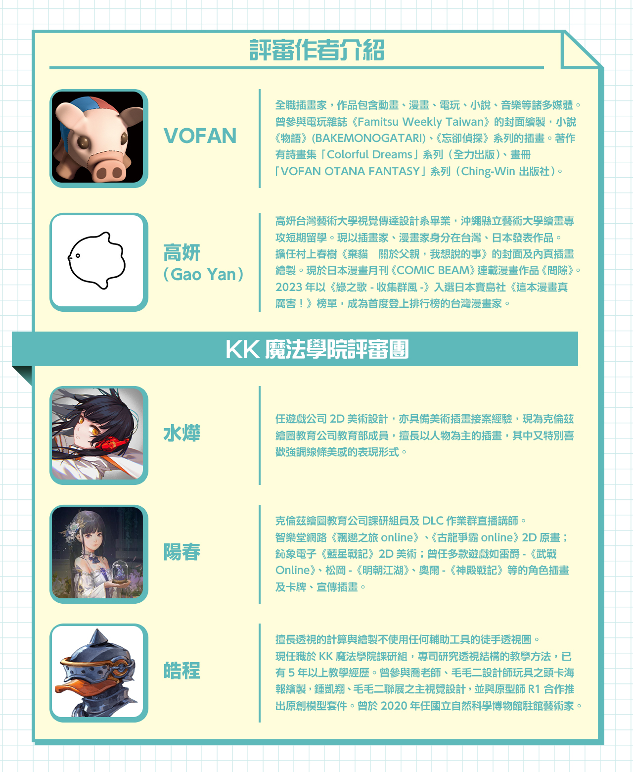
Introducing Our Judges
The Grand Prize for the U22 category
VOFAN: This piece makes excellent use of varying shades of blues and yellows to create a feeling of nostalgia reminiscent of film photography. Another usage of color I find skillful is the bright blue scarf the fox-eared boy is wearing, which stands out amidst the uniform color scheme and draws the viewer’s eye back to the two characters.
What I particularly like about this piece is how the image is composed with a focal length of approximately 85mm. Most young creators avoid the 85mm prime, a middle-ground focal length between portrait and telephoto, due to it being a tricky perspective to work with. The fact that this artist did not shy away from it is a testament to their ability and willingness to try new things and keep challenging themself.
The boys’ brief exchange of looks creates a beautiful snapshot in time that is both mundane yet vibrant and full of life.

KK Magic Academy: This piece really stood out to us, for it’s rare to come across an illustration with such a spectacular backdrop. The artist is well versed in the fundamentals of art, and their art style perfectly complements the story they are trying to convey through their work. They also make excellent use of perspective to create depth in the image, with the foreground, middle ground, and background all distinct from one another, providing the viewer with a rich viewing experience.
If we had to offer one critique, it would be to pay a little more attention to the background perspective. Fixing the distortion in that area will improve the overall presentation of the piece, making it look even more polished and professional.

Gao Yan: The creator’s use of colors is incredibly masterful. The blue of the sky complements the city in the middle ground and the figures in the foreground, and the well-defined color scheme naturally draws the viewer’s eye to the main subjects of the piece.
If I were to offer a word of advice, it would be to be a little more precise with the sizing of the buildings and the depiction of the landscape and figures—doing so could refine the overall appearance and make it appear more polished. Another thing I would like to mention is that despite the depicted scenery being that of Taiwan, the unique character designs give the impression that this drawing is set in a fictional world. Creating fictional bus stop names and drawing them into the illustration could further enhance the whimsicality of this piece and rouse the viewer’s intrigue in the story behind it.
Illustrator Panel Awards
The VOFAN Award

VOFAN: Could this be Yuè xià lǎorén, the Matchmaker God herself, or a girl appointed on her behalf? The gender-bent character design is incredibly well thought out and has excellent attention to detail, from her clothing to the staff she’s holding and the red thread extending from it.
Additionally, details such as the fluorescent lights on the ceiling, the offerings and incense burners on the table, and the smoky tendrils add a touch of reality to the temple’s interior. The fact that the perspective differs from reality shows that the artist did not merely copy the design from a photograph and conveys the artist’s attention to detail and sincerity when creating this work. Although drawing from a low vantage point with an ultra-wide angle is no easy feat, the creator did an excellent job, and the composition, coupled with the imposing way the character sits, makes the piece all the more impressive.
The Gao Yan Award

Gao Yan: I found the use of colors and changes in lighting highly interesting, and the piece remains unmuddled despite the use of many dark tones. The brushstrokes are unique, and while the lines may look messy at first glance, they do an excellent job of conveying texture and reality. It is evident that the creator has a mature art style, and I look forward to them developing it even more in the future.
Regarding the visuals and overall color scheme, I would recommend incorporating colors that blend smoother into the edges of the highlights and shadows. For example, adding a brighter orange to the border where light and shadow meets on the skin can add more depth to the piece.
The KK Magic Academy Award

The Grand Prize for the U18 category

VOFAN: Is it hope or nothing but a dream that awaits the boy and girl running towards the light in the forest? The flapping skirt fabric and figures running hand in hand convey a sense of fluidity in the otherwise still forest. Although nighttime colors can be challenging to work with, the cool-toned color scheme is balanced beautifully, preventing the illustration from becoming too dark. The shape of the surface reflecting the light is sharp, and the richly changing layers of color are highly pleasing to the eye. Overall, it is an incredibly soothing piece that shows the creator’s mastery.

Gao Yan: This is an exquisite piece of work. Not only are the composition, color scheme, use of lighting, and coloring well-developed, but the figurative painting technique and grasp of ratios, as well as the narrative elements of the abstract piece, are all handled skillfully.
If I were to offer a word of advice, I would suggest making the ratios of the present composition less “even.” By making the light soaring through the sky in the upper left corner smaller and its tail longer, it can help the sky appear wider and further away from the two figures, emphasizing the sense of chase in the story. It can also increase the contrast and rhythm of the overall piece.

KK Magic Academy, naturaljuice: The colors are surreal and beautiful, and the movement and design of the characters and the placement of each element in the scene all fit the subject matter perfectly. The characters’ movements and designs are well thought out, and the placement of all the elements is both creative and logical. The overall visual effect is stunning, and the harmonizing elements contribute to a high-quality piece. Its display of technique and deep understanding of its subject matter make this piece highly worthy of the Grand Prize.
Illustrator Panel Awards
The VOFAN Award

The Gao Yan Award

Gao Yan: The creator’s use of color and coloring methods are incredibly skilled, and I was impressed by their ability to balance lighting and changes in color so masterfully. Although the composition appears level and serene at first glance, the background is detailed and carefully rendered, narrow where it needs to be narrow and wide where it needs to be wide, making it a piece full of intrigue.
Where this work falls short is in depicting the curtains and their shadows. If the colors were muted a bit to emphasize the thinness of the fabric and the contrast of light and shadow, or the curtains were drawn to emphasize their soft texture, they could add more to the piece rather than simply being a decoration in the background.
The KK Magic Academy Award

KK Magic Academy, naturaljuice: The outlines and tonal values are depicted in a masterful way, and the fine brushstrokes and skillful color mixing techniques further bring the picture to life. The addition of a fantastical element also gives the work additional depth and dimension. Due to these factors and their advanced techniques, the creator was able to take a simple portrait and turn it into something far more exquisite.
That brings us to the end of the award-winning entries. While the following entry in the U22 category did not win an award this year, it received a special critique because it attracted the attention of Judge Gao Yan.
Honorable Mention

Gao Yan: The composition of this piece is both interesting and skillful. Besides being well-balanced when viewed from afar, it is also incredibly rich in detail when viewed up close. Although the work is able to stand on its own even if you were only to crop out certain parts of it, the overall visual effect, when viewed from a distance, remains stunning, which is a tricky thing to manage.
I also found it interesting that the creator chose to retain the edges of the frame due to this being a hand-drawn illustration. If I were to offer some advice, it would be to do a bit of post-processing and cropping to remove the noise and black lines on the edges of the paper that occur when scanning illustrations. This would further improve the work’s overall visual effect when converting it from analog to digital.
The Awards of Excellence
The U22 category
The U18 category
A final word from the pixiv Taiwan U22 Student Award staff
Thank you so much to all the participants for submitting your incredible work!
In addition, we would also like to express our deep gratitude for the cooperation and support of the staff and instructors of the following:
・ Department of Visual Communication Design, National Taiwan University of Arts
・ Department of Digital Media Design, National Yunlin University of Science and Technology
・ Department of Comic Art, Tainan University of Technology
・ Department of Cultural and Creative Industries, National Kaohsiung University of Science and Technology
・ College of Innovative Design and Management, National Taipei University of Business
・ Department of Visual Communication Design, Kun Shan University of Science and Technology
・ Department of Arts and Design, National Taipei University of Education
Thank you for your help in ensuring the success of the pixiv Taiwan U22 Student Awards!
Our only regret is that we could not give the spotlight to more of the incredible art works that were submitted to this contest.
Many of them simply blew us away with their style and creative use of materials, and we hope that all of the students participants will continue to pursue creating works that they love, refine their skills and techniques, and take their chances again in our next contest!


