
Color palettes determine a VTuber's image!? Check out the color schemes created by high school students and Camomi Camomi
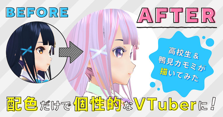
Article by Yohei Ogawa
Have you ever thought that VTubers look plenty unique even when they aren't moving?
Well, it's only natural for you to think so. After all, most of the colors of the characters around us were chosen for a reason.
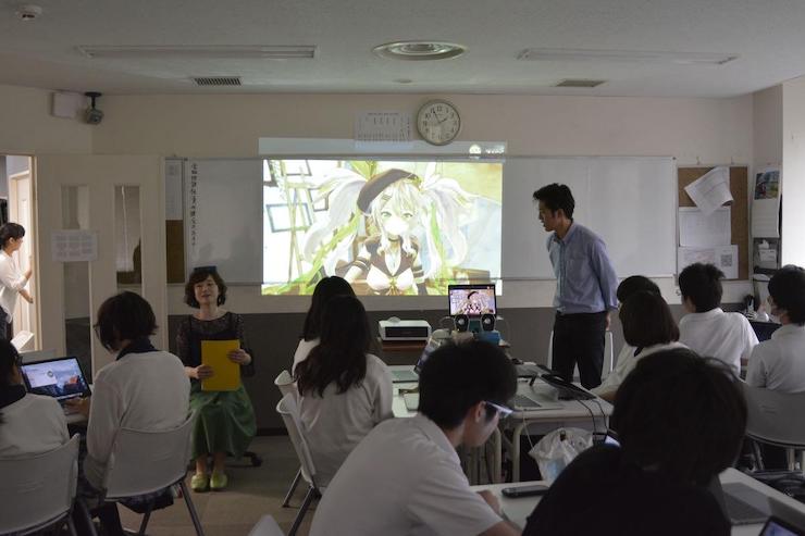
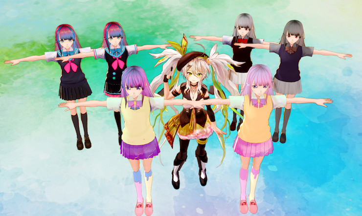
A special course to learn about it was held at Clark Memorial International High School Akihabara IT Campus in June 2019. The topic was to create an original 3D character that VTubers can use by changing only the color scheme of Shino Sendagaya, a preset character of the 3D character maker VRoid Studio that is run by pixiv.
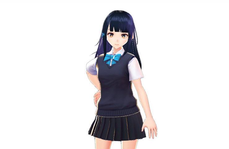
Sendagaya was designed to have a simple appearance and color tone. We asked the students to use her as a base to make color schemes that match three images, namely Dynamic, Chic, and Romantic, and create an original VTuber character.
The task is more than just about changing her color scheme. Imagine what kind of personality she has, her favorite things, what she's into, her upbringing, and other details. And then, let's try to think about how to best translate the personality and image of your original character into her appearance!
● Introducing the lecturers
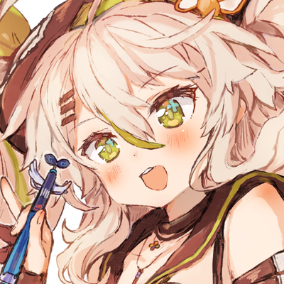
She actively posts her works on pixiv and videos as a VTuber. She delivered an edgy lecture where she tried to provide her perspectives as a virtual artist on the characters that the students made using VRoid Studio.
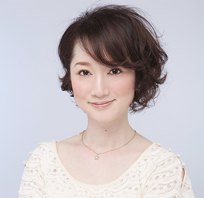
Teaching the students about colors together with Camomi was Kazuha Sato. She teaches people about colors at the Advance Forward True Colors. Her explanations about the theories of colors were very thorough.
It was a unique course in which the virtual space merged with an actual classroom. Read this article and find out how the course went!
● The goal of the lecture
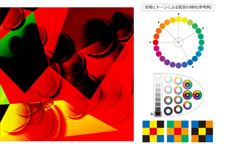
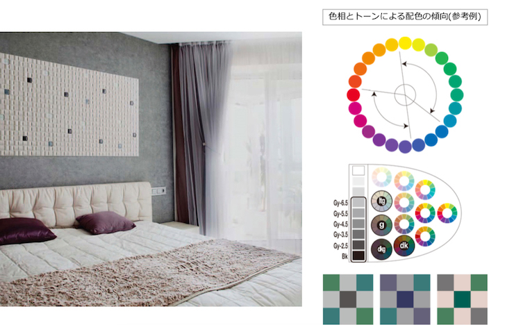
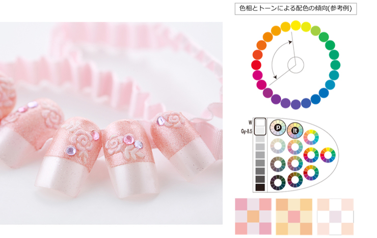
The task of the lecture was to create color schemes based on three images, namely Dynamic, Chic, and Romantic. The information needed to create each one of three images is in the official Color Exam textbook. Although the steps to create a color scheme are fixed, the artist's taste decides what colors and tones to use and the resulting balance...
● Creating a VTuber character
Camomi's color scheme stands out even among many VTubers. The name of her color scheme is Warm Natural and it's supposed to give off the calm, simple, warm, and gentle vibes.
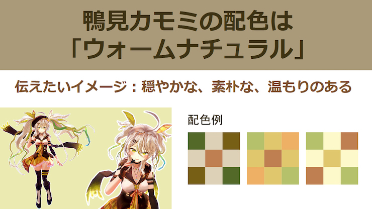
Next, we're going to briefly explain about the balance of a color scheme with Camomi as an example.
Described above is Camomi's color scheme. According to Sato, "The color balance of her outfit is as explained in the chart above. However, I feel that her hair color is more dominant because her hair sways once she's in a video. In that sense, the roles of her base and accent colors might seem reversed. Then again, I don't think there's any particular issue with it in the case of Camomi's character because her base and subordinate colors are using similar tones."
Next, let's take a look at Camomi's corrections on the works selected for each color scheme theme!
● Correction on Dynamic
What does Dynamic mean?
Check out this student's Dynamic color scheme!
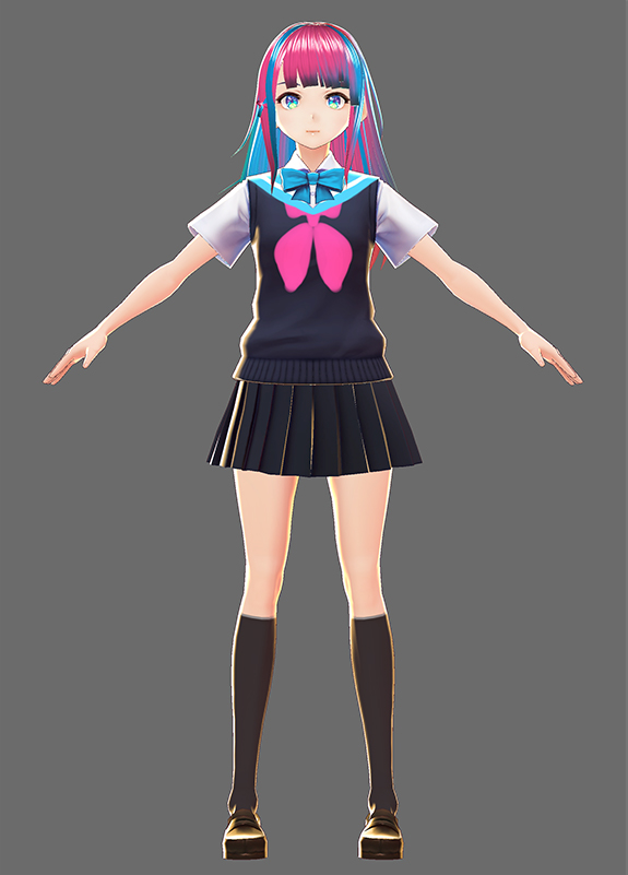
● The image of her look: Calm and collected, but messy
● What do you want her to do as a VTuber?
I like Luna Kaguya, so I want Rei to sing and have her own live concerts
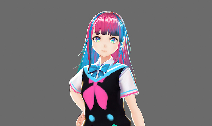
Camomi: I like that her hair is in pink and light blue. The ribbon on her chest is eye-catching. And I like how her eyes are colored in details! I think her eyes are beautiful!
Sato: The colors that are often used to create a Dynamic image are black, red, blue, green and yellow, so it's rare to see someone using light blue to achieve the image. There's no problem with the hues, so I would say this color scheme is more than acceptable. The scheme also includes the color black and I think it's very charming.
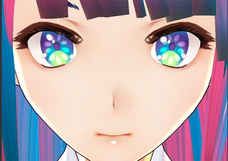
With eyes that have been colored in details like a kaleidoscope, Rei is very impressive as a character that represents the Dynamic image. However, according to Camomi and Sato, compared to the details of Rei's face and upper half, the design of her lower half is a bit too simple and slightly lacking...
With that thought in mind, Camomi edited the character using VRoid and this is the result!
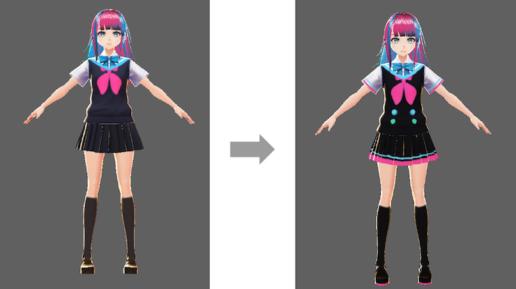
Sato: I see that you've added the color pink her skirt and her shoes. Since the student has come up with a concrete profile for this character, they could try to think about how to make this character appear energetic through not only her face but her entire body, and improve this character.
Points to note!
● Correction on Chic
What does Chic mean?
Check out this student's Chic color scheme!
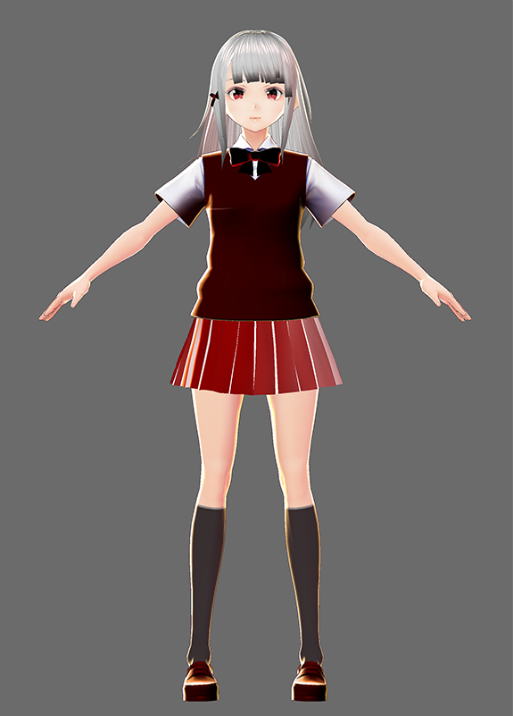
● Personality: Gloomy, but once she's opened up to someone, she's actually a normal girl who does smile
● What do you want her to do as a VTuber?
I want her to make videos of her drawing or mixing and matching stylish outfits in the colors red and black
Camomi: She looks awesome! But her skirt is too red for a Chic look. Let's think about how to make her look chic while still keeping the color red!
Sato: I agree. While this color scheme is comprised of calm colors, it falls a little out of what you'd call a chic look. In order to make this color scheme look chicer, I think we should add more neutral colors (such as gray). But there's nothing wrong with the hues selected in this color scheme. The colors are balanced and I think that's admirable. I like that there's a gradation of color on her skirt. We should definitely enhance that point.
Although the color scheme can't exactly be considered chic, let's try to optimize it! Camomi corrected the color scheme after considering the entire balance of the character and here's the result!
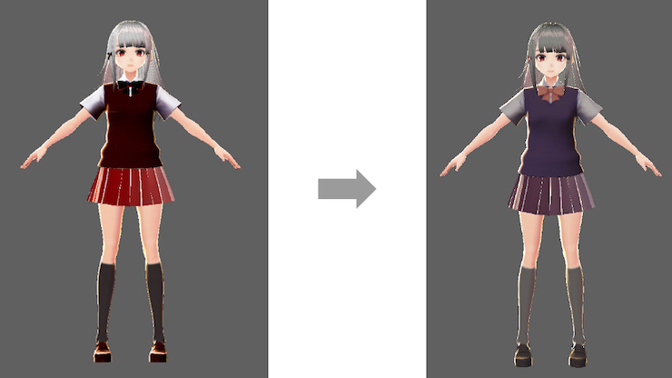
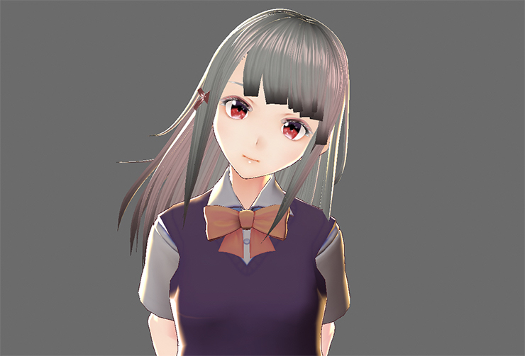
Sato: I think you did a great job. Your color choice for her ribbon is superb. The student has created a firm concept for this character and the question is how to represent that concept through the methodology of the image Chic. We also have to be careful not to use too many brown colors because the resulting image will be Classic instead of Chic. And apart from the color scheme, I think dimming the color of her hair and adjusting the color of her vest has led to an overall calmer impression.
Points to note!
You wouldn't want your hues to end up looking too similar to each other, so be careful!
If the area that needs coloring is huge, you can make a significant change in your character's image just by adjusting the hue and saturation slightly.
Too many red colors will result in a more Classic image, while too many bright and saturated colors will result in Elegant, so pay attention to the colors you choose!
A chic image doesn't mean you have to use plain colors! A single striking element can make your character stand out. So try imagining what kind of character (VTuber) you want to create and use accent colors to make it prominent.
● Correction on Romantic
What does Romantic mean?
Check out this student's Romantic color scheme!
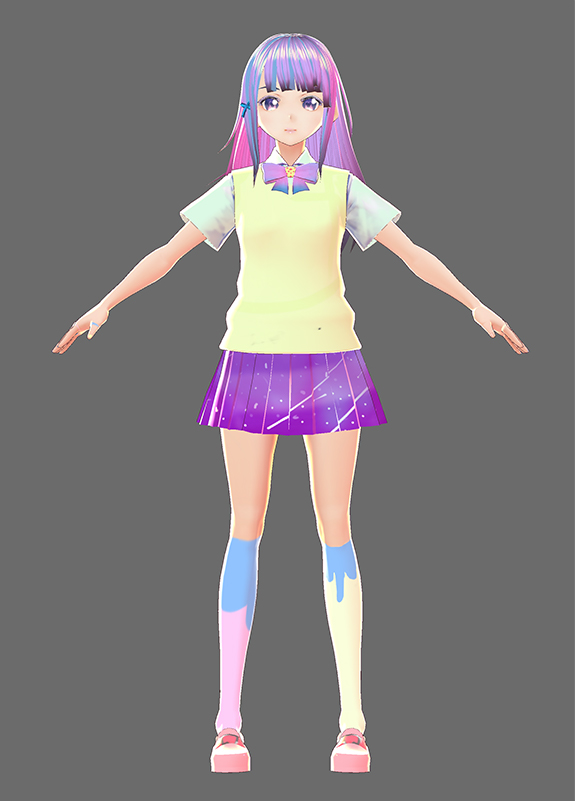
● Personality: She introduces herself as a 20-year-old high school student. She barely goes to school, so she's repeating the same class. She often gets emotionally unstable. She lies about being 17 whenever she applies for a part-time job. Although she knows she's too old to wear a high school uniform, she wants to keep wearing it until she's 23. She's kind of trashy, but she's a good kid.
● What do you want her to do as a VTuber?
1. Be a beauty guru or review affordable beauty products and sweets
2. Post updates on her diet program
Camomi: At a glance, she looks like someone who would stroll around Harajuku in a yumekawa outfit (夢カワ; cute and dreamy). Her eyes, nails, and socks make you wonder if she's spent time getting all dolled up! The student has drawn her entire appearance in details and the elaborate design is simply wonderful. I would say this character embodies the Romantic image!
Sato: I'm surprised the student has created such a detailed profile for this character. I like how the character has been designed carefully, down to the last detail. Purple isn't included in the definition of the Romantic image according to the color exam, but I believe this character lives up to many people's idea of what a romantic image is.
When asked about this character, the student said, "I pictured her personality as I worked on the colors of her nails and hair. I tried to make her skirt look like the Milky Way and I also thought about how she'd look as a whole." The character has been carefully designed from head to toe and she looks plenty "romantic". But the student also received a comment about the strong purple, which makes the image of her character lean more toward Elegant than Romantic. What happens if the character's image looks more Romantic? Here's the answer!
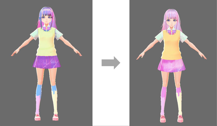
Sato: And because her vest was in a slightly greenish-yellow, we changed the color to orange-yellow and she still looks adorable. We also changed the parts that were in purple to pink. You can make your character look more Romantic by removing the sharp and definite lines between colors and unifying all of the tones with brightness.
Points to note!
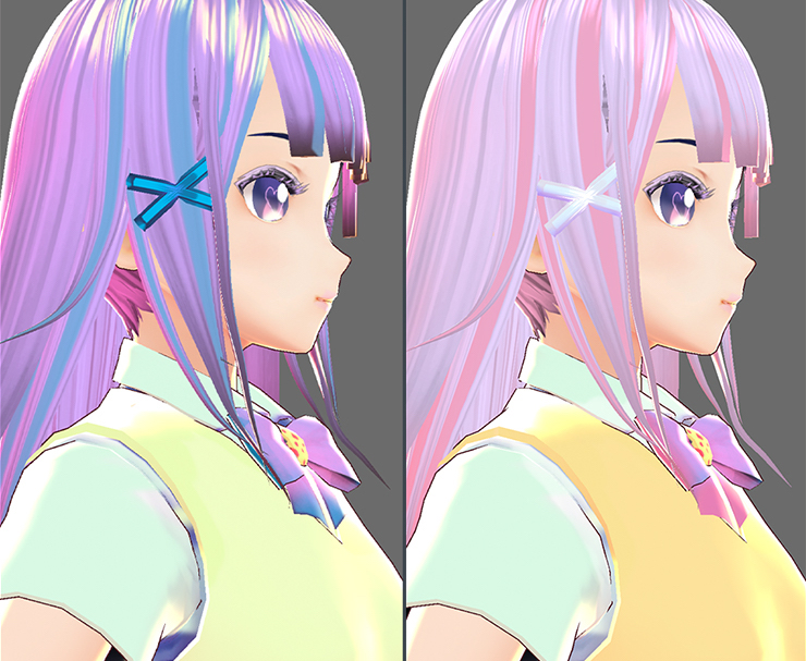
Simply put, the Romantic image is created by using colors that are inarguably pastel. It's important to aim to create a cute, soft, and fluffy image!
Keep in mind that purple ends up giving your character the mature Elegant image instead of Romantic, so be careful!
● Camomi took on the challenge and created her own character too!
Camomi also tried to create her own character
The image of Camomi's current character is based on the Warm Natural color scheme, but during the lecture, she decided that she would create a character with the Dynamic color scheme! She pictured a character that is bright, positive-thinking, and lively. Here's the result!
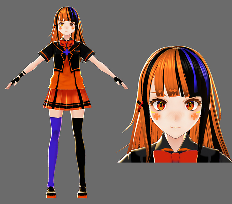
The entire class gasped in awe at the stunning quality of the character that Camomi made. But according to Sato, "The orange and black come off too strong that this character might be leaning more toward the Halloween image than Dynamic..." After editing the character based on Sato's comment, here's the result!
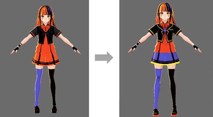
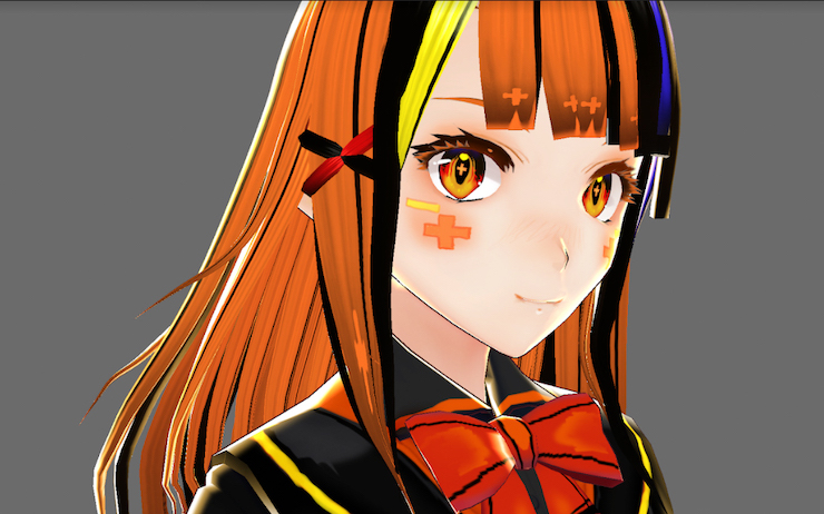
The students were amazed. They learned that what it takes to transform a character's image is not a huge design change but a change in the balance of the colors. Camomi was even more amazed by this newfound knowledge.
Camomi: I don't really use colors that are this bright. There aren't that many VTubers who use bright colors, so if I were to create new characters, it might be a good idea to try using the Dynamic color scheme! Sato, thank you for the lessons! I bet the things you taught us will be useful!
● The end of the lecture
Sato: The color schemes in the color exam were selected based on the results of various surveys and questionnaires, such as asking the survey participants (who are in their 20s to 50s) what they think of a certain color scheme (i.e. which color scheme they think suit a certain image the most). So the exam is very useful when you want to create a design that represents a specific image. However, please remember that the color exam is based on statistics. When you work in the creative industry, please be flexible in modifying your works and create works that aren't bound by a certain framework. In order to be able to do so, I think it'll be a good idea to study for the color exam and learn the basic knowledge. You are all young and so are your tastes, so I believe you can make the most out of that basic knowledge. Please aim to be creators that can produce works that are uniquely yours!
Camomi: The most important thing in character design is to create characters that can convey what you want them to with just a glance from the audience. The ideal scenario would be when you can adjust your color scheme to suit a given concept while keeping in mind that various people will be looking at your work and that your characters have personalities and their own unique traits. For you to be able to understand that process, I think the color scheme knowledge that you can gain through studying for the color exam will be useful.
Today, all of you have thoroughly thought about your characters' concepts. I'm sure your characters will improve once you know what color schemes can efficiently represent their personalities. I want you to study about colors and apply the knowledge when creating characters since that is one way to present your characters in an enchanting way. This knowledge will also come in handy when you look at illustrations or watch anime (laughs). Please expand the creative world!
● Now that you know what colors can do, it's time to take on the color exam!
Additionally, the organization is currently accepting applications for the Winter 2019 exam, which is to be held in November 2019! You can apply online and there are about 400 exam sites all over Japan. The exam is a rare opportunity for you to gain the knowledge that will be useful in the creative industry, including creating illustrations, videos, 3D models, video games, and more. Why don't you challenge yourself and take on the November exam?
Application Period
Dates: August 1 (Thu) - October 3, 2019 (Thu)
*Online applications are accepted until October 10, 2019 (Thu)
Exam Dates
Levels 3, 2, 1, and UC: November 11, 2019 (Sun)
Level 1.2: December 15, 2019 (Sun)
Exam Hours
Level 3: 09:50-11:00 (70 minutes)
Level 2: 11:50-13:10 (80 minutes)
Level UC: 13:50-14:50 (60 minutes)
Level 1: 15:20-16:50 (90 minutes)
Level 1.2: 13:00-14:30 (90 minutes)


![Springfish Illustration Contest 2025 Results & Comments From the Judges! - [Free Commemorative Digital Art Collection Available]](https://i.pximg.net/c/1200x630_q80_a2_g1_u1_icr0:0.082:1:0.957/img-original/img/2025/06/05/00/17/01/131154729_p0.jpg)


![Fan Art of Hyakumantenbara Salome [No. 18 in 2022's Net Buzzword 100] - Never Wearing Less Than a 100% Smile!](https://i.pximg.net/c/1200x630_q80_a2_g1_u1_icr0:0.06:1:0.43/img-original/img/2022/08/09/21/38/04/100358888_p0.jpg)
![[Artist’s Spotlight] An interview with designer and illustrator John Kafka - Where traditional painting meets contemporary fashion](https://i.pximg.net/imgaz/upload/20260810/573420973.jpg)

As the name suggests, the base color is a foundation color that covers most of the area and determines the overall image of an illustration. The base color can even be said to occupy 70% of the entire illustration.
・Subordinate Color
Next to the base color in terms of the coverage area is the subordinate color. It serves to either bring about a sense of unification or variation. It's a color that determines the impression of the entire illustration and covers about 25% of it.
・Accent Color
The accent color covers the last 5% of the illustration. It's a color that catches the eye of those viewing the illustration and completes the illustration.