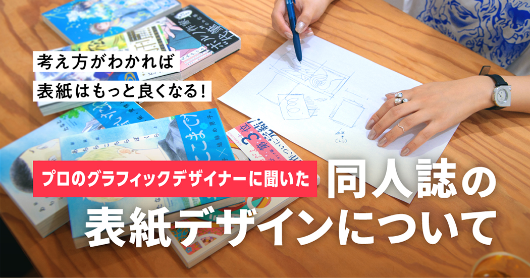
About dojinshi cover design - We interviewed a professional graphic designer!
Artists create dojinshi in spite of their busy schedule. The cover of their dojinshi plays an important role in order to attract as many readers as possible. After all, the cover is the first information that a reader sees. If you are a dojinshi artist, you might be able to gain more readers with an eye-catching cover.
But how should you design the cover of your dojinshi?
We asked Shirakawa who is a representative of En to Kyu, a design company that has worked on One Room Angel, Seifuku Nusumareta, and other works from various genres including shojo and BL, to share useful tips regarding how to design a dojinshi cover.
■ "I asked for too much."
── Could you tell us more about your job? Have you ever received a memorable commission?
Shirakawa: All commissions are memorable, but I would say Pornographer by Maki Marukido stands out in particular.
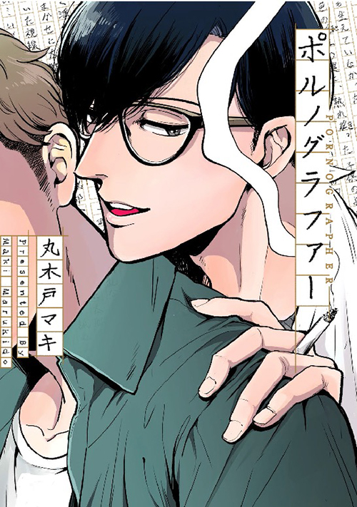
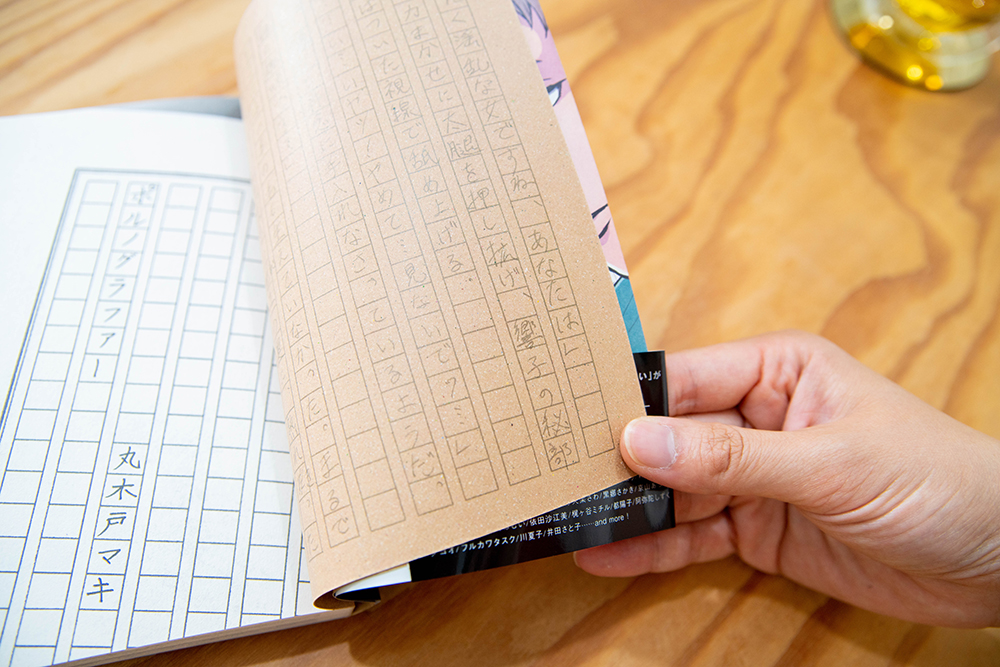
Shirakawa: It's a BL manga about an erotic novelist and a college student who works as his assistant. In the manga, there is a scene in which the college student transcribes the erotic novelist's words onto the manuscript paper. And so, we decided to incorporate a man's handwriting into the cover design. We then asked a male employee from Shodensha's marketing department to write the manuscript and used his handwriting on several other occasions.
Since we also wanted to give the book a paperback look, we used textured paper for the entire book.
── It must have been quite an effort.
Shirakawa: I thought maybe I shouldn't have asked such a huge favor of the marketing employee. I felt like I asked for too much (laughs).
But I was also glad.
The decision to ask a man to write the manuscript came during my meeting with the manga's editor and Marukido herself and we thought it was a good idea. Thankfully, the marketing employee of Shodensha happily agreed to write the manuscript for us. Everyone involved in the process had such a positive attitude and it helped me. Their positive attitude encouraged me and that's why this commission was very memorable to me.
But whenever I accept a job and proceed to read the manga, I'm always impressed by how interesting the manga is. I want all sorts of people to read it.
No matter the commission, I think it's important for me to feel eager to introduce the work to many people.
■ One Room Angel Tracing Paper Edition
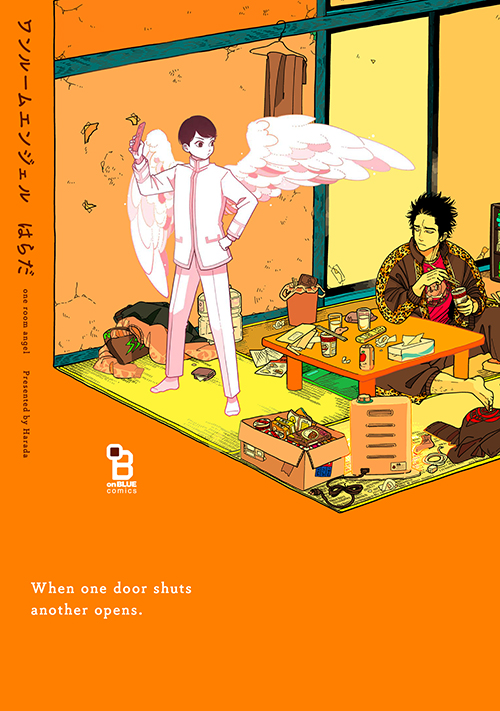
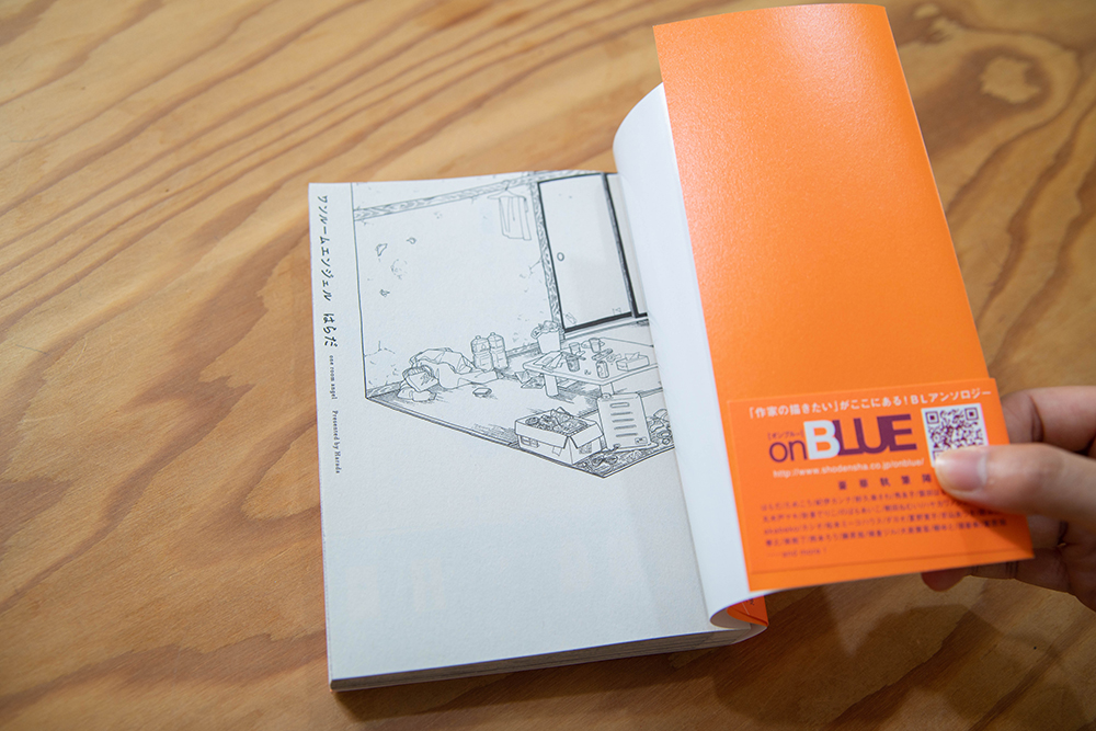
Shirakawa: There's actually a tracing paper cover for this work, but the design wasn't chosen in the end.
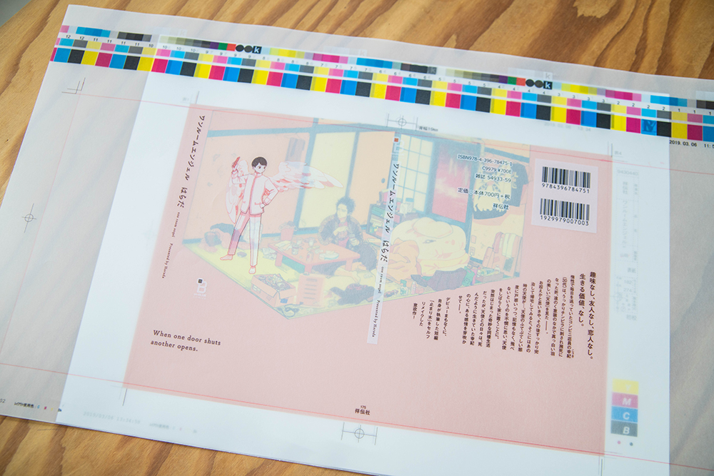
Shirakawa: We had a meeting to discuss what we could do with the cover design and Harada said she wanted the angel on the cover art to appear and disappear, and so we agreed that we probably should use tracing paper. In other words, we would print the angel on the cover, which is made of tracing paper. And then, we would print the rest of the cover art on the book itself. So if we take off the tracing paper, the angel will disappear.
── So why wasn't the design chosen?
Shirakawa: Because the design might not make the book stand out in bookstores. The tracing paper will make the colors of the cover art appear dimmer.
── You're right. The vivid color orange does look dimmer here.
Shirakawa: We did consider using a thinner tracing paper to allow the colors beneath to come out, but after considering the distribution of the book, this is already the thinnest paper we could possibly use.
── That's too bad.
Shirakawa: Those who read the book would have understood what the unchosen design means, but people wouldn't read the book if they didn't buy it. So before everything else, we needed to make sure people would actually buy the book... (fakes crying) To make up for the unchosen cover design, we decided to remove the angel in the illustration on the first page. We also decided to create a little game of showing the angel on several pages throughout the book.
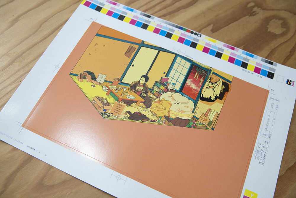
Shirakawa: Yes. We asked her if she had anything that she wanted to draw, so this is the result. If we placed the art only on the front side of the book, everything would appear cramped and the characters would look smaller. By spreading the art across the front and back sides of the book, we were able to create some blank space.
── The blank space makes the room look like a place that belongs only to the two characters.
Shirakawa: At first, I thought the cover art should depict only the angel on a blank white space because the angel is an impactful character. But during the meeting, I was told that the cover shouldn't give off such solemn vibes. So this cover art is a result of my consideration of the fact that this room is the main setting of the story and that the title is "One Room Angel".
── The title takes very little space of the cover. I think that's lovely.
Shirakawa: The decision to give the title a simpler look comes from the fact that the cover art has plenty of detailed lines. But since the story is anything but common, we decided to write the title vertically to create a sense of something being out of place.
Shirakawa: I wouldn't say "planned" and I don't know how to explain it well either, but I wanted to create a design that incorporated the work's world-building. There are various Easter eggs inside the book too, so please check it out.
■ Stolen letters in Seifuku Nusumareta
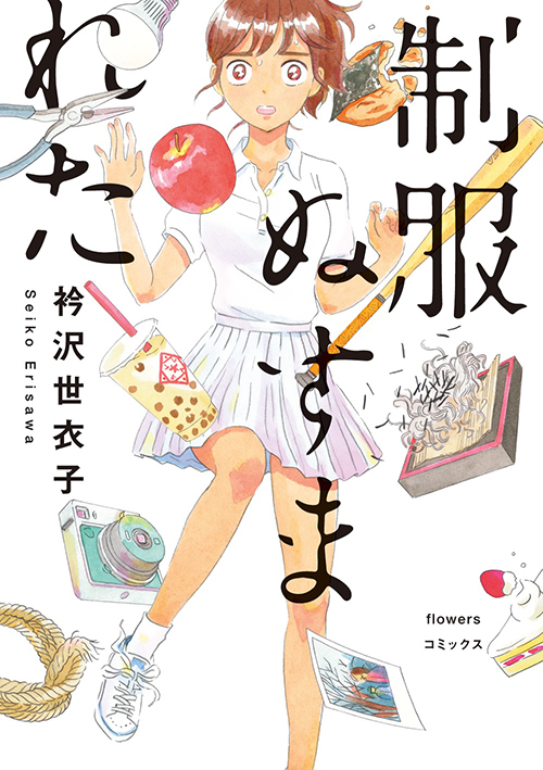
── Speaking of your non-BL works, I like the cover of Seifuku Nusumareta by Seiko Erisawa. It's beautiful.
Shirakawa: Erisawa herself said she wanted me to design the cover art of her book and I was happy to hear that.
At first, we thought of depicting only uniforms on the cover art and no human characters. But that design might be a little too difficult to comprehend, so we decided to feature the girl of the main story.
── The design of the title is also very unique.
Shirakawa: When I submit a rough design, I try to give as little explanation as possible. I know this is probably an extreme opinion, but I think the most important thing is what your audience feel when they see your creation. That's what I thought when I submitted this design. After seeing the design, the manga editor told me: "I really like how parts of the letters look like they've been stolen." And that's exactly what I intended when I created the design, so I was happy that I seem to have gotten the message across.
── The cover also represents Seiko Erisawa's bizarre world-building.
Shirakawa: Yes. Her literary style is charming--it's not something that you can easily describe and it has its own characteristic peculiarity. The work has a good title that made me question the meaning when I first saw it. And when I finally got to read the book, I became even more determined to introduce the bizarreness of this story. I tried to depict the world-building of this book by scattering the important items found in not only the main story but other stories as well.
── Are the designs between BL and non-BL books any different?
Shirakawa: My way of thinking doesn't change. I approach all commissions with the same way of thinking, but the answers that I get change depending on the content...
Works are divided into genres and my way of applying ideas changes depending on the genre. I think people have a tendency to avoid things that they aren't used to seeing, so I try to follow the existing theories of a genre to a certain extent. I think you could say that I follow these theories and add my own ideas later on.
■ Knowing the charm of your drawing
── Next, please give the readers of this article pointers on how to create a dojinshi cover. What would be the best way to design a cover?
Shirakawa: Simply put, the designing process is like aiming for beautility in industrial goods. As long as the concept of the work is defined clearly, applying ideas for the cover design shouldn't be a difficult thing to do.
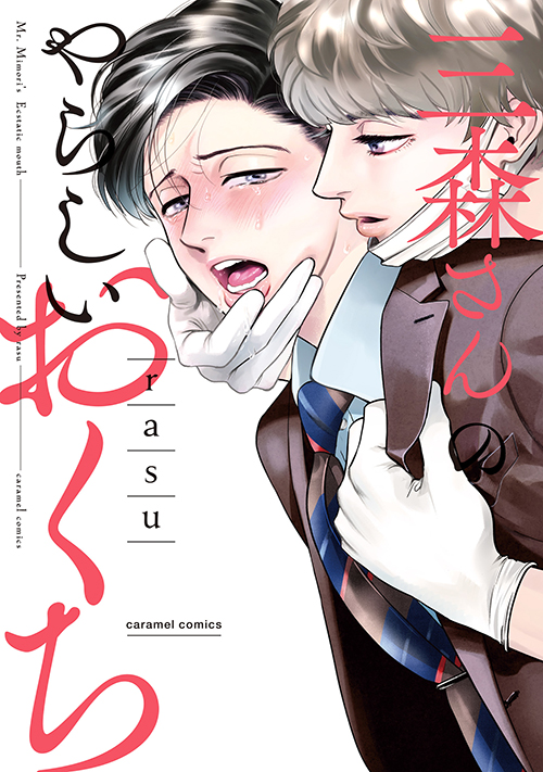
Shirakawa: For instance, I was in charge of designing the cover of rasu's BL work Mimori-san no Yarashii Okuchi. The story has an impactful setting because one of the characters' erogenous zone is his mouth. When I learned about the setting, I immediately knew what the finished design would look like. I knew the cover shouldn't be a full shot and that I should focus on the mouth.
── But defining the concept of a work is quite a challenging task...
Shirakawa: If you can't start with defining the concept of your work, you might want to start by thinking about the charm of your drawing or what is lacking. I think this process will naturally lead you to a suitable design.
For instance, some artists say that although they can draw faces, they can't draw bodies.
But I think there's plenty of charm in being able to draw adorable faces even if you can't draw bodies. In fact, it's quite a strong point. It might be a good idea to simply feature a striking face on the cover.
The same goes for coloring. If you're good at coloring illustrations in monotones instead of colors, then feel free to use a monochrome art for your cover. For instance, you can use a unique and bright color as the background color and paste a monochrome drawing on top. I think it's such a shame if you stop trying just because you believe you can't excel at something. My advice is to try to change what you can't do into something charming.
── That's a really good idea! What should we do to increase our repertoire of ideas?
Shirakawa: I think you can add more ideas to your "idea drawer" by making it a habit to seek an explanation on why you find something attractive, instead of just looking at that something and admiring it. If all you do is look at something, I feel like you lose more in the process and you don't gain anything for yourself.
In my case, I try to collect designs that I think are nice. It's also because I simply want to keep things that I find wonderful.
Shirakawa: Also, I think it's a good idea to visit art museums and galleries. I believe it's important to look at works that people consider a masterpiece. And if you haven't grasped what your preference is, it might be best to just go out there, look at various things, and expand your knowledge. By doing so, you'll come to see the things that you've been missing and your idea drawer in general, not only limited to design, will expand. I haven't been going to the museums myself, but if you're a student, I strongly encourage you to go while you're still a student!
── Do you have any advice that dojinshi artists can follow to create a cover design right before their manuscript submission deadline?
Shirakawa: That's a difficult question because designing takes time... If you don't have time to draw a cover art, I think you can use the panels in your dojinshi on your cover art. For instance, you can choose the panels that you like or are proud of.
── It sounds as useful as the monochrome cover technique you mentioned before.
Shirakawa: Fonts are also important. Some artists create their own fonts from scratch, but the crucial thing about titles is that they have to be easy to understand. So in some cases, it might actually be better if you refrain from over-designing the font of your title.
I think it's always a good idea to have that one font that you'll like no matter what. By having that one font, you'll save time and have fun designing your cover. You can also handwrite your title.
── Lastly, what would you like to say to the readers of this article?
Shirakawa: Thank you for letting me talk about a lot of things. I hope you find them useful.
Still, I personally think that most people buy a dojinshi after reading the sample, so please don't think too hard on the design of your cover.
Dojinshi is a work that only you can make, so don't overthink things and just create your dojinshi the way you like it.
Thank you for bearing with me and for reading this far. I hope the designs that En to Kyu has done will lead you to many wonderful works.
■ We asked Shirakawa to design a dojinshi cover!
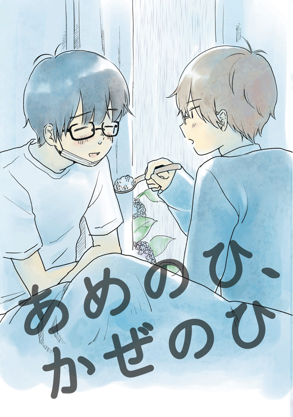
But because seeing is believing, we asked Shirakawa to redesign the cover design of Ame no Hi, Kaze no Hi, a dojinshi released by a pixiv user named hituji.
You'll be impressed by the designs Shirakawa came up with! Each of the designs reflects the things she talked about in the interview!
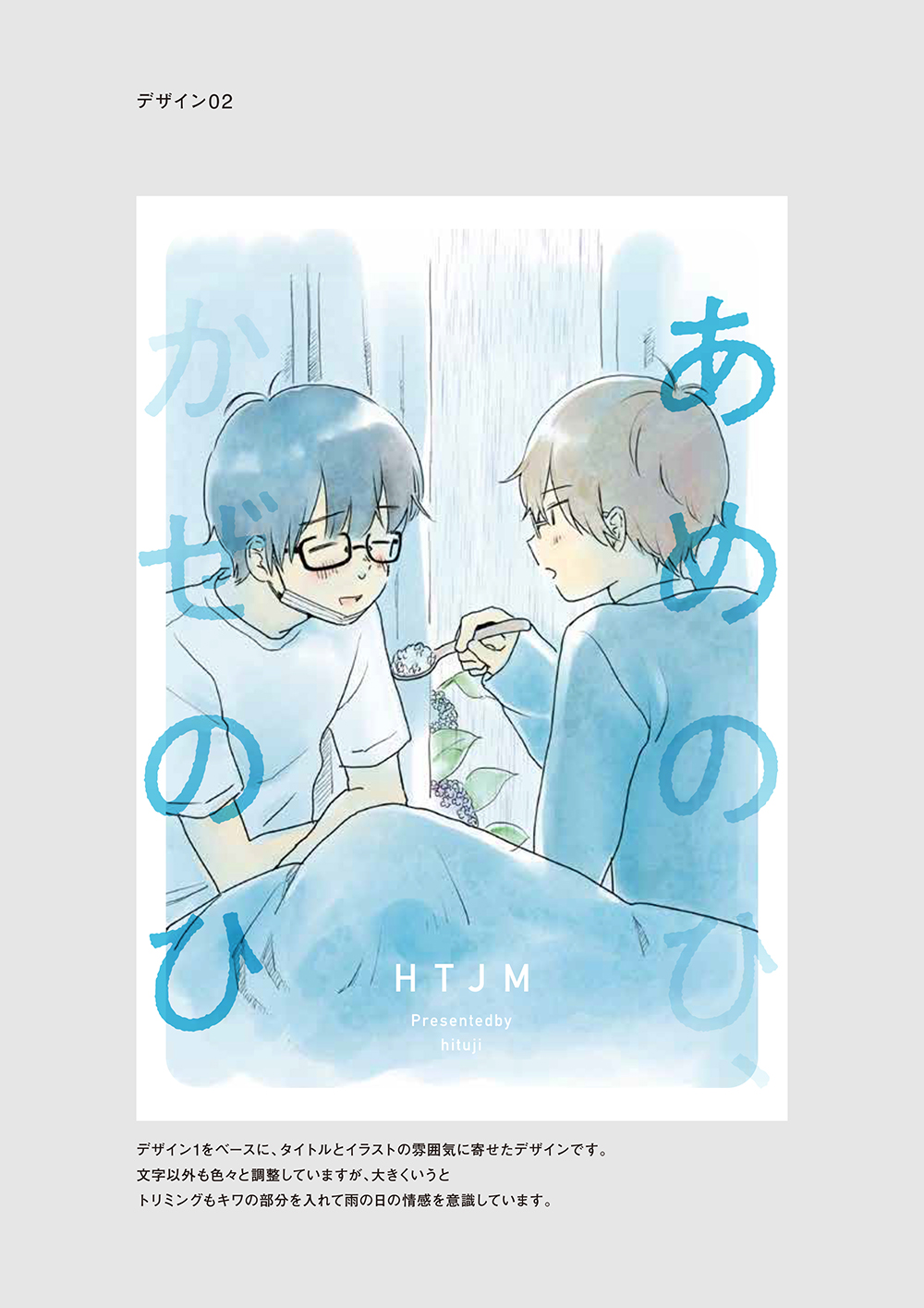
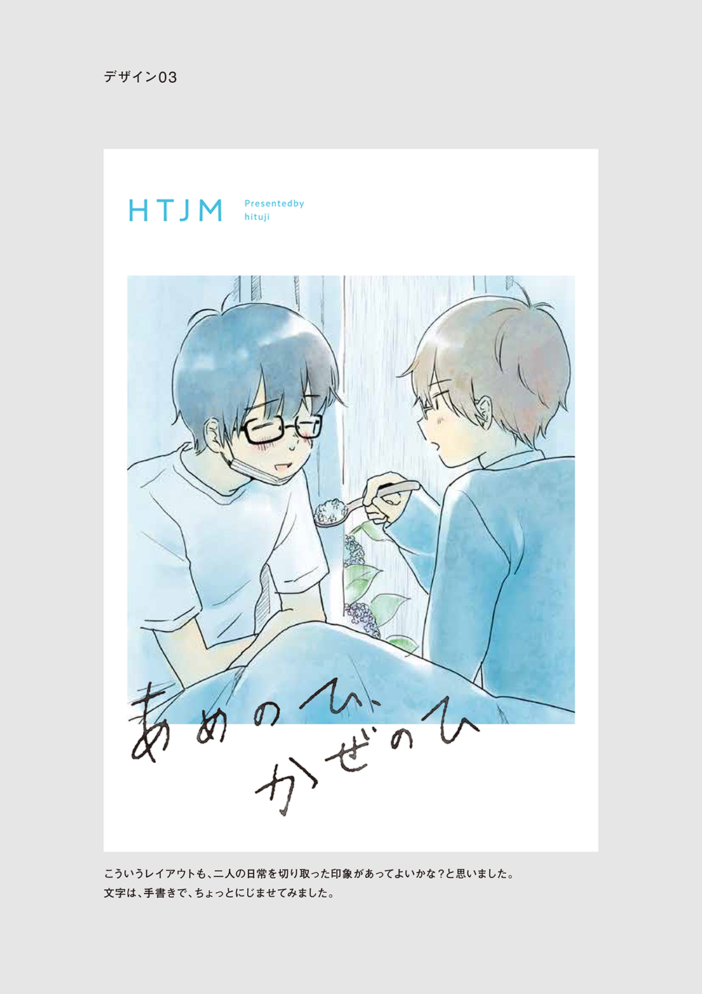
Ame no Hi, Kaze no Hi
Summary:
This is a short story about two college students, a junior and his senior, who attend the same research department and are secretly dating. While looking after his senior who has caught a cold, the junior is happy to be in the position to take care for once. In the middle of nursing his senior back to health, the junior dozes off and sees a strange dream.
■ The rough designs by Shirakawa
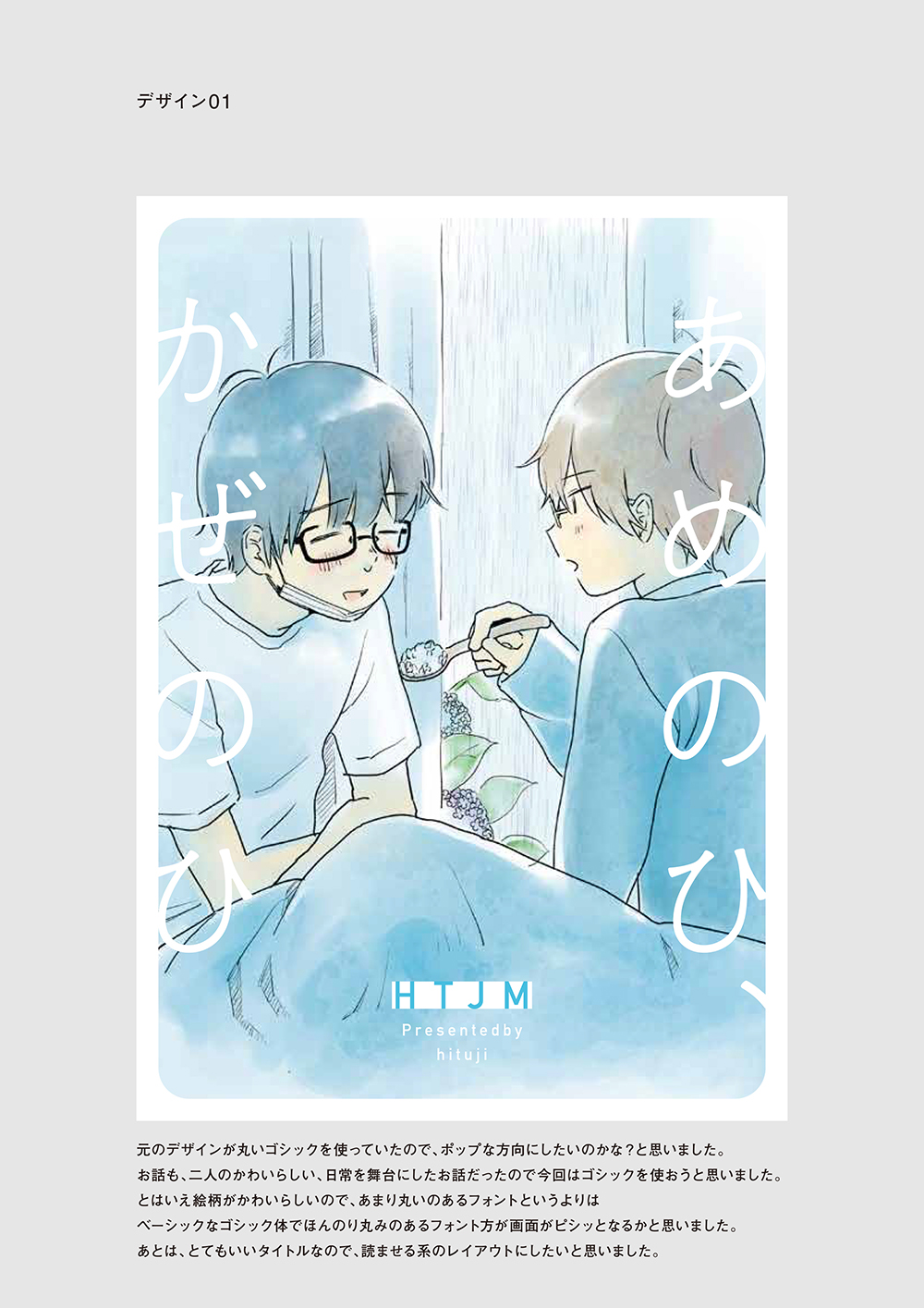
Lastly, I wanted to create a layout that makes people want to read this dojinshi because it has such a lovely title that portrays the story inside."
■ hituji's Comment
I looked at her design proposals and although each one of them seems simple, I couldn't believe they were based on my cover because they all look so much more refined! I'm so happy for the change!
I like simple covers, but my idea of a simple cover is that it doesn't involve a lot of elements. So I tend to end up simply putting the letters of the title on top of my drawing.
But in addition to looking simple and retaining the soft ambiance of the dojinshi, her design proposals also have three completely different vibes. It made me realize that there are actually many things that we can do with "simplicity" such as the type and position of the font, the transparency of the letters, the edges of the illustration, and more. (I'm sure this is what she meant with expanding the drawer of ideas!)
When she said I should use fonts that aren't too roundish in order to give the cover a sharper image because my art style is cute, I felt like I saw the light. I usually look at a bunch of fonts and end up using those that I personally like, but from now on I'll try to keep in mind how a font looks when paired with my drawing.
Also, although the third design looks slightly different from the original design, it fits the dojinshi perfectly because it is about a scene in the couple's simple daily life. I was deeply moved. To be honest, I once hand-wrote the title for the cover of my dojinshi, but I wasn't happy with the design because it looked messy.
I immediately followed Shirakawa's advice and started analyzing the charm points of her designs! For instance, although her designs still appear rough, she put a large blank space at the top and bottom of the illustration and she neatly arranged the name of the circle to create an overall neat and well-ordered look!