pixiv's High Schoolers Illustration Contest 2022 Results - Out of Nearly 1000 Entries, Who Came Out On Top?
Another year, another edition of pixiv's High Schoolers Illustration Contest.
This year marked the fifth rendition of the contest aiming to highlight the talents of high school-aged artists, attracting a total of 992 entries.
Truth be told, we were concerned that this time's theme, "journeys", might have been too abstract. However, even our distinguished panel of illustrators who acted as the contest's judges were amazed after looking at the entries! The panel was eager to explore how each applicant had interpreted the theme and to dive into each work's unique settings. Without further ado, here are the award-winning artworks that were chosen after careful consideration!
Here's a look at the illustrators who judged this year's entries
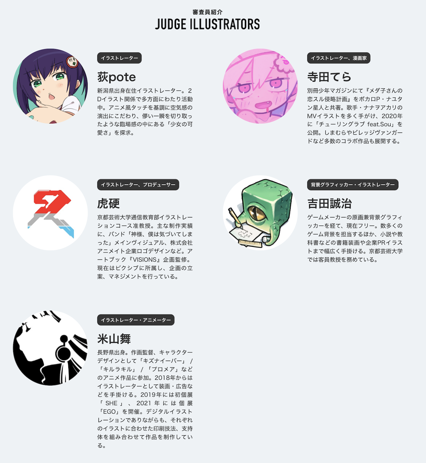
From top to bottom, our five judges were Ogipote, Tera Terada, Torako, Seiji Yoshida, and Mai Yoneyama.
The Grand Prize
This award is given to the work that was considered to be the most outstanding among this year's 992 entries. The winner and recipient of 200,000 JPY in prize money is...
The panel's critique

In this piece, the artist was able to express their own style while staying true to the theme of "journeys", an impressive feat in its own right. What stood out the most, however, were the colors, the composition, and the artist's unique style, which all worked well together to create a piece of art that's enjoyable to look at. The art style is in line with what's popular today, which made me think that a piece like this could sell well commercially. The artist was also insightful enough to know which elements should be rendered in full and which ones could be omitted.

When you zoom in, you can see that the artwork isn't actually drawn in much detail, and I mean that in a nice way. However, the level of depth that this illustration achieves showcases the artist's drawing abilities. Using red for the main lines and blue for the shaded areas was a lovely touch. When you look at this creator's other posts on pixiv, you notice that they really enjoy this kind of character and motifs. Having distinct tastes is a creator's strongest weapon.

Various brushes were used extensively, yet it was painted with such rough strokes that it's clear which brushes were used. This harmony adds a lovely dimension to the painting and is really intriguing. The white on the sleeves, in particular, appears to have been painted quickly, but it looks fantastic in the drawing, and the technique is excellent!
Also, the drawing's density and roughness are balanced beautifully.
Perhaps it's because of the red used in the line art, but this piece feels very sensual. It feels like the artist took the theme of "journeys" and paired it with a subject matter that they truly enjoy.
The mask hanging from the guy's ear reflects current events while also giving the character a sense of realism by implying that he's taking off his mask because he's outside, walking around with his camera. This illustration has a look with a high degree of completion, both when zoomed in and out. And yet, the rough texture of the brush strokes is very appealing.
The artist did an excellent job of subtly directing the viewer's eye to the parts of the painting that they wanted to highlight, for example by taking advantage of the way light enters the scene. The artist's control skills are exceptional for a high school student, as evidenced by the rough brush strokes. This illustration would be ideal for a book cover, and the empty space on top would be perfect for the book's title. This work is very technical but also packed with the creator's tastes and preferences. Moreover, the boy seems to have hurt his arm, suggesting he's too absorbed in taking pictures to notice; this is also an element that may appeal to some people's fetishes.
Illustrator Panel Awards
These works were selected by each of the members of our all-illustrator panel. Winners will receive a 30,000 JPY Amazon gift card.
The Ogipote Award

While some works will inevitably appear technically clumsy because the creator is still developing as an artist, this one feels well-finished and is almost completely free of that clumsy vibe. It's very cohesive. The artist skillfully drew the folds in the skirt and played with colors, and the fact that the buildings in the background were drawn in such detail without being obtrusive is a very nice and subtle touch. If I had to nitpick, I'd say the color scheme in the foreground is a little distracting, and the shading of the fish could have used a bit more work. However, these are areas that will come naturally as they continue to hone their technique.

The bubbles are beautifully drawn. When viewed as a whole, the illustration's quality is very consistent.

I was impressed by the artist's mastery of a difficult technique like aerial perspective (a way to express depth in which objects appear differently due to the effect of the atmosphere). The composition's a little monotonous, but this is something the artist can work on in the future.
The Tera Terada Award

Firstly, the idea of migratory birds taking a plane is very cute. The various personalities that emerge in this illustration are also entertaining. At first glance, I was drawn to the color scheme of orange and blue. I'd like the artist to focus more on making their artwork look nice even when zoomed in next time, but the ability to make things fun at a glance should not be underestimated.

I was surprised to see that the bird with the polka-dotted blue ribbon was mostly painted in solid colors. I'm curious if the artist came to this bold decision organically or if it was all calculated... In any case, it's quite unique.

The vivid use of colors is impressive, and the artist effectively expressed aerial perspective by reducing the contrast in the distant background while still using highly saturated colors. Although the vanishing point isn't calculated too precisely, the perspective looks natural, and I like how the creator took advantage of the lies you can tell with an illustration. From the foreground to the background, it's an enjoyable work brimming with storytelling.
The Torako Award

I love this one! (laughs) I said the same for the winner of the Grand Prize, but I like this illustration's brush-like finish. If you look closely, you'll notice that the shape of the foreground character's mouth is rather peculiar, yet there's a really clever balance between the stylized and the more realistic parts. The way the main line art isn't completely black, but a bit faded here and there, is also impressive.

Rather than use multiply layers, the artist adjusted each color's shadow individually. This illustration clearly took a lot of time and effort. I also like how the creator addressed the issue of the illustration maybe getting too crowded by adding a gradient to the chains around the camel's snout. In any case, the color palette is just wonderful.

The character in the back with the compass and spread out map is quite creative. The resolution of every element on the canvas is very high.
The Seiji Yoshida Award

The character is the main focus of this illustration, but the background's also stunning. Instead of going for a completely monochrome color scheme, the artist used colors and highlights effectively. Running away from home is also a clever take on the theme of "journeys". The composition prioritizes having an impact on the viewer, so it ignores its ties to reality, but the result doesn't feel off. Also, while the canvas is dark overall, the artist has successfully avoided a situation in which an error could cause the outlines of the background and character to blend together and become hard to see. In my opinion, this is also a fantastic display of technique.

The use of white, such as in the boy's tears and in the puddle, is very refined. I also like the orange accents.

This artwork prioritizes composition, which is why it immediately captures the viewer's attention. The silhouette outlines are so cool!
The Mai Yoneyama Award

It's impressive how the car still looks like a car with just a minimal number of elements. Even for professionals, showing all the characters through a single car window would be a difficult composition. The characters fit into one window, and from there, the eye follows the arm as it reaches out and smoothly directs the viewer's gaze to the discarded papers. I felt that the artist's composition skills were excellent, as they were able to guide the viewer's gaze in a circular motion among the four characters. It's fascinating to see the artist's emotions reflected in the illustration, as well as the skill with which they visually communicate their message.

The roof of the car is open to reveal the carrier, and not many others would've gone that far. This makes me think that the artist is accustomed to drawing such complex angles. By the way, based on the trees in the foreground and the visible part of the peninsula in the background, I believe this is set in Atami. (laughs)
The Corporate Sponsor Awards
These awards are given to the most outstanding work chosen by each of our sponsors. Each company gives the winners a variety of goods and services to support the artist's creative endeavors. The comments are provided by each company's representative.
The Nuverse Award
The Copic Award
We were impressed by the fact that this artwork portrays how the character actually looks rather than the journey he's taking in his dream. That's a refreshing take. The warmth of the lines, which is typical of traditional works, and the consistent use of color are also excellent. Although we can't see the boy's expression, the mood of the scene and the gadgets all around him hint at the depth of his love for dinosaurs.
The Orbital2 STERNA Award
In this lovely illustration, the many motifs scattered across the canvas match the happy girl getting ready for a trip. The girl's excitement about her upcoming journey is conveyed very well.
We chose this artwork because of the sensitivity with which the artist chose a variation on the theme of "journeys" by showing the girl's travel preparations. The composition is ideal for the concept. We hope the artist continues to create wonderful works!
We chose this artwork because of the sensitivity with which the artist chose a variation on the theme of "journeys" by showing the girl's travel preparations. The composition is ideal for the concept. We hope the artist continues to create wonderful works!
The Wacom Award
The KADOKAWA Kitora Award
In this low-angle shot, both the character and the big torii appear dramatic and striking. The character gazes beyond the torii gate, but if you look closely, you'll notice their feet are pointing in the opposite direction, creating a rather peculiar composition. This conveys the character's hesitation as they wonder whether to go farther into the sanctuary or to turn back, as the fox leads them.
The harmonious hues and the subtlety with which the trees in the background merge with the nighttime background are lovely, and the idea of a therian employing an animal is also novel. The goggles' off-screen luminescence is also a nice touch.
The illustration is fantastic in terms of drawing and composition, and it tells a fascinating story. We're hoping the artist will do a series of travel-themed illustrations and to see more of their work in the future.
The CHUNITHM Award
The artist's unique style and skillful composition technique are both very appealing. Although the overall concept isn't as glamorous as one might expect from the keyword "journeys," the illustration's quiet atmosphere broadens the viewer's imagination and gives the impression that a mysterious tale is hidden within the artwork. We're very fond of the distinct charm of your drawings and hope that you'll continue to develop your sense of individuality.
The CLIP STUDIO PAINT Award
The warm colors and meticulously drawn characters, accessories, and background draw the viewer in.
We got a sense of the two characters' past and future all packed into one image.
We got a sense of the two characters' past and future all packed into one image.


About pixiv's High Schoolers Illustration Contest 2022