What are the steps for charming characters and beautiful hues? A making-of and interview with U35!
This time we had U35 try out the new “Cintiq 27QHD” LCD pen tablet and draw something for us. In every day life, she uses a “Cintiq 13HD”. How will she like a graphics tablet that is almost four times larger? Will this have an impact on her work? Let’s find out together! Especially you, considering to get a liquid crystal tablet... Don’t miss this interview!
In the second part of the article, you’ll learn about U35’s favorite drawing tools and about her story - did you know she was an office lady before?
Let’s start with the making-of, shall we? But remember, this is just the beginning! Many more interesting contents await for you ahead.
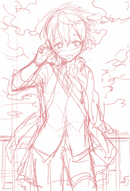
Sketch/Lineart
Trying out colors
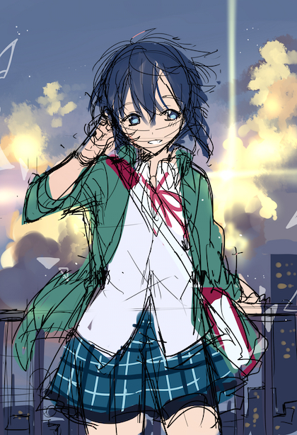
Main point! Choosing the colors according to what you want to emphasize the most!
This time I chose to emphasize the character, so I started from that to decide the colors. If I wanted to emphasize the situation, I would have started from the background.
What do you want to focus on? The characters or the overall atmosphere? Deciding that in advance will have a huge impact on your final result.
Inking
After deciding roughly how the illustration will look like, I proceed to the inking phase.
In order to give the illustration a sense of movement, I always think about in which direction the wind is blowing and keeping that in mind, I draw hair and clothes.
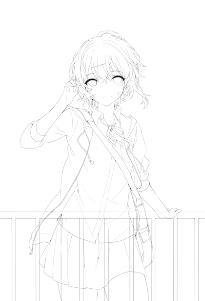
Thanks to the “Cintiq 27QHD” large display, it was easier to achieve balance.
After I finish inking, I separate layers according to the colors I’m going to use. I do that in moderation, actually, because if you end up with too many layers it can get really hard...
Coloring the character
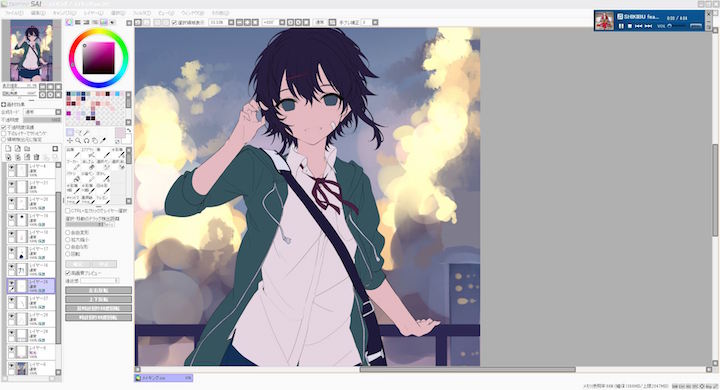
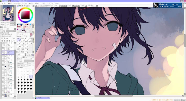
I want my character to be backlit, so I paint shadows roughly on most of her body. The idea is to have some daylight coming from the back, reflecting on the right part of her skin and clothes. Once the illustration is totally shaded, I add a slightly darker color to the line separating dark and light parts - under the eyes, on her hair and so on.
Coloring the background
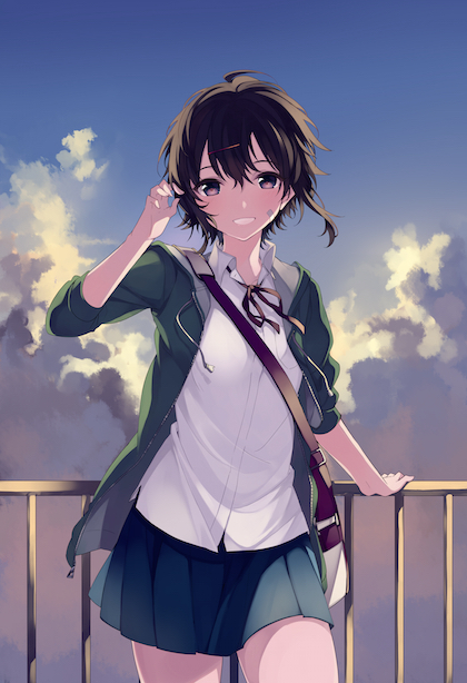
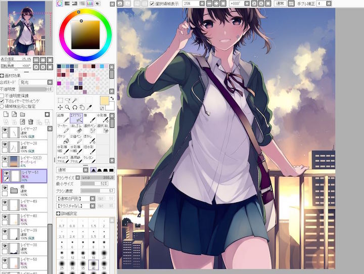
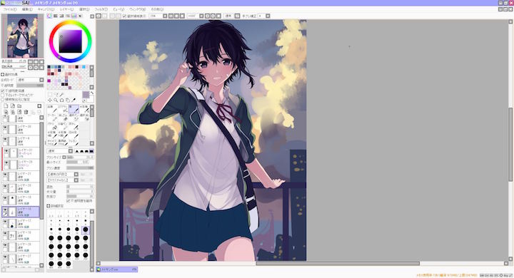
I create a new “luminosity” layer and using one of the pictures I took as a reference, I try to recreate a city skyline during sunset.
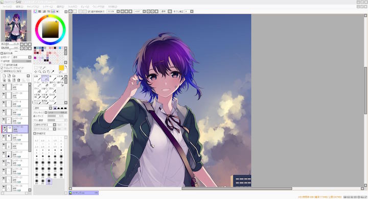
As you can see I didn’t use anime style coloring for the background, so I had to adjust the main character colors to fit the scenery. What’s important is having the courage to change your initial colors! There’s nothing to fear, I swear. From this point on, I’m just making some minor fixes.
Finishing touches
The character was colored in an anime style, while the background looks more painting-like. We have to make the illustration look cohesive, and we’re going to achieve that by making some color adjustments and adding some effects.
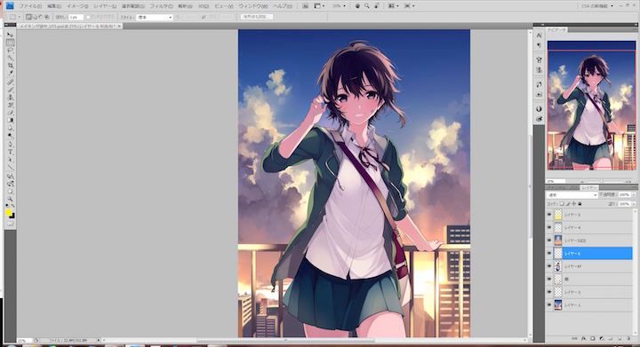
For this step, I use Photoshop. I wasn’t sure about how I wanted the colors to look like, but then I decided to make those lights really pop out.
The character will end up standing out pretty easily, so this whole procedure requires to pay attention. I’m still studying to learn how to make it look better.
Here’s the final result!
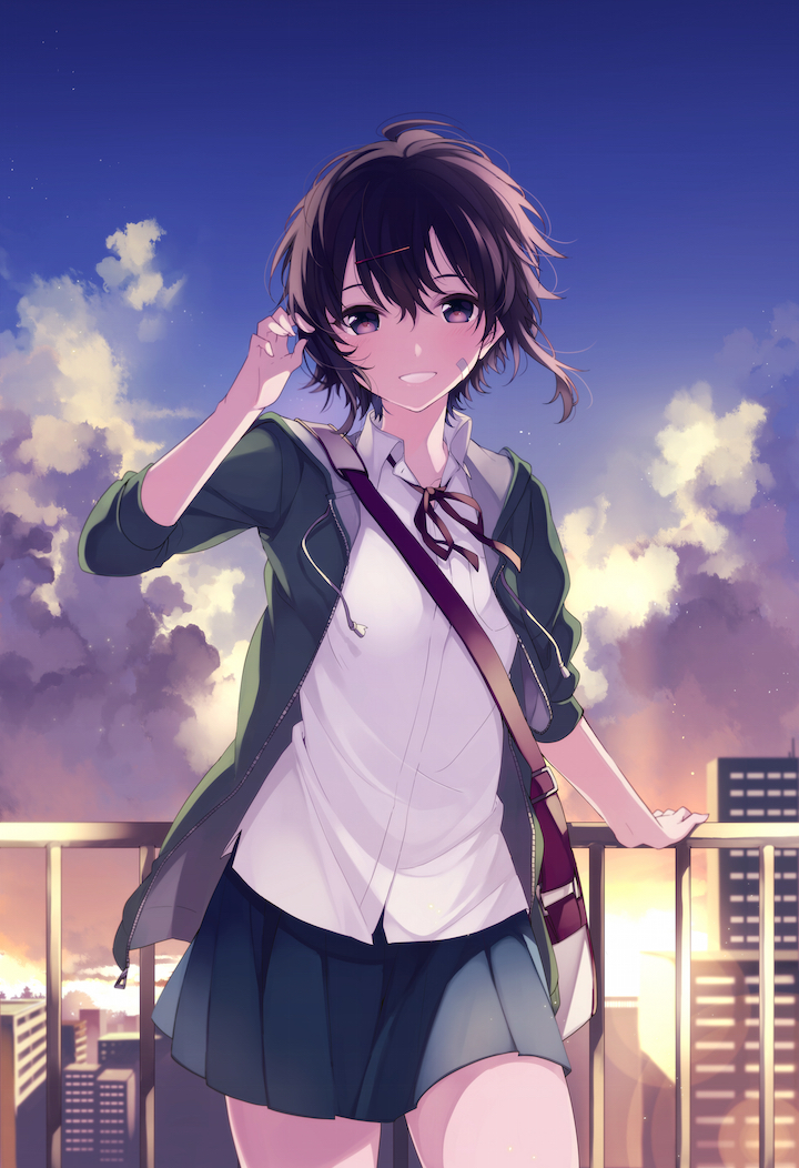
This was a hard one to pull off!
From start to finish, it took me around 16 to 17 hours. The step that took me the most was inking - that alone took about 4 hours. But the “Cintiq 27QHD” made the process so much faster than usual!
