• English
  • 简体中文
  • 繁體中文
  • 한국어
  • ภาษาไทย
  • Bahasa Melayu
  • 日本語
pixivision
Make it interesting
Explore
  • Illustrations
  • Manga
  • Novels
Create
  • Tutorials
  • Behind the Art
  • Materials
Discover
  • Interviews
  • Columns
  • News
  • Top
  • Interviews
  • Much more than just an anime! Exploring the depths of Re:CREATORS
Interviews
2017.07.14

Much more than just an anime! Exploring the depths of Re:CREATORS
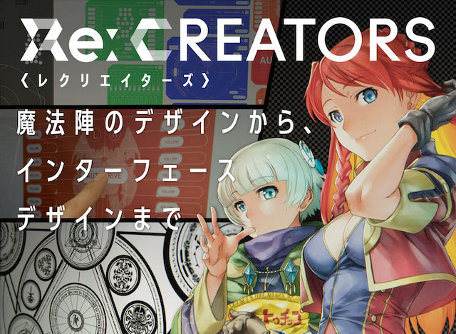
Re:CREATORS is an anime with plenty of twists and turns. One of its peculiarities are the many logos, company names and advertisements appearing in this titles – and they’re designed by the art direction team, which includes Tomoyuki Arima.

He’s in charge of many aspects of the anime, ranging from magic circles design all the way to the interface design of the robot Gigas Machina, piloted by Rui Kanoya. 


In the last interview, we discussed what being a member of the art direction team implies. This time, we'll talk about how logos appearing in the anime were made, and talk with the graphic designer Shinichiro Miyazaki, who's in charge of the design of the magic circles, about the assets he uses in Illustrators and about his secret techniques.

■ The point is to make these designs memorable even if they only appear for a second

-- So, how do you design the logos appearing in the anime?

Shinichiro Miyazaki: the logos are designed by the whole design team, so I think the technique varies depending on the person.

Tomoyuki Arima: when it comes to fictitious logos, it's important to emphasize the stereotypical side of them. You need to look at the storyboard, at the plot, and think about what elements are necessary to convey a certain thing.

Miyazaki: What I do is to add a couple lines of supplementary explanation to each logo I design. I always try to cover what kind of company I'm representing and what it does. Then I pass it on to the other designers.
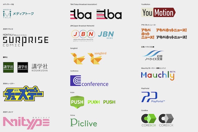
▲ Some fictitious logos. Even though they don't really exist, they look strangely familiar...

-- Does the script say where the logos are going to be used? On a billboard, for example.

Arima: No, you have to use your imagination. For ads that appear in smartphone games, you need also to prepare complimentary text, such as the app store banner, copyright notations and something like "search ___ on the store!". I use a lot of imagination.

-- Do you usually bring out ideas about logos and such in brainstorming and then put different designers in charge of the shape?

Arima: Exactly. We talk in Skype every night discussing what is missing and what we should create. Things that were thought carefully are memorable even if they are displayed on the screen for only an instant.

-- What are you particularly careful to when designing logos?

Arima: I always try to emphasize the various types, and at the same time I try to build that logo's identity.

It's meaningless to only focus on the appearance, and I think a certain theme can be conveyed even if switching between different layouts. It offers a reason to dig deeper into Re:CREATORS, I think.

It's important for the logos to have a story inside the mind of their creators.

Miyazaki: It's a talk we have every time we start a new project.

-- By the way, how many logos did you create in total?

Arima: Between companies and services, I think we created about 30. If you count the icons as well, you have to multiply that number by 3~4.

-- How can you be sure not to be overdoing your logo? How do you confirm they still look different from existing ones?

Arima: Well, I guess we're gonna be okay if the name is different. (laughs) Still, the logos we make are nothing but resources, and it's the animation department that decides how to use them.

Sometimes we talk with director Ei Aoki about how to portray a particular logo once the cast is on board.

Once we confirm the general image with the director, we need to think about whether it's better to create as many as possible or if we need to trace its basic essence first. Also, are they gonna be used for cuts emphasizing reality?

When everything is clear, we need to avoid false-looking logos. That's what I think. 
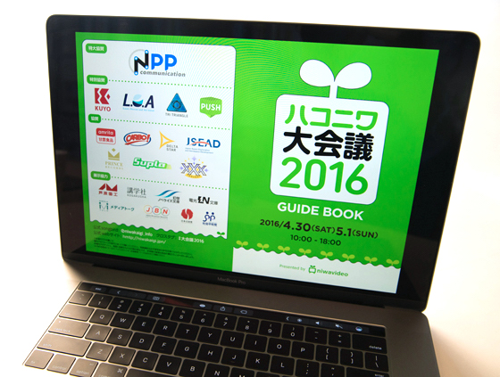
-- In Episode 11, when Sōta Mizushino meets Shimazaki at the station, the scene looks very real.

▲ The pamphlet for the fictitious event "Hakoniwa Conference". The settings are very detailed!

Miyazaki: that particular cut contains a huge amount of details and information.

Arima: As a sponsor of the event, there are heavy industries, aerospace organizations, publishers, and even factional parties (laughs). The intention was to make the event lively, but there is also a clear statement that it would be good to devote resources there.

■ Approaching magic circles starting from the characters' personalities
-- Miyazaki, you're in charge of the magic circles appearing in the anime. What software do you use to design them? Illustrator or Photoshop?

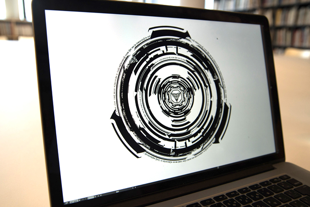
Miyazaki: I mainly use Illustrator brushes. It makes it easier to manage assets, and you don't have to worry about their resolution.

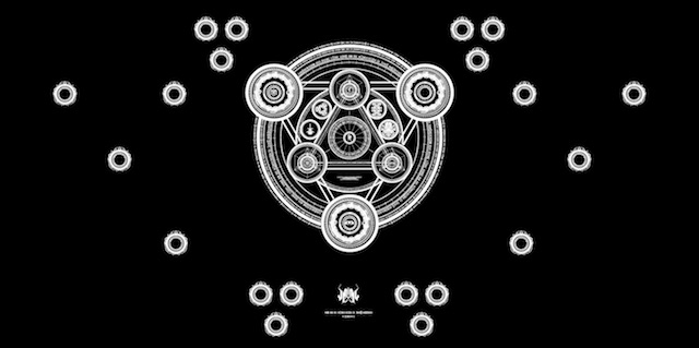
▲ Military Uniform Princess - Altair's magic circle

▲ Zoomed-in view

-- It looks amazing! Do you use materials in your personal collection to create these designs?

Miyazaki: Some of the materials I use are part of a collection, but I adjust some of them myself in order to make the design more unique. The remaining materials were made by me.

-- For example, what was your approach when designing this magic circle in particular?

Miyazaki: When I have to design the magic circle for a particular character, I always try to analyze their backbone and personality.

-- I understand what you mean just by looking at Meteora's magic circle.

Miyazaki: For Meteora, I designed a royal-looking circle.

▲Meteora's magic circle

Arima: When he starts adding little circles around the main one, no one can stop him.

Miyazaki: It's just like a funnel (laughs).

-- It's a very energetic design. I like it!

Miyazaki: If I can talk a little about Altair's circle, I should mention that it has a very special origin. She's a character based on another character really existing, so she's basically fan fiction. Many creators worked with her giving her different traits.

For this reason, I felt the need to design a chaotic circle instead of an ordinary one. I tried incorporating sharp impressions from her personality and costume design. However, it doesn't matter how many fan fictions a character gets, I feel like their fundamental traits are always conserved.

That is why I incorporated in the design some elements from the social game Eternal Wars Megalosphere, where Altair originally comes from.
▲ Eternal Wars Megalosphere logo

-- Megalosphere is in the center, while the rest of the design unfolds arount it.

Miyazaki: Exactly.  Many different meanings were attached to it until we agreed on the ultimate magic circle.

Arima: Altair's magic circle is formed by the repetition of different elements. It's supposed to look like an annual ring. We also had some materials about it...
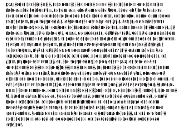
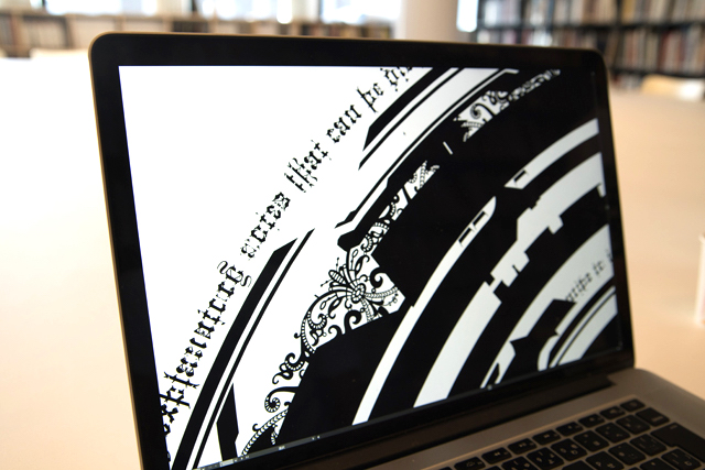
▲ At first sight, it looks like any other font which is commonly used in magic circles. However...

-- These are the letters appearing around the circle, right? It feels like something that would appear in a magic book.

Arima: Actually, we created this font from zero and made it into a font file to be used specifically for magic circles.

--Really!? I knew it's a common practice to incorporate letters into magic circles, but creating a font from zero...

Arima: This font is called dark magic circle regular! (laughs)

Miyazaki: The characters in the world inside the anime are different from those in the real world, and the language system in use is different. We agreed that creating a new system from zero would be the right thing to do. These characters are enough to give the circles a very magical feeling.

--I can see that! I think one of the biggest troubles for creators is the feeling of the unknown going lost if you're always using pre-existing fonts.

Arima: The good thing about being a designer is that you can create something like this starting from scrap materials. After all, creating things is our job. Also, compared to Japanese Kanji, English letters are easier to design!

■ Let's practice creating magic circles!
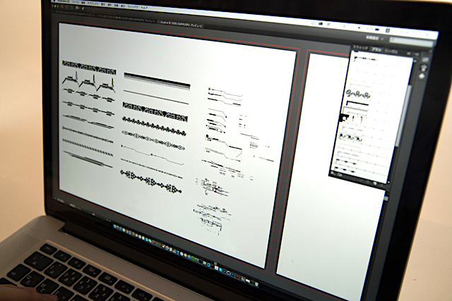
--What's the creative process behind designing a magic circle?

Miyazaki: The first thing I do is to create a lot of assets and register them in the brush palette. I use those brushes in a circular path, change the width of certain lines, duplicate them and clip them with the path finder tool. These adjustments are usually repeated over and over.

▲ Magic circle assets

-- How do you come up with ideas and patterns for your assets?

Miyazaki: I think that making patterns for assets is only a matter of repeating a process trial and error. For example, what happens if you make a nail-like pattern (left)? You need to try if you want to find out. 

I create many patterns and settle for those that are easier to use.


After that, for example, I experiment with adding oblique lines, o try creating radial shapes divided into equal intervals.You need to repeat those experiments.

--How did you design Meteora's magic circle?

Miyazaki: When I made Meteora's magic circle, I thought that I wanted to make it into something with a high sense of royalty. I took a look at the classics and realized there are many magic circles in them, together with ritual circles from mantras and feng shui. I mixed those elements with magical ones, and the final design turned out quite complicated.


Although it is a design with a considerably large amount of information, I think that if you keep the basic composition at its best, you will be able to interpret your own decorations later. By building it up with various combinations of shapes such as circles, triangles, and rays, it will become more and more precise.
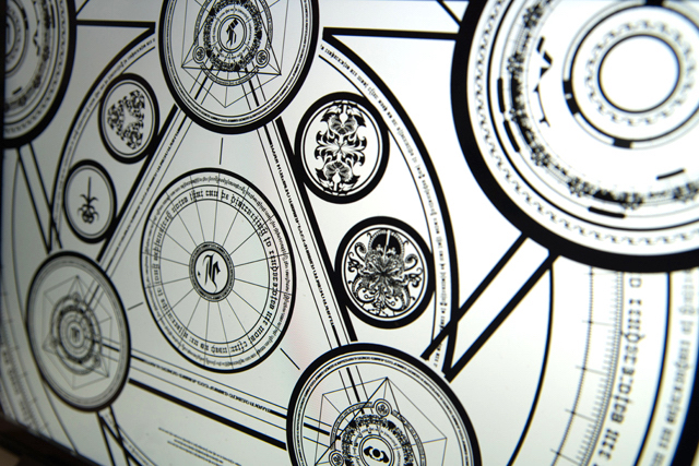
▲ Meteora's magic circle, zoomed in

-- If we zoom in on the design, the details of it become very noticeable. Unfortunately, many details remain unnoticed in the anime...

Miyazaki: A glow effect is applied to it in the anime. It's nearly impossible to see the outline of the circle clearly.

-- By the way, where do you find the inspiration to design your magic circles?

Miyazaki: At the beginning, I knew absolutely nothing about magic circles, so the only thing I could do was to fumble around Pinterest and Tumblr, looking for some specific keywords and analyzing whatever looked like a magic circle. From there, I combined traits from my character with pre-existing models and filled out the space with details.

We asked Miyazaki to show us the exact process he follows to make magic circles. A simple circle will become a complex geometric pattern in the blink of an eye... Are you ready to witness the magic?

[Video under construction]

■ So many secret backstories!
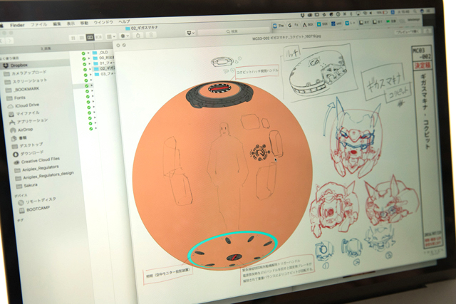
--You also designed the interface of the robot Gigas Machina. It looks like a very advanced design. Did you receive any particular indication?

Arima: About that 360-degree cockpit, some setting pictures were released in the in Blu-ray/DVD col.1. At the meeting with Mr. TROYCA, he told me that he wanted to create a situation where one person was inside the omnidirectional monitor, and he also wanted command windows scattered all around.

▲ The cockpit design for Gigas Machina.

Arima: We also got some indications about the windows. They were very detailed, such as "when you push this button, Gigas Machina will turn to auto drive". I thought a fail-safe function was also essential, for example to revoke certain commands by holding or swiping buttons.

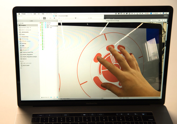
-- By focusing on so many details, the final work will feel way more realistic. When I saw that you could control a command window by inserting your fingers in it, I was blown away!

Arima: I came up with that idea as well. An interface that could be attached to a hand, and lock it at the same coordinates. I got the help from a girl in the office, whose size I feel is close to Rui Kanoya's. That way, I could adjust the size of the interface as well.

▲ This is what happens when you place your hand on it.

-- Wow, it looks so real!

Arima: We also create things like this...

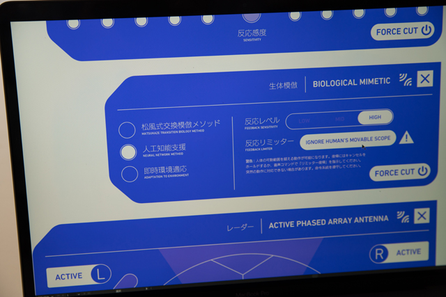
▲It really looks like an interface to control the movements of a robot!

-- What does "Reaction Limiter" mean?

Arima: Even if normally the robot can move only within the movable range of human beings, using the "Reaction Limiter" command makes it possible to move beyond that limit. However, in that case, Kanoya will get some really sore muscles (laughs) 

-- I see! By the way, when is this design going to appear in the anime?

Arima: Never. It's one of my daydreams. (laughs)

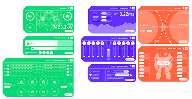
▲ Gigas Machina's interface images

Arima: Robots often come with three interfaces or screens: "power", "reaction", "control". Each interface has a different color. As for this, I talked with a colleague who is developing the Re:CREATORS website, and we are discussed several machine specifications for preparing the design at the text manuscript level.


For example, when performing image processing, you can set the exposure time. If you shoot at a high number of frames, you can also perform slow-motion processing. 
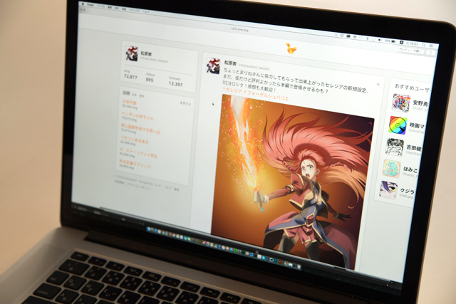
-- These are some secret backstories! Speaking of interfaces, what part of the websites appearing in the anime did you work for?

Arima: This one.

▲ The Songbird service appearing in the anime. It's very similar to Twitter.

-- The placement of the various elements resembles another notorious website...

Arima: We designed the interface in a very straight way. The PC that Matsubara is using comes with a web browser called Cerone and with an OS called Screen, which is very similar to Windows. Sōta is using the same OS, but he's a writer, so the apps in the menu bar are completely different.

-- Very elaborate!

Arima: This scene was very important in order to create a realistic feeling and increasing the power of the title. Still, there are way fewer elements compared to the original service. Also, there are no ads.

■ An elaborate packaging

-- Miyazaki, you were also involved with the creation of the Blu-ray packaging.  Can you tell us exactly what was your job there?

Miyazaki: We think about the character composition for each volume and present it to the author Rei Hiroe. We tie characters together using 3DCG, and add various elements to explain what's gonna happen in that particular volume.

-- What's the part of the packaging that you are most proud of?

Arima: The fact that Anitype, a magazine existing in the anime, is sold in reality as well.

─ The back cover of the Blue-ray/DVD vol.1 is the cover page of Anitype, right? I saw it on the official website. It is really like a magazine.

Arima: It's a 40p booklet, but I wanted it to feel like a magazine rather than a simple booklet. It features artworks and magic circles appearing in the title, the artworks and magic teams in the drama are also included, and you can also see that Selesia Upitiria's original light novel Elemental Symphony of Vogelchevalier is very well made as well, with a back cover and an obi origami you can't see in the anime itself.


Miyazaki: Also, the images of the packages on the web are CGs, not photographs.
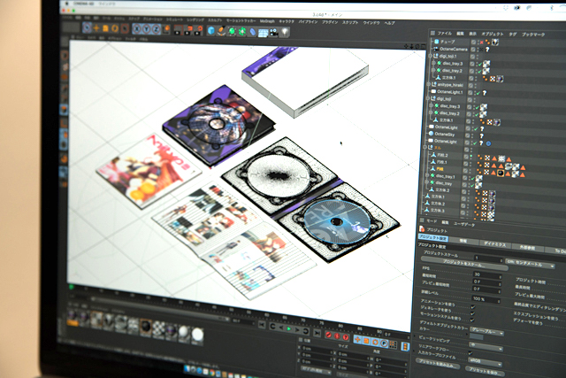
-- Huh? Are they not photographs?

Miyazaki: It's all CG, even trays. By choosing CGs instead of photographs, we don't have to sacrifice a single pixel. It also makes it easier to control the packaging look.

-- It's clear that you didn't only focus on the package itself, but also on how to show it.

Miyazaki: Works like these are often judged by their thumbnails, but I feel that it's important to understand what kind of contents are inside by making the packaging beautiful. 

Arima: I am aiming for something that doesn't look like a natural tone picture. When I actually saw the final result, I realized that it was exactly what I was hoping for.

-- It's good to reach the results you were hoping for! Thank you for your time today.

Share this article
  • Share
  • Post
  • Share
  • Post
Follow pixivision on Facebook!
Find us on X too!
Follow @pixivision
Stay updated with pixivision's daily features!

Newest articles tagged Interviews

  • Behind the scenes with illustrator Tokkyu! How does she refine her personal style and add sparkle to her work?

    Behind the scenes with illustrator Tokkyu! How does she refine her personal style and add sparkle to her work?

  • Interview with Mimimi, the Grand Prize winner of the pixiv High Schoolers Illustration Contest 2025 - “Illustration is just a part of my life.”

    Interview with Mimimi, the Grand Prize winner of the pixiv High Schoolers Illustration Contest 2025 - “Illustration is just a part of my life.”

  • Behind the scenes with illustrator NAKDI! How does she bring characters to life and why does she like sharing works-in-progress?

    Behind the scenes with illustrator NAKDI! How does she bring characters to life and why does she like sharing works-in-progress?

  • Behind the scenes with illustrator ran9u! How does she design characters and add excitement to her drawings?

    Behind the scenes with illustrator ran9u! How does she design characters and add excitement to her drawings?

View more▶︎

Follow pixivision's
official accounts!

p-chanMonthly Ranking
  • Illustrations

    Drawings of Patterned Bikinis - Pre...

  • Illustrations

    Drawings of Pools at Night - After ...

  • Illustrations

    Drawings of Flared and Frilled Biki...

  • Illustrations

    Drawings of Streaked Hair - Lucky S...

  • Illustrations

    [Featured Articles] Summer Illustra...

p-chanFeatured
  • Interviews

    Behind the scenes with illustrator ...

  • Illustrations

    Drawings of Characters in Water - T...

  • Illustrations

    Drawings of the Bunny Ear Pose - Ea...

  • Illustrations

    Fan Art Featuring Genshin Impact's ...

  • Columns

    Curry Zawa Kaoru's Creative Counsel...

Follow pixivision's
official accounts!

  • Top
  • About pixivision
  • Suggest a theme
  • English
  • 简体中文
  • 繁體中文
  • 한국어
  • ภาษาไทย
  • Bahasa Melayu
  • 日本語
  • pixivision
  • About pixiv Inc.
  • Terms of Use
  • Contact Us
  • Advertising
  • Privacy Policy
©pixiv