• English
  • 简体中文
  • 繁體中文
  • 한국어
  • ภาษาไทย
  • Bahasa Melayu
  • 日本語
pixivision
Make it interesting
Explore
  • Illustrations
  • Manga
  • Novels
Create
  • Tutorials
  • Behind the Art
  • Materials
Discover
  • Interviews
  • Columns
  • News
  • Top
  • Behind the Art
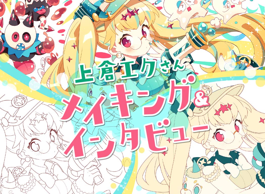
  • Creating sparkling, kawaii drawings - Making & Interview With Eku Uekura
Behind the ArtPR
2017.08.01

Creating sparkling, kawaii drawings - Making & Interview With Eku Uekura
  • interview
  • illustrator interviews
  • making-of
  • author's commentary

Interview, article by Youhei Ogawa
Photography, editing by Takafumi Sekiguchi
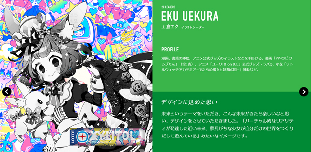
Have you heard of the XYLITOL 20th PROJECT, to commemorate the 20th anniversary of Xylitol Gum? This project features 20 creators in their twenties and is currently ongoing. One of the chosen artists was Eku Uekura, who accepted to work on the design for a special Xylitol Gum packet, and at the same time agreed to let us interview her.

XYLITOL 20th PROJECT website also features the packaging by Eku Uekura.

Eku Uekura's next goal is a solo exhibition. After all, an exhibition featuring only your paintings is a dream for every illustrator. The place where her dream came true is... Akihabara JR Station! From July 31st (Mon) until August 6th (Sun), Uekura's illustration will be exhibited outside Showa Dori Exit, in Akihabara Station.
This time, she's gonna introduce us to the making process behind this very illustration. How to create kawaii illustrations? How to skillfully use sparkling transparencies and pop hues? Check this out!
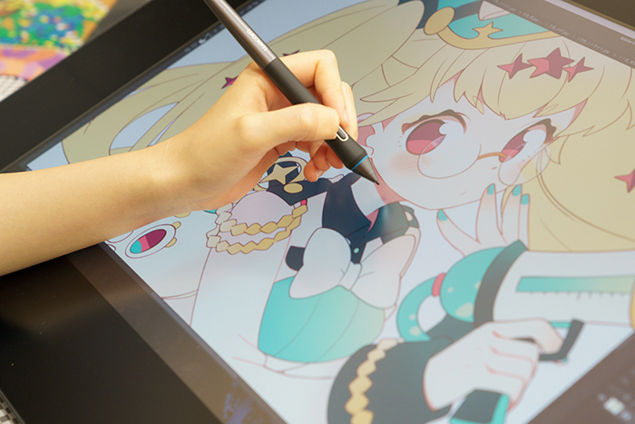
Let's start from costume design!
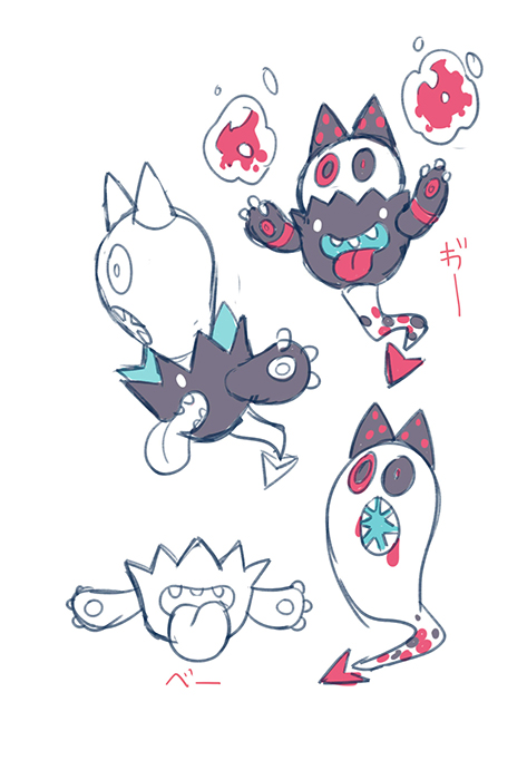
Let's begin with the design of the characters who are going to appear in the illustration.

In my case, since inspiration comes in the following order: from costume design to pose, from pose to facial expression. Never mind the fact that the design of the costume tends to be very different at the end, compared to the initial one (laughs).
The protagonist of the illustration will be XYLITOL-chan (temporary name), who I drew as a police officer, following the theme of "protection", "defense". I chose green for the color palette, the same color of the product itself. For the enemy characters, I was inspired by a magnified picture of a germ. Although I used the same color scheme I used for the main character, I also added brown and red to create a stained effect.

Initial Draft
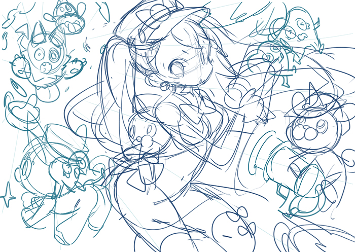
Once the design is settled, I start working on the pose. I redraw the pose several times until I feel it's perfect for the costume I designed. This time, before choosing this pose, I tried to draw 3~4 different ones.
After deciding on a pose, I draw her facial expression. The impression of this character is pretty different from before, right?
I really like KYLITOL-chan and the mascotte character, so I fill all remaining spaces with enemy characters.

Colored Draft
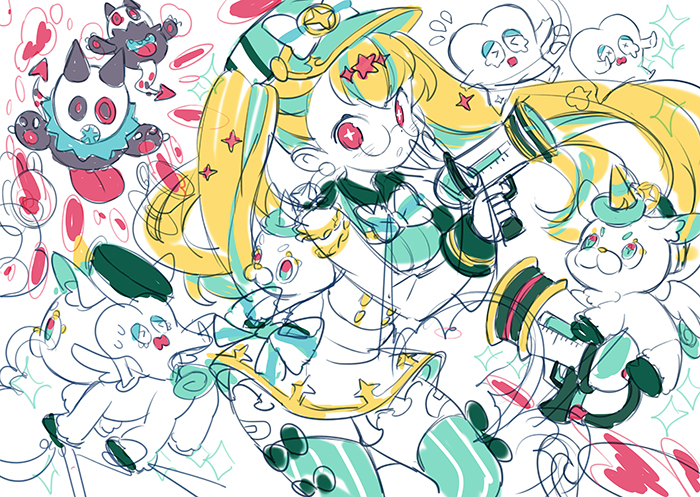
When the initial draft is finished, I will roughly place the colors and take a look at the overall balance. Although color design is often over at the character design stage, it's essential to check whether the color arrangement looks good or not if you look at the complete picture. It will also help you grasp an idea of how the illustration will look like once it's finished.

Lineart

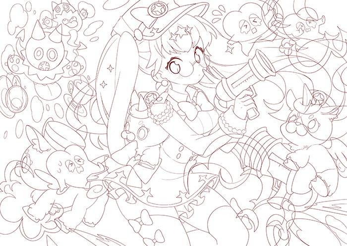
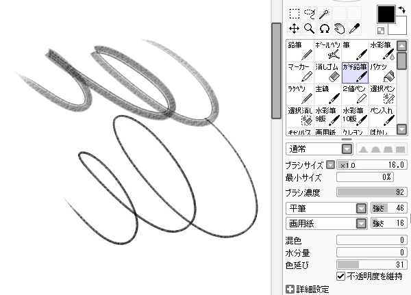
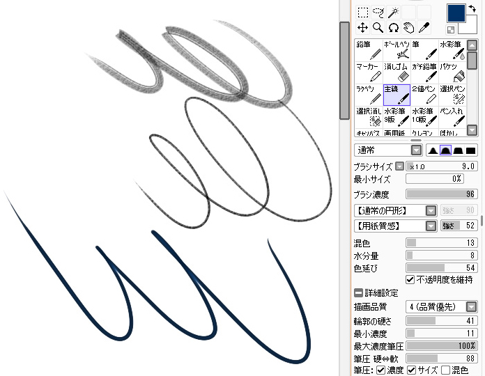
Let's clean up the lineart. I create a new layer on top of the draft and use it for the linework. However, I don't use the basic settings: instead, I have a personalized brush, designed to look like a pencil.

If you want your brush to look soft and smooth, you should try these value settings.

While if you want a sharper effect, you should try these other value settings.

Since there will be times when you will have to change the color of the lineart, I draw the lineart on different layers, separated according to the different parts (XYLITOL-chan in the middle uses up 15 layers herself).
Sometimes I also shift the placement of the characters, so when it comes to the characters behind the protagonist, I think it's useful to draw even the parts that are going to be hidden later on.

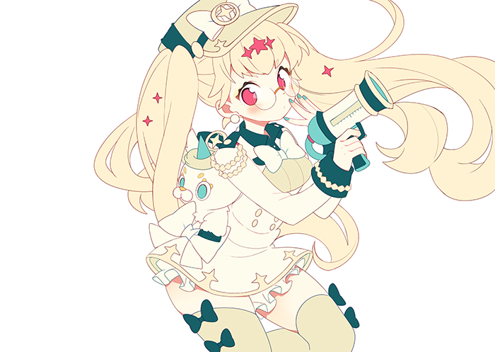
Base Colors #1
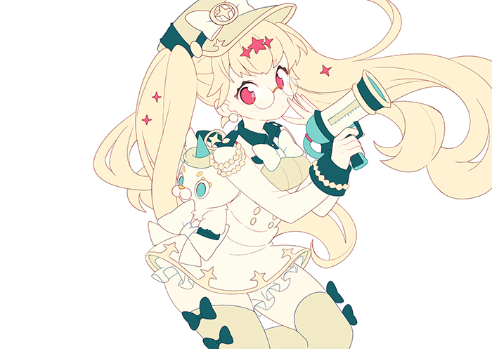
Once my lineart is done, I start coloring my illustration from the base colors. I start from yellow and green, the base colors, and the color of her skin. I do this without thinking about it too much, using the bucket tool.

Base Colors #2

When I finish applying a color, I prefer to recreate the skin texture before moving on to shadows and highlights. My coloring style features many gradations, so I like to recreate a sense of roundness before doing anything else.
I'm clipping the textures to a new layer and add some effects with a brush. In this case, I'm using a multiply layer.

Coloring #1
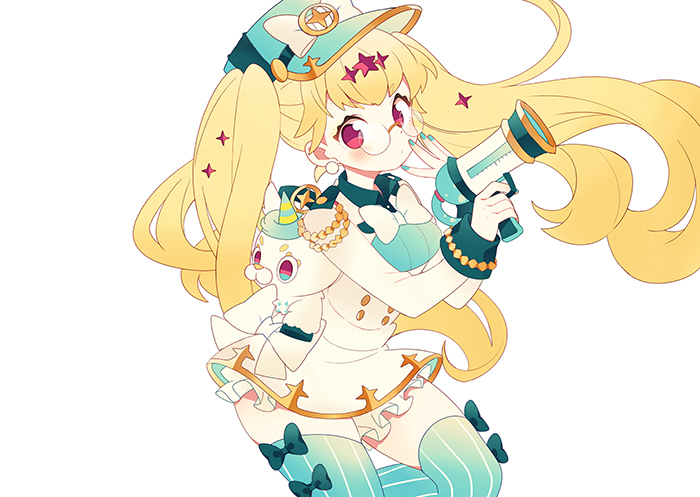
After laying the basic colors, it's time to color. The color of her skin and yellow are already in place, so let's move on to another important color of this composition: I add green, and add gradations to her hair etc. Both for the green parts and her hair, I create a new layer, clip it to the one below and use it to add multiple gradations.

Coloring #2

Time to add color to recreate the stereoscopic effect of the hair. I follow the same procedure I followed while coloring the other parts.

Shading

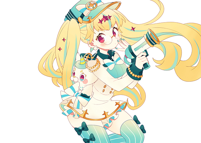
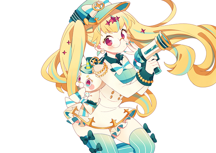
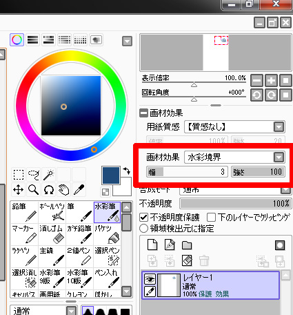
The colors are done, so I start shading the illustration. I use multiply clipping layers. When I do so, I set the layer mode to fringe, so the shadows appear neater. After deciding where to use fringe and where not, the different textures in the illustrations appear clearer and a sense of unity is created in the painting. I don't add effects to the shadows on her skin, but I do for her hair, clothes and for the finer details.

Fringe setting screen.

By selecting the fringe mode before adding a color, you can create some tiny borders around it.

Highlights
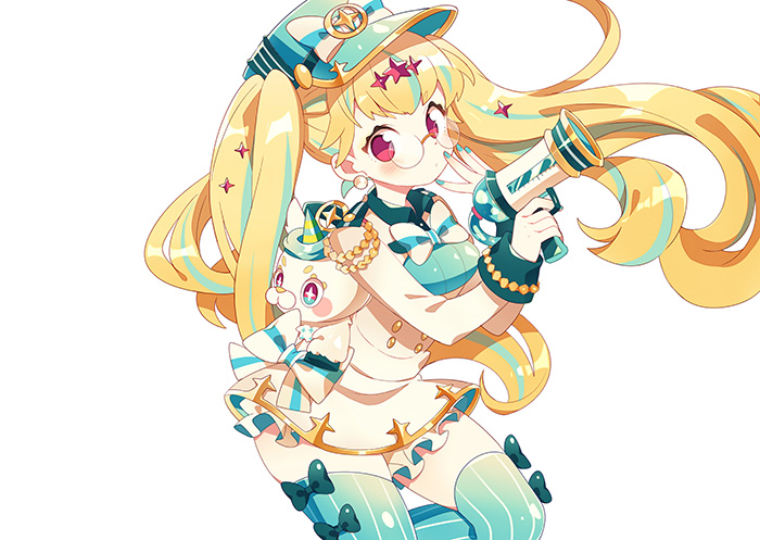
After the shadows, I proceed to add highlights. I express highlights by using luminescence layers instead of multiply ones. I will increase the number of information in the illustration by adding a darker color next to the highlights.

The brush size that I choose is between 100~200, and I add highlights abundantly to all those parts that require them. I will proceed to erase unnecessary part at a later time. 

By adding highlights, you can create different textures

Even with the same painting method, you can change the texture of a material by adding highlights. When expressing objects illuminated by a light source, the brightness of it usually changes in the following order: highlights, neutral color, shadows. However, this time, I skipped the neutral colors when placing highlights to her hair decorations. In this way, you can give the object a sense of transparency, so it’s especially recommended if you want to create a glittery texture. 

Background and Finishing

With the last highlights, XYLITOL-chan is finally complete. Now it’s the time to fill the background with enemy characters. The painting process doesn’t change much. I just repeat the same coloring process over and over again…

After I’m done, I add some more effects. I add a glittery, mysterious liquid coming out of the water gun (?) and so on. I add density to the illustration to adjust the overall balance. Since I feel like the illustration would really pop out and look even more kawaii by adding some more sparkles, I add them all over. 

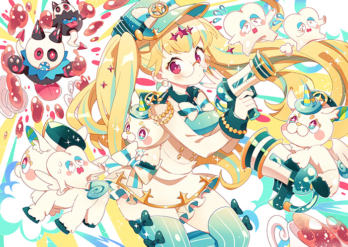
Finished illustration!
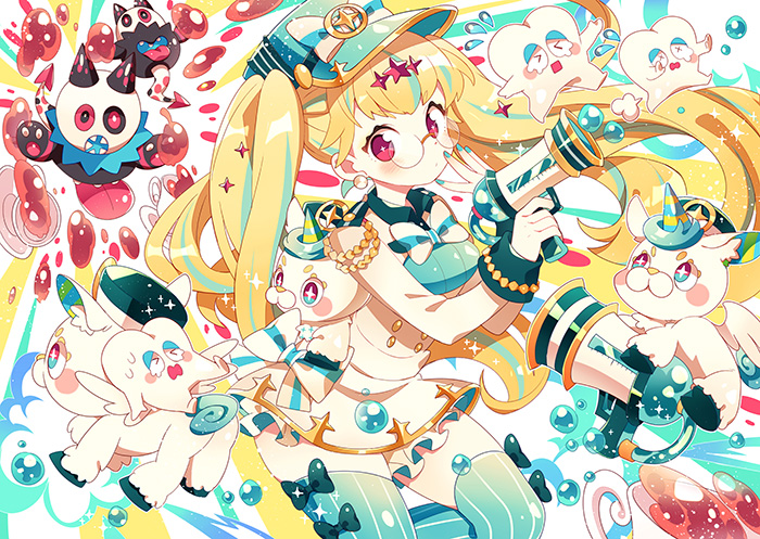
I complete the illustration by slightly adjusting the overall color balance. Thank you so much for reading this article until the end!

What I do when drawing is to start from the lineart and color each part one by one, before adjusting the balance in the end. This way, though, I’m going to end up with a multitude of layers. I cannot recommend this method with big-sized illustrations like this one, but it’s indeed convenient when it comes to adjustments. However, everyone tends to draw in their very own way. You should try and work out a way to find balance for yourself.

A personal exhibition @ Akihabara JR Station!
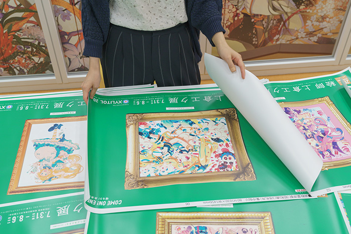
On the same day of our interview, Eku received the colored proofs of the posters that are going to be displayed in Akihabara JR Station. After checking them thoroughly, she seems perfectly satisfied! If you have the chance, definitely check out her work in Akihabara JR Station, Showa Dori Exit, from July 31 (Mon) until August 6 (Sun)! ♪

Eku Uekura
  • Eku Uekura
  • Born on June 17th in Kamakura Prefecture. Illustrator and mangaka. She worked as a manga artist, cover illustrator, illustrator,
    character designer, SD character designer, she illustrated CD jackets and more.

  • pixiv
    Twitter:
    Personal Website:
Provided by:株式会社ロッテ / Planning & Production:pixiv

Newest articles tagged making-of

  • The Making of 13 Copic Drawings - A Lesson in Coloring

    The Making of 13 Copic Drawings - A Lesson in Coloring

  • The Making of 15 Watercolor and Colored Pencil Drawings - A Glimpse Behind the Scenes

    The Making of 15 Watercolor and Colored Pencil Drawings - A Glimpse Behind the Scenes

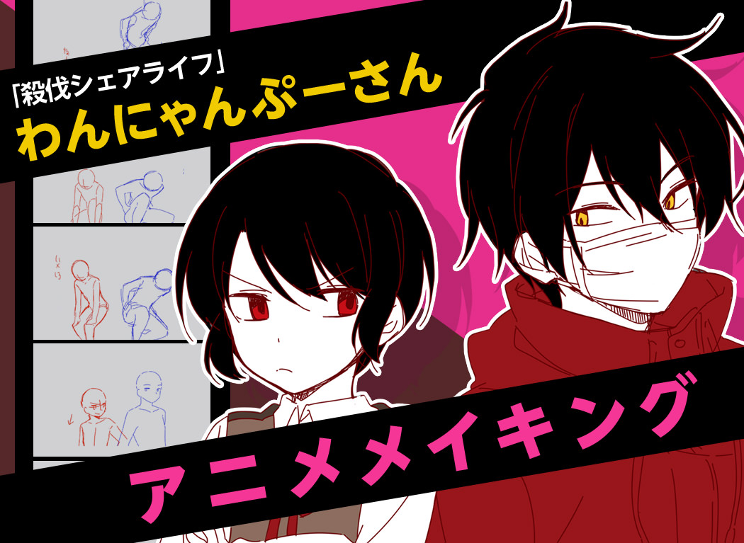
  • Animations of Works In Progress - Capturing the Creative Process

    Animations of Works In Progress - Capturing the Creative Process

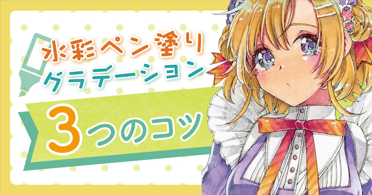
  • 3 Tips to Achieve Smooth and Cute Colors Using Gradients and Water! - Behold the Power of Water-Based Markers!

    3 Tips to Achieve Smooth and Cute Colors Using Gradients and Water! - Behold the Power of Water-Based Markers!

If you liked making-of, you will also love...

  • Ita-Nail Movie - Drawing Challenge: Jotaro Kujo, Noriaki Kakyoin and DIO! (JoJo's Bizarre Adventure)

    Ita-Nail Movie - Drawing Challenge: Jotaro Kujo, Noriaki Kakyoin and DIO! (JoJo's Bizarre Adventure)

  • How To Create Pixel Art GIFs? An Interview With Illustrator Yuuta Toyoi

    How To Create Pixel Art GIFs? An Interview With Illustrator Yuuta Toyoi

  • How to go about doing Ita-Nail art! Tutorial for Noriaki Kakyoin Nails (Jojo’s Bizarre Adventure)

    How to go about doing Ita-Nail art! Tutorial for Noriaki Kakyoin Nails (Jojo’s Bizarre Adventure)

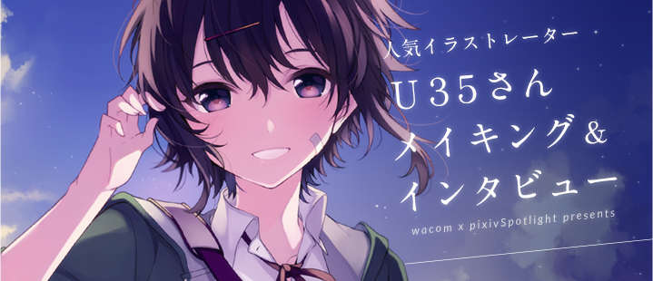
  • What are the steps for charming characters and beautiful hues? A making-of and interview with U35!

    What are the steps for charming characters and beautiful hues? A making-of and interview with U35!

  • Drawing Coloring Tutorials: Cel-shading & Thick Painting

    Drawing Coloring Tutorials: Cel-shading & Thick Painting

  • Rella making-of and interview - Drawing a peaceful and elegant world with Adobe Photoshop CC

    Rella making-of and interview - Drawing a peaceful and elegant world with Adobe Photoshop CC

Share this article
  • Share
  • Post
  • Share
  • Post

Tags:

  • interview
  • illustrator interviews
  • making-of
  • author's commentary
Follow pixivision on Facebook!
Find us on X too!
Follow @pixivision
Stay updated with pixivision's daily features!

Newest articles tagged Behind the Art

  • The Making of 13 Copic Drawings - A Lesson in Coloring

    The Making of 13 Copic Drawings - A Lesson in Coloring

  • The Making of 15 Watercolor and Colored Pencil Drawings - A Glimpse Behind the Scenes

    The Making of 15 Watercolor and Colored Pencil Drawings - A Glimpse Behind the Scenes

  • Are you ready for Comiket? Useful Techniques For Your Event Booth

    Are you ready for Comiket? Useful Techniques For Your Event Booth

  • Wait a second! (Almost) Useless Tutorials

    Wait a second! (Almost) Useless Tutorials

View more▶︎

Follow pixivision's
official accounts!

p-chanMonthly Ranking
  • Illustrations

    Drawings of Pools at Night - After ...

  • Illustrations

    [Featured Articles] Summer Illustra...

  • Illustrations

    Drawings of Streaked Hair - Lucky S...

  • Illustrations

    Drawings of Flared and Frilled Biki...

  • Illustrations

    Drawings of White Bikinis VS Black ...

p-chanFeatured
  • Illustrations

    Drawings Tagged With #IrasutoyaChal...

  • Illustrations

    Drawings of Swim Rings - Staying Af...

  • Illustrations

    Drawings of the Bunny Ear Pose - Ea...

  • Tutorials

    How to Draw Chibi Poses - Posing in...

  • Illustrations

    Drawings Featuring Sandals - Light ...

Follow pixivision's
official accounts!

  • Top
  • About pixivision
  • Suggest a theme
  • English
  • 简体中文
  • 繁體中文
  • 한국어
  • ภาษาไทย
  • Bahasa Melayu
  • 日本語
  • pixivision
  • About pixiv Inc.
  • Terms of Use
  • Contact Us
  • Advertising
  • Privacy Policy
©pixiv