
Coloring Techniques to Upgrade Your Art!! Feat. Naoki Saito and More!
A color that lifts up your spirit, a color that makes you feel refreshed, and a color that calms you down--when you're asked these questions, what kinds of colors do you imagine? Sometimes a color is an extension of our mind and other times, it is something that heavily influences our mind.
It's a nice feeling when you know that the colors in your illustration inspire your audience. But have you ever been in a slump where no matter how many colors you've used, the illustration still doesn't sit well with you? What if we tell you that the cause is probably the way you use colors...?
Author: Yohei Ogawa
Editor & Photography: Hitomi Sakuma
Different colors are needed to create a colored illustration and the amount of color combinations that you can achieve is infinite(!) Which is probably why many artists face the trouble of deciding what colors to combine and how.
This time we're featuring a special lecture to help 3 people who love drawing but are currently facing the trouble of using colors the right way. We have invited Naoki Saito, an illustrator who has worked in many fields as a creator of character designs and illustrations for various manga and novels, and Fumiko Ishii, a certified color instructor of the Public Interest Incorporated Association Advance Forward True Colors, to be our lecturers and they have answered our questions in details.
You will find hints to solve your problem here as well!
First of all, let's draw something!

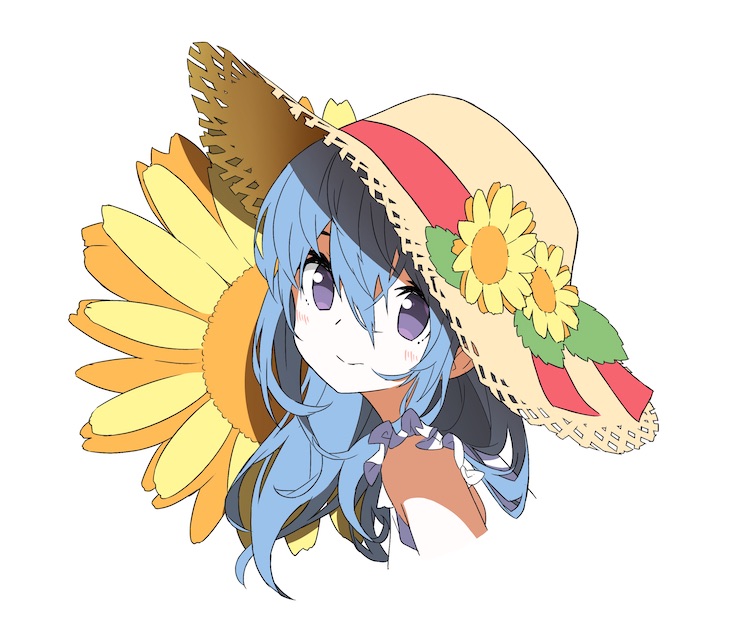
The 3 people who have been invited to be the participants of this lecture were Harada, Yohira, and Morita. These 3 people frequently draw because drawing is their hobby, but what they have in common is the following problem: they don't know how to improve their skill of drawing colored illustrations. So we asked them to color the lined illustration.
Let's take a look at the results!
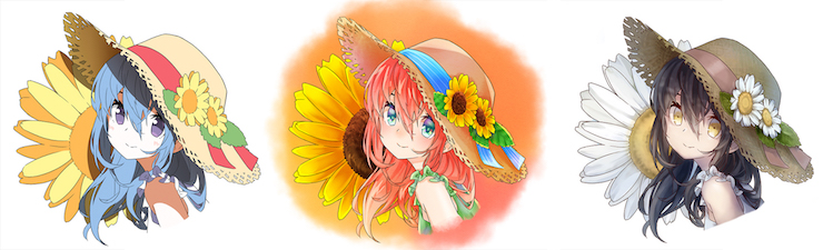
They have all come up with beautiful colors and each work is attractive enough as it is now, but...?
Morita's work (with 2 years of drawing experience)
Morita:
It is a beautiful and summery illustration, but it has a slightly 'transient' vibe to it. It's like watching a girl who isn't an outdoor type spending a day outside... I started coloring her skin first and then moved to her eyes and the parts around her face before bringing the illustration to completion.
I think what's wonderful about this work is that the brightness, hue, and saturation(*)--these three elements are properly arranged and the application of the brightness, which is the most important thing, is solid. The proof of that is our eyes immediately go to her eyes and hat.
Ishii:
Learning how to make good use of colors and to balance them is going to be amazing. This work is going to come out to be a masterpiece.
Advice from the Pros
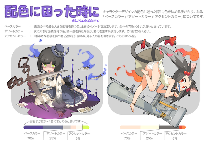
The balance that Saito recommends is as follows.
3 types of colors
・Base color
The color that occupies the largest area of the screen. It should cover about 70% of the canvas.
・Subordinate colors
The next most predominant color. The artist can decide whether it should match the base color or not. It should cover about 25% of the canvas.
・Accent colors
The color covering the smallest area of the screen. It is used to draw the attention of the viewer and it should cover about 5% of the canvas.
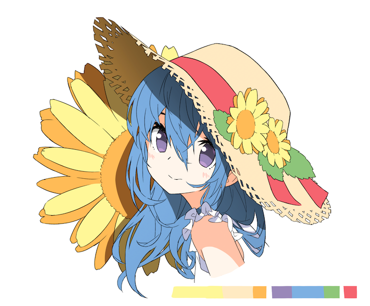
In this illustration, you can see the ideal proportion of base colors (skin, hat, petals etc) that decides the atmosphere of the whole image, subordinate colors (hair, pupils, leaves, etc.) that produce change, accent color (ribbon). The reason it feels so comfortable to look at is this balance.
On top of that, the pros presented a couple of suggestions to make the illustration even more attractive.
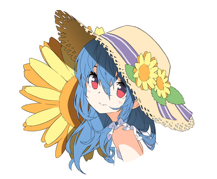
Red is the color that most attracts the eye
Let's learn about complementary colors!
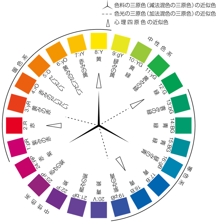
The reason why the blue hair of the girl is very impactful is that the yellow and blue of sunflowers are in a complementary relationship. Blue is a difficult color which feeling can change according to its surrounding hues, but in this illustration, it comes out really well. Great! This is the effect of complementary colors.
The author said they chose these particular colors following their heart, and nevertheless, the colors chosen are following all the criteria expressed above: amazing!
However, with the necessary knowledge, you can make your illustrations even more impactful. With the necessary knowledge, the drawings you have to discard due to a lack of inspiration will dramatically decrease!
What are complementary colors?
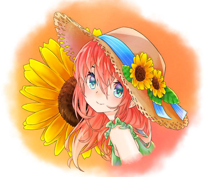
Yohira's rich use of colors
Yohira:
The eyes of the girl look very cute, especially combined with those huge sunflowers. Flowers are my favorite motif, so I always have fun thinking about how to paint them. In the end, I decided to paint the whole image according to the colors of the sunflowers.
Ishii:
The illustration looks very compact, thanks to its rich hues and bright and vivid tones. I really like the glossy finish of the girl's arms, they're painted very well. There are many different colors in this picture, but there's almost no difference in luminosity. You can tell it has a very feminine taste.
Saito:
Energy is overflowing from the painting! I think the idea was to make this illustration look as energetic as possible. There are not many people who can combine intention and results, so you should be proud of your work! Despite the variety of colors, it's very well balanced. I would never have chosen green for her dress, but it's the use of green itself what makes this illustration so impressive.
Advice from the Pros
Let's try adjusting the brightness
To make an image feel more vivid, you need stronger elements and weaker elements to coexist.
In this illustration, all the sunflowers are drawn with the same brightness, so it would be an interesting experiment to paint the central large sunflower with a bigger brightness difference and the small two on the hat with a reduced brightness difference. By adopting this technique for the leaves and the ribbon on the hat, you can choose what details you want to be at the center of the attention.
How to express vividness
Harada's lifelike illustration
Harada:
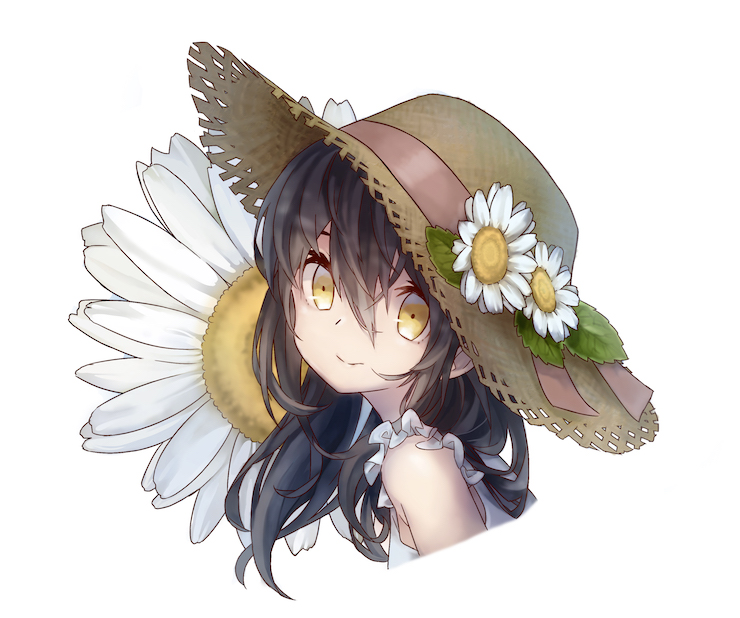
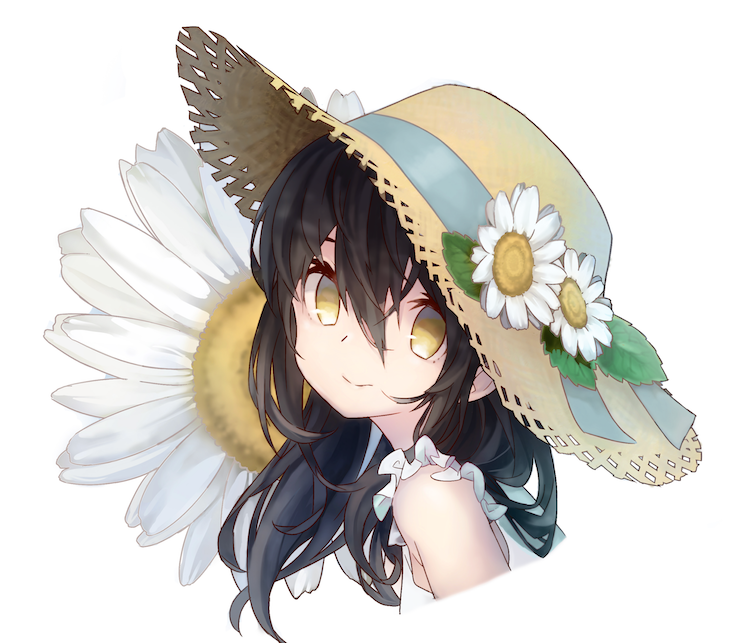
When I saw the line drawing I instantly got a pretty bright, gentle impression. I tried to paint the flowers white instead of yellow. I hope this illustration conveys a summery feeling...
Saito:
You can understand at a first glance that this artwork was colored by an experienced illustrator, due to the cleanliness of the color.
The author perfectly knew what they wanted to express!
Ishii:
I agree. The accent of blue in the back of the hat also looks very good. I also use color differences like this one sometimes.
Advice from the Pros
Never use black for shadows
Guiding the line of sight
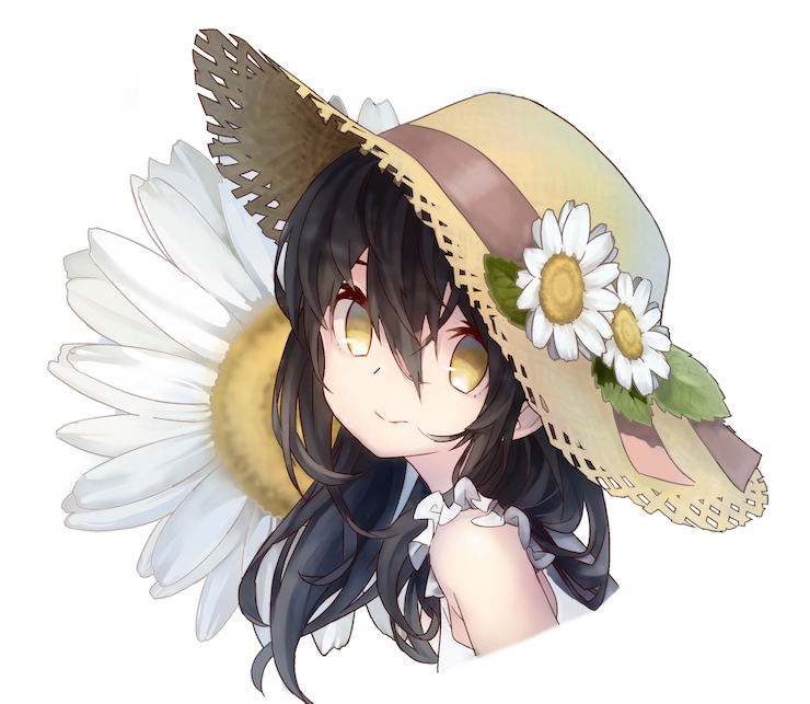
Neat artworks come in cold colors
Focal points:
Dark colors don't feel very neat. By changing a few colors, we now have an illustration which is mostly white and blue, but these two colors alone look a bit boring. For this reason, we will need a warmer color to act as the focal point of the drawing.
Let's put these pieces of advice into practice!
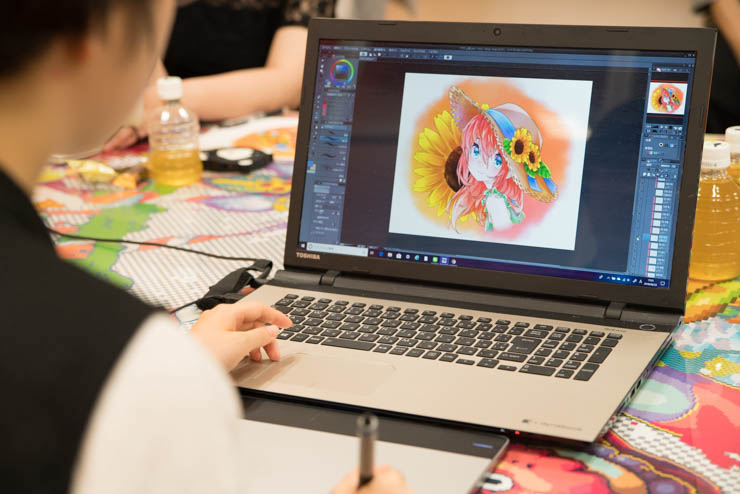
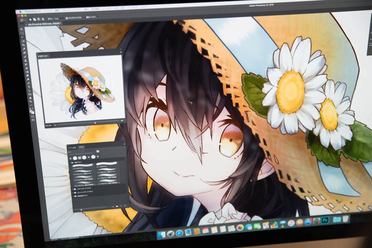
After a comprehensive review by Saito and Ishii, the lecture moves to practical skill where our artist will be able to put their advice into practice!
The teachers are ready to reply to any questions on the spot, but the allotted time is only 90 minutes (!). The three artists will have to focus if they want to make good use of the advice they received in such a limited time.
Always display the whole picture!
When in trouble, try black and white
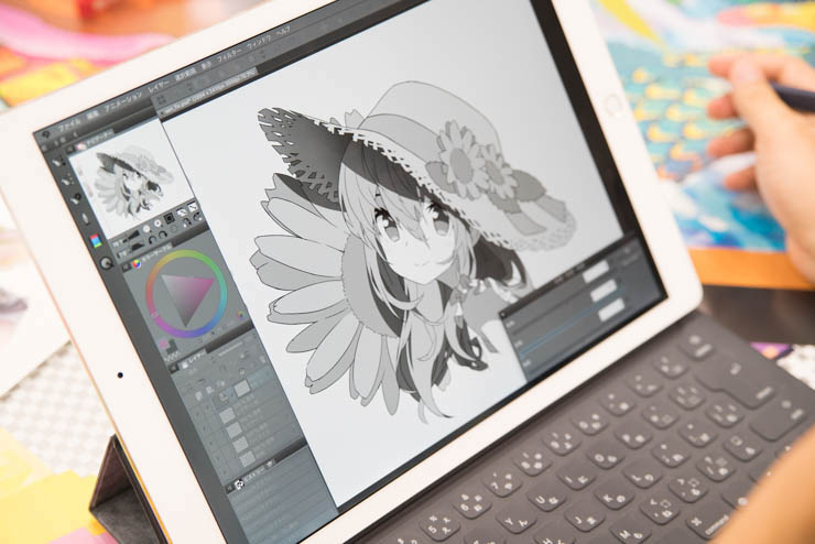
Try hemming
It is possible to give the spectator a sharp impression of the illustration by thinning the line drawing and blackening only the outermost outline. Try changing colors only on the outside of the hair, or according to each article of clothing. It's a technique that works in many different ways, so don't hesitate to try your hand at it!
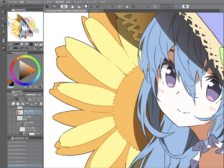
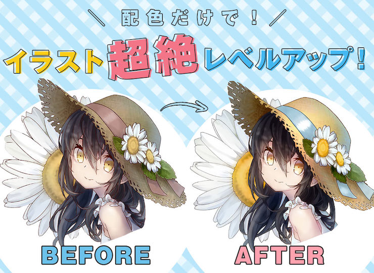
What does the finished result look like!? Before & After comparison
Morita's illustration
Morita:
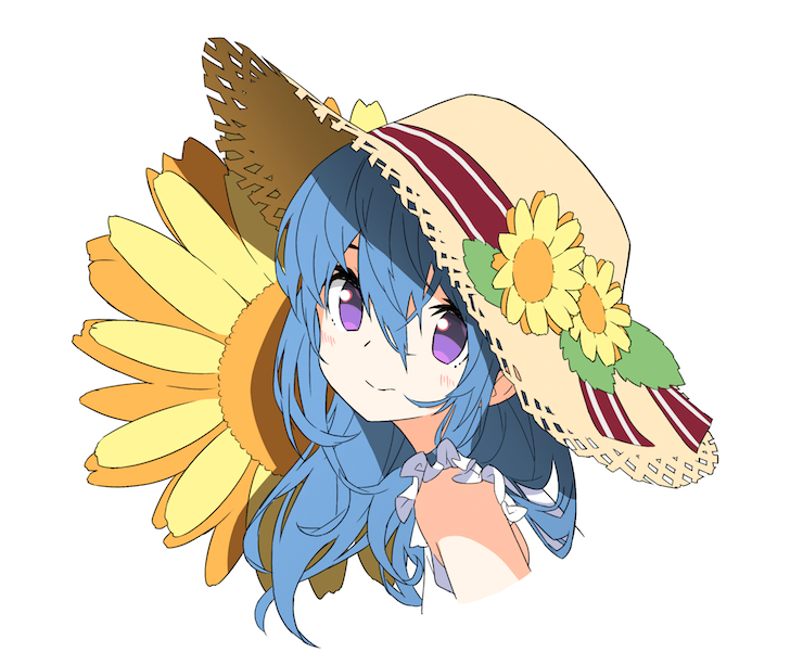
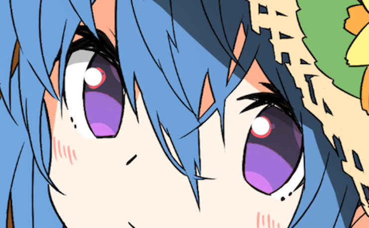
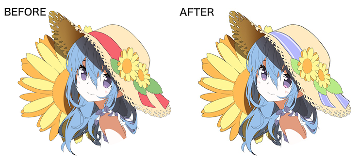
Since I was pointed out that the attention was naturally drawn to red of the ribbon, I changed the color and tried using red for the highlights of the eyes.
Saito:
By even just adding two stripes to the hat ribbon, the illustration just got more girly! I really like it. By adjusting the lighting of the painting, the balance got way better. However, the red in the highlights of her eyes is a little bit hard to spot, so I would enlarge the area a little bit. Also, by adding different colors to the lineart, the illustration now looks softer - despite being something that might go unnoticed if looking at the zoomed-out illustration.
Ishii:
By making the girl's skin brighter, the illustration has now an even more summery feeling. Like Sato said, I would have added more red to her eyes.
Yohira's illustration
Yohira:
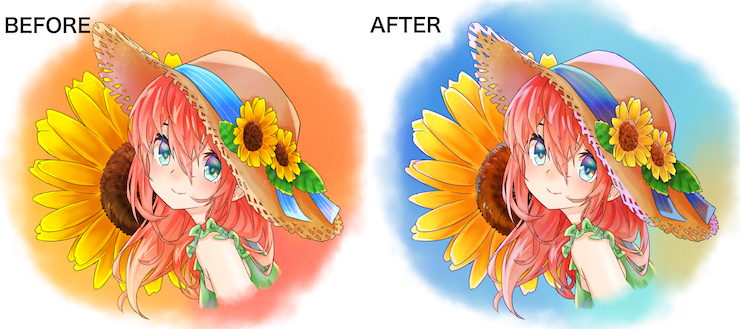
At first, I used an overwhelming amount of orange in this illustration, so I dared to change the background to blue this time. I tried also adding the reflection of the blue sky. What do you think?
Saito:
I like that you used a little bit of blue in the sunflowers. I think it's great that you can use a color like that so smoothly! Changing colors so drastically takes courage, and the pickier you are, the harder it is to make those changes.
By raising the lightness of the sunflower seeds, my eye is drawn to the character's face. Adding three different level of brightness creates a pleasant rhythm on the screen!
Ishii:
Summer comes in two ways: in the warm tones of red, the ones who make you sweat, and in the cool blue shades. This work has changed so much from the initial version! Yohira had the courage to change their work completely, and I feel this is an important strength to have.
Harada's illustration
Harada:
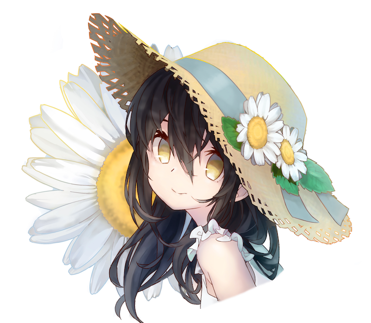
Since I was taught about the difference between light and darkness, I replaced all the contrast and tried to change the colors that do not match the idea of "cleanliness and tidiness".
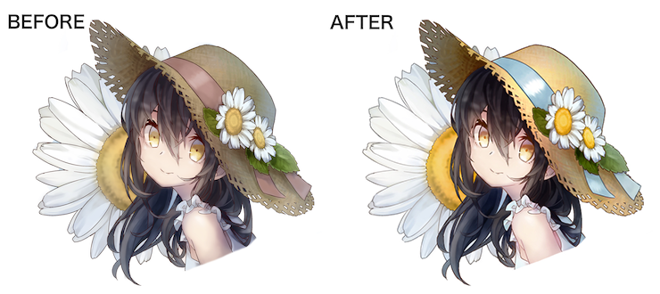
Saito:
The earhly tones brought this illustration to a whole new level.
One thing that truly changed is that now the illustration seems to have a good fragrance. When shadows are black it's hard to make a painting look neat and fresh, but by changing the color of the shadows just slightly the image looks way cleaner! So the first thing I thought when seeing the revised illustration was "it looks like it smells good"! It makes you wanna sniff it.
Ishii:
I'm very impressed that Harada's illustration improved so much in such a short time. Due to the adjustment of the colors and of the sharpness of the painting, her skin now looks so much softer - especially on the shoulder. In addition, by adding more white, white itself stands out even more. Harada put my advice into solid practice, and this makes me ecstatic.
Our teachers also show off their works!
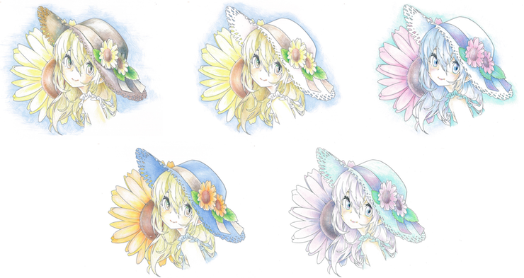
Ishii's illustrations
Ishii:
I think everyone would start coloring this artwork from the girl, so I decided to start from the flowers instead. I tried out multiple patterns to understand how I could improve the colors of the flowers.
In all these illustrations, I'm using about 8 to 9 colors for the whole picture. I think that you can see that the direction of the work is decided naturally with the image of color.
Saito's illustration
Saito:
I drew this lineart with the idea of "tidiness and cleanliness" in mind, but I decided to do something different from everyone else by using energetic colors instead.
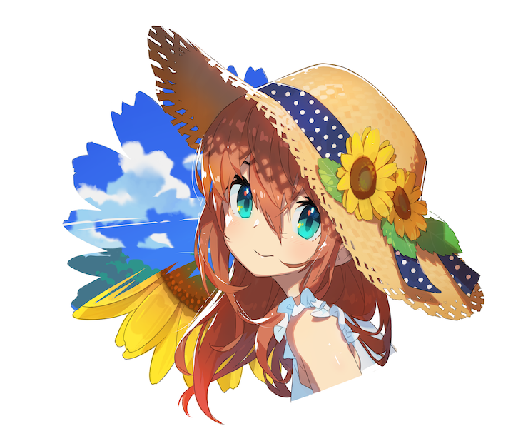
Saito:
It's a technique to make yellow and orange stand out more. I added the blue sky to use a complementary color, and I also used blue as an accent in the girl's eyes.
Also, in order to give the image a sense of texture, the hat is textured and made a bit darker. You can hardly see it, but at the same time, you can tell that it is a straw hat. Adjusting the brightness is very important.
The end of the lesson
Ishii:
Painting always requires observation. Especially when drawing a slightly deformed world, it is necessary to add a bit of reality to avoid making the illustration look too light. You've got to add and subtract. In the theater world, it is said that even things that are real look like a farce on stage. Gestures need to be amplified.
It's just the same when it comes to illustration. Drawing and coloring follow the same principles.
Saito:
The correction time allotted in this course is only 90 minutes. 90 minutes feel like ages when standing up still, but feel like an instant when you're drawing. It's amazing that you were able to improve your coloring in such a short time. The power of youth! I was supposed to be a teacher, but in the end, I learned so many things. I am very thankful for this experience, and I hope I was helpful.
So, what do you think?
Where you surprised at the dramatic changes that occurred in these illustrations in just 90 minutes? The power of colors is to make the intentions of the creator clear, and to convey emotions directly from the screen. Colors are amazing, aren't they?
If you think colors are amazing, try challenging the Shikisai Kentei test!
If you would like to learn more about color, please visit the Shikisai Kentei (color examination) association's site by all means. It is full of information such as the reason behind the power of colors and the proper way to learn about it!
The Winter 2018 test will be held on Sunday, November 11, 2018, and applications are open! Applications can be made from the internet and about 400 test sites are located throughout Japan. Why don't you challenge yourself to take the exam in November? You can gain useful knowledge to become an even better illustrator!
"Shikisai Kentei" Winter 2018: find the details here!
Application period:
August 1st (Wed) ~ October 4th (Thu)
Internet application extension: October 5th (Fri) ~ October 11th (Thu)
Test dates:
Level 3, 2, 1: November 11th (Sun)
Level 1 Part 2, Level UC: December 16th (Sun)
Test times:
[Level 3] 10:30 ~ 11:40 (70min)
[Level 2] 13:00 ~ 14:20 (80min)
[Level 1] 15:10 ~ 16:40 (90min)
[Level 1 Part 2] 12:00 ~ 13:30 (90min)
[Level UC] 15:00 ~ 16:00 (60min)



About brightness, hue and saturation
・Brightness
Literally the brightness of the color. When you increase the brightness of the color red, it becomes pink. When you lower it, it becomes reddish brown.
・Hue
Red shades, blue shades, green shades. The true nature of colors. For example, both red and pink have a red hue.
・Saturation
The vividness of the color. Think about the reddest of reds and imagine gradually adding a shade of gray to it. The color will become duller, even though its brightness stays the same. The saturation decreases as the proportion of gray increases and the proportion of red decreases, making the color progressively achromatic.