• English
  • 简体中文
  • 繁體中文
  • 한국어
  • ภาษาไทย
  • Bahasa Melayu
  • 日本語
pixivision
Make it interesting
Tag List
Explore
  • Illustrations
  • Manga
  • Novels
Create
  • Tutorials
  • Behind the Art
  • Materials
Discover
  • Interviews
  • Columns
  • News
  • Top
  • Interviews
  • 3 Tips to Achieve Smooth and Cute Colors Using Gradients and Water! - Behold the Power of Water-Based Markers!
InterviewsPR
2020.11.20

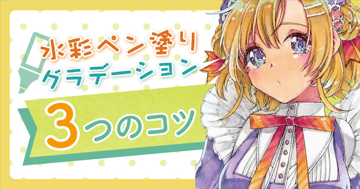
3 Tips to Achieve Smooth and Cute Colors Using Gradients and Water! - Behold the Power of Water-Based Markers!

  • interview
  • making-of
  • traditional
  • useful
Remember those beautiful colors you used to find on the first page of your favorite shoujo manga when you were little? Do you ever feel like recreating that mesmerizing, almost-translucent look when drawing your own pretty characters, and yet have trouble achieving the same result because you're entirely self-taught or because you don't understand how to use the tools needed?


Our teacher for the day will be Kawana. She's a creator who's also very popular on Instagram and who will demonstrate how to draw illustrations using markers, colored pencils, and other familiar-but-difficult-to-master painting tools. She also has many overseas fans and her easy-to-follow explanations (from things like magazine features and lectures at real-life events) are very well received.


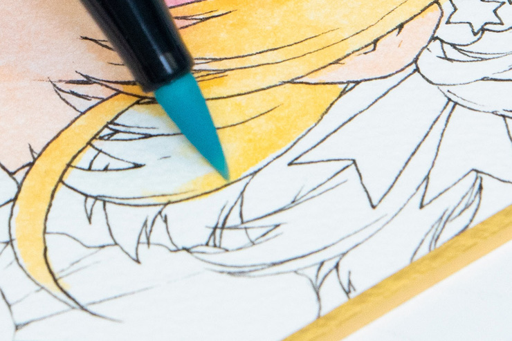
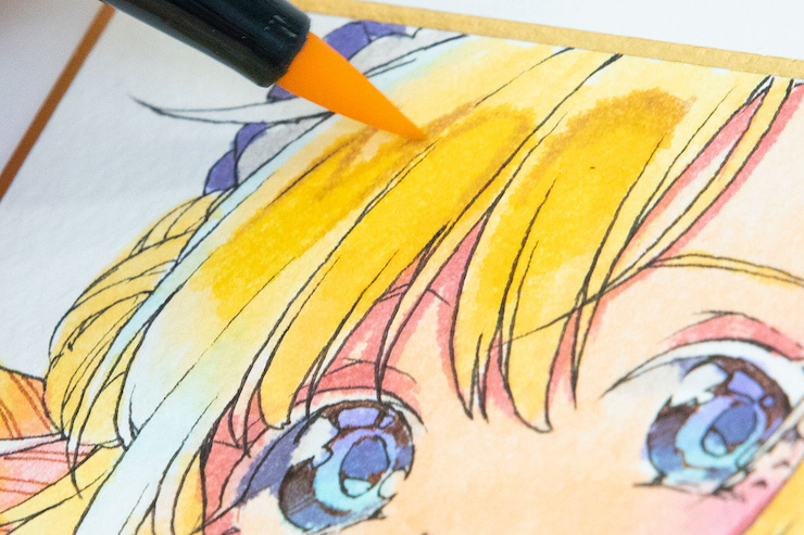
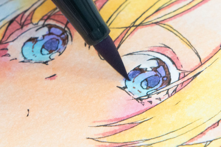
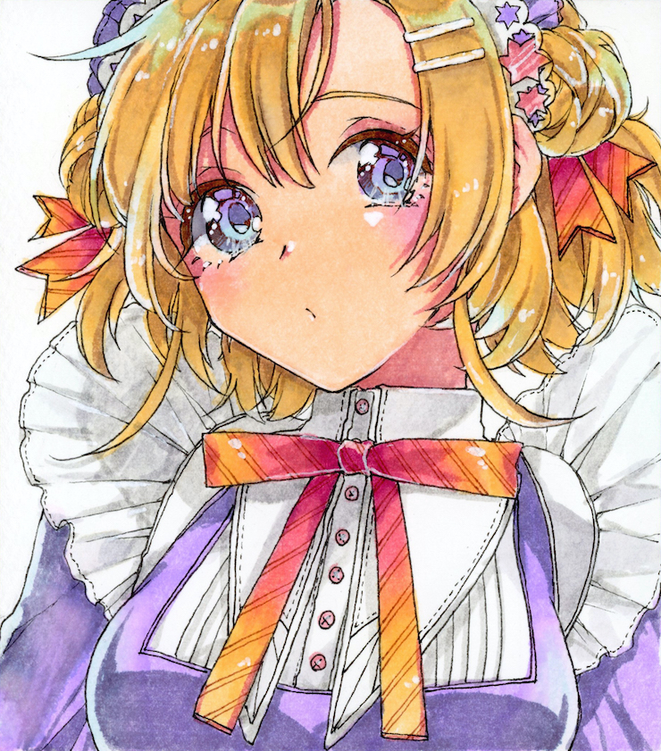
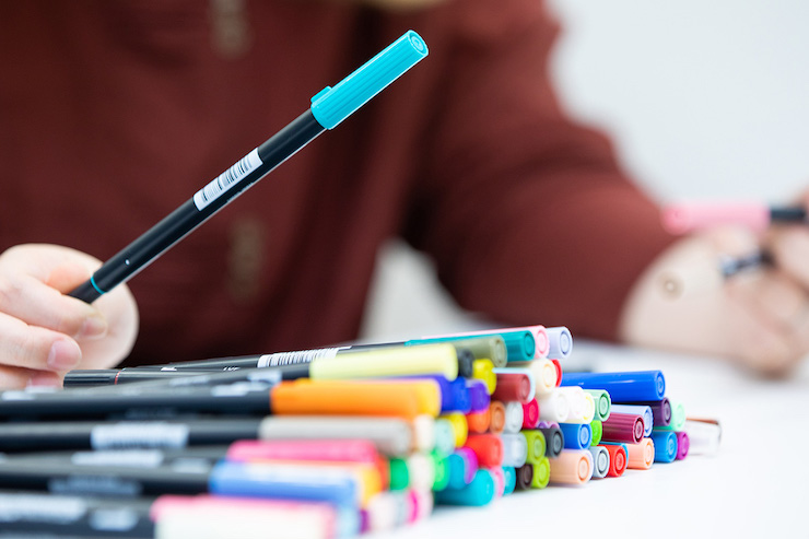
In this article, we'll be using Tombow's ABT graphic markers to introduce some techniques that tend to trip up beginners, such as how to create gradients and shades, tips on how to avoid colors bleeding, and how to draw highlights to enhance texture, focusing on skin, hair, and clothing.


If you want to take your analog painting skills to the next level, or if you're just unsure of how to choose the right tools, this is definitely a read for you!
Kawana
  • Kawana
  • An illustrator who mainly works with analog art materials. She specializes in illustrations of girls, and her easy-to-follow explanations, both in magazines and at real-life events, are very well received. She also has a big overseas following on Instagram.

  • pixiv
    Instagram
    Twitter

Redoing mistakes?! Kawana explains her analog coloring style with water-based markers
── What are the main challenges for beginners when coloring with markers and pens?
川名さん
I often teach beginner classes at workshops, and many of them tend to color too precisely within the lines so that the pigment doesn't bleed out of the line art. By doing so, they often end up with multiple layers of color near the borders, which results in an unbalanced illustration.

── I know what you mean. When it comes to drawing with pens or markers, the fear that you won't be able to redo a certain action over and over again, unlike with pencils or digital art, can make it hard to move with confidence.

川名さん
Actually, both markers and watercolors allow you a certain level of freedom to redo certain actions if you make a small mistake. For example, with the ABT markers that I will be using this time, I can use the N00 Colorless Blender marker (which was originally designed to mix and blend colors) as a color remover and apply it to the parts of the illustrations that have bled out of the line art to lift the colors. So there's no reason not to be confident!

── What is the most fun about coloring by hand rather than digitally?

川名さん
Let's see... I guess it's the fact that you'll never be able to do exactly the same thing twice. Even if you color the same way, the result will be different each time, and the fun part is that you can easily try out the ideas you have at that moment and see the results right away. Also, since all outcomes are one-of-a-kind original works, I think they make great presents or thank-you gifts.

Recovering from a mistake! Goodbye, coloring outside the lines.

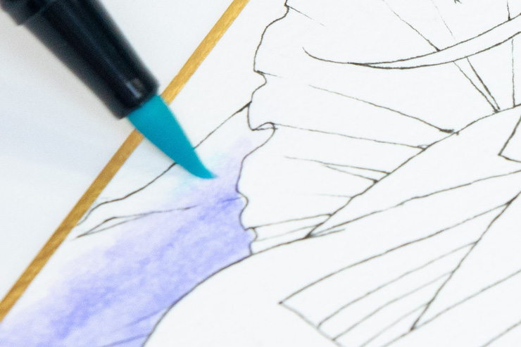
Oh no, your colors bled outside the lines! All you need is the ABT N00 colorless blender. Apply it wherever you want to remove the color and fix your mistakes by pushing the lifted color in the direction you want using the tip of your marker. "When it comes to analog art, many people are afraid of making mistakes. But you can still recover from them!" (Kawana)

Tips for coloring pretty skin: cover every inch of it & use single-color gradients!

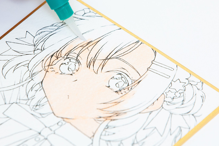
Apply the base color to every inch of the skin!
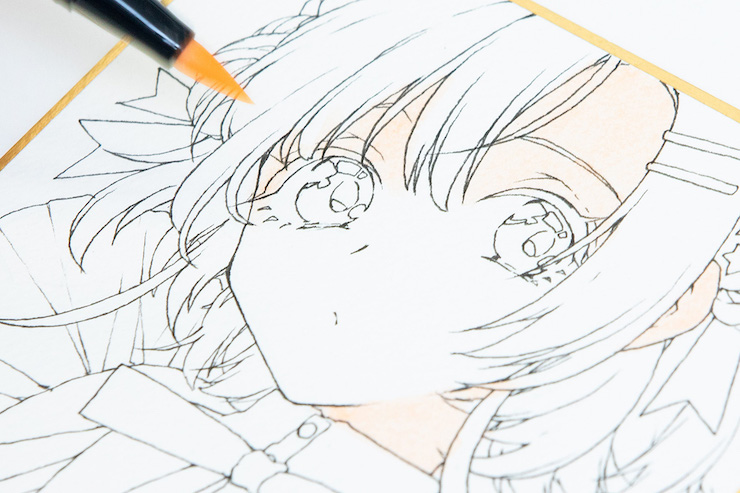
Once you've decided on a base color for the skin (850), apply the same color to the entirety of the skin. There's no need to leave some areas blank for later (to create highlights, etc).
"Even if it seems like too much, be brave enough to apply the base color to every inch of the skin and I promise you'll be fine!" (Kawana)

It's okay if the skin color covers part of the hair. "When you apply the hair color, the skin will be visible from the space between the hair strands and the finished result will look amazing. If it ends up being too intense, you can just use a water brush to dilute the color." (Kawana)

Make the skin look softer with single-color gradients!
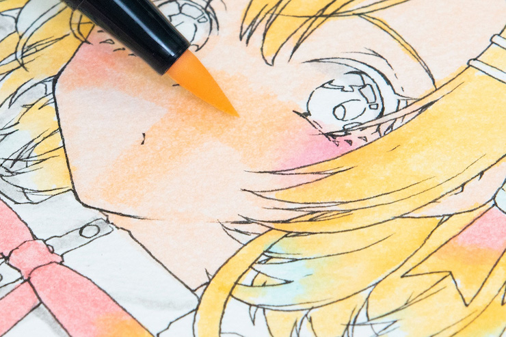
After you're done with the base color, let it dry completely before adding the second layer of color to add depth.
"I applied the same color I used for the base a second time on the cheeks and at the cross between the nose and mouth. The result with ABT markers tends to be pretty even, so I'm just going to go ahead with it." (Kawana)

The neck, ears, and areas where the strands of hair cast their shadow are also shaded in the same way, using the same base color.
"For blush, I just placed a reddish color (772) around the cheekbones and blended it with a water brush. Here, I used a large brush to quickly apply colors while looking at the picture as a whole. It's important to look at the painting from a bird's eye perspective so as not to upset the balance of the illustration by obsessing over tiny details." (Kawana)

Create the perfect complexion by using red as a shading color.
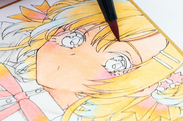
Once you've added the overall shading to the skin, paint another layer of shadows using a brownish color with a red undertone (817) in all those darker spots that aren't hit by direct light, like where the hair casts its shadow.

"It all comes down to personal preference, but some artists may even choose purple shadows according to the mood of the illustration. If you want to get a crisp shadow resembling anime-style coloring, make sure you let your colors dry enough so they don't bleed. The key to coloring skin is to use both watered-down gradients and crisp shadows." (Kawana)

How to master 2 types of gradients

Gradient no.1: wet and layer colors with a water brush
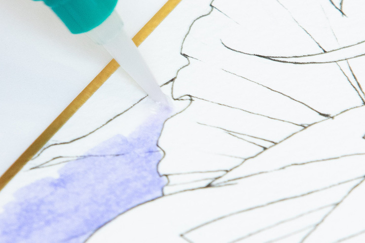
For clothes made of soft materials such as chiffon, start by applying the base color of the clothes (620), leaving only the areas open to direct light. Once you're done with the base color, moisten the remaining areas with a water brush.

Apply a light blue color (491) on the light parts of the clothes that have been previously dampened with the water brush and use the blotches to create a gradient.
"You can also use a bright color as an undertone on part of the hair to give the whole illustration a cohesive look. A smooth gradient is one of the unique charms of watercolors." (Kawana)

Gradient no.2: overlay colors of similar brightness with the tip of the brush
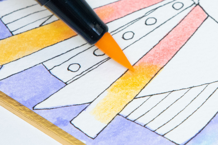
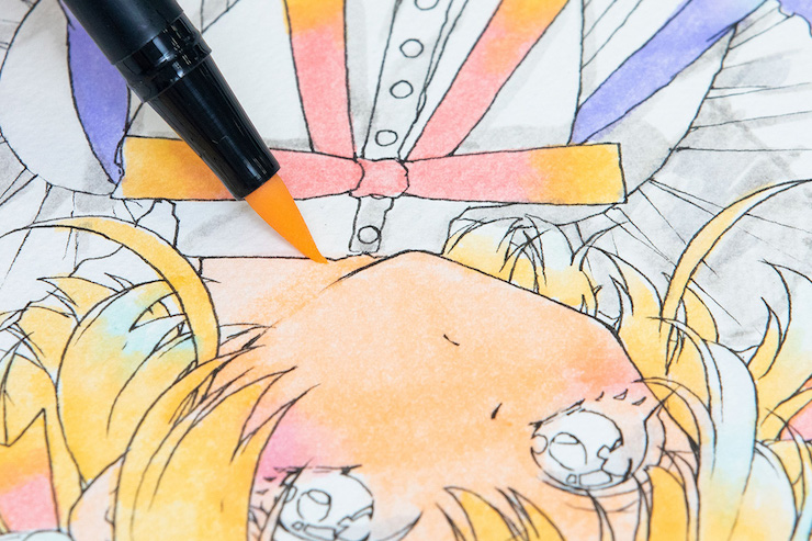
For the ribbon, make a gradient using two colors of similar brightness, red and orange (817 and 933). If the colors are close in brightness, it's better to blend them directly with the tip of the ABT marker instead of using a water brush to create a beautiful gradient.


In ABT markers, the last digit of the color number represents the color tone, where 0 is a light color and 9 is a dark color.

Comparing gradients: water brush VS markers
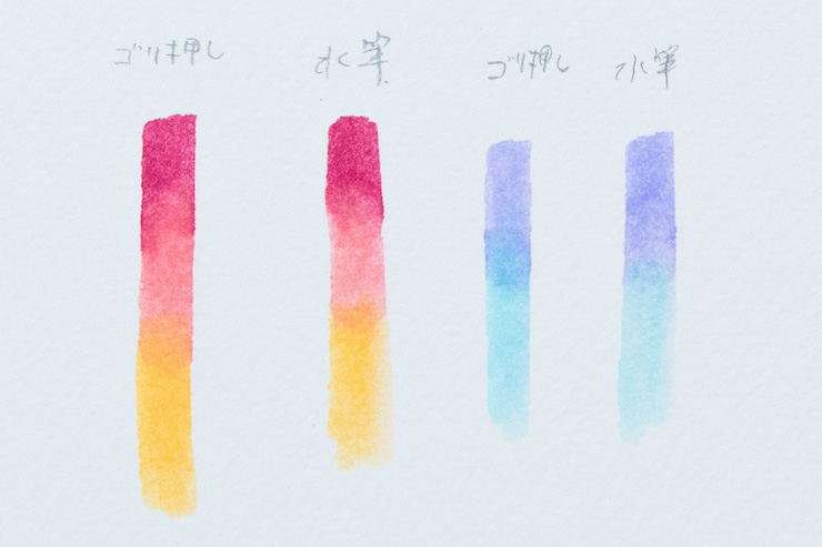
Here you can see the difference between a gradient where colors are blended with a water brush (left of each pair) and with markers (right of each pair).

"Colors tend to get diluted when you blend them with a water brush, so when you're using two colors that are almost equally bright (like in the case of the ribbon), I recommend that you blend the colors directly with the tip of the marker. On the other hand, if the colors belong to the same family but differ in brightness, like purple and blue, you can create a natural-looking gradient by blending the darker color with a water brush." (Kawana)

Let the colors dry before you apply another layer!
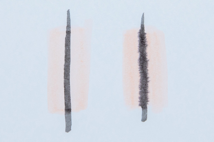
When adding another layer on top of another color, the most important thing to remember is to wait until the previous layer has dried completely. In this picture, you can see what happens when you paint over a layer that's already dry (left) and over colors that are still damp (right).

"Sometimes I deliberately blend smaller accessories with the surroundings to give them an extra flair. But unless you want to create a gradient, you should wait until the first layer has dried before you apply a second coat! Keeping this in mind will help you prevent colors from unintentionally bleeding." (Kawana)

Painting clothes

Apply shadows starting from the larger parts and refine the shapes little by little
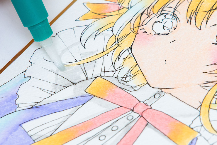
Since we're coloring a white dress, we'll start off with a light gray (N60) to add some shadows and give a little bit of depth to it.
"Coloring detailed shadows right from the beginning is a no-no! Keep an eye on the balance of the whole picture, and start from the larger areas before moving on to the smaller parts. If the color you want to use is too dark, you can use a plastic sleeve or something similar as a palette and dilute the color with a water brush before applying it to make it lighter." (Kawana)

You can add expressivity to the shadow color by blending it out with a water brush.
"Blend out the shadow color from darkest areas to the lightest. For areas with fine shadows such as flares, apply the color after the base has dried." (Kawana)

Let the markers dry completely before drawing the smaller details!
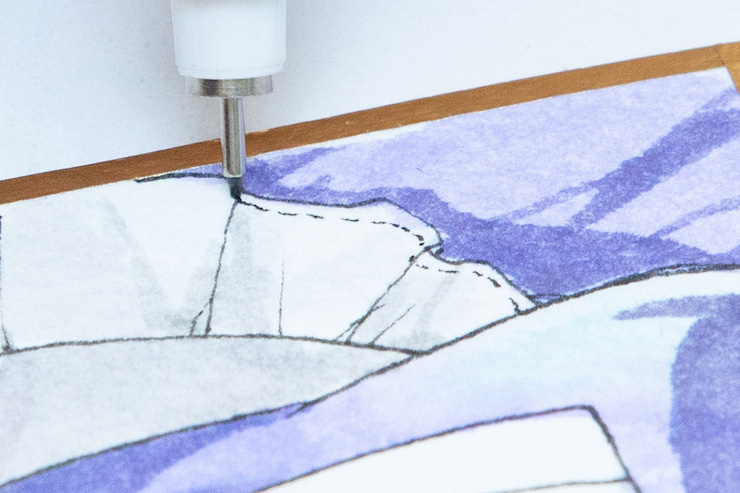
Shade the largest areas, let it dry, and then add the darker, finer shadows. Rinse and repeat.

"Colors will not bleed once the painting has dried completely, so you can safely layer not only detailed shadows, but also the ribbon pattern, stitching, and other fine details." (Kawana)

This is how you get shiny hair! 3 rules to create natural-looking hair tufts

After the base color, add a common undertone to the entirety of the hair
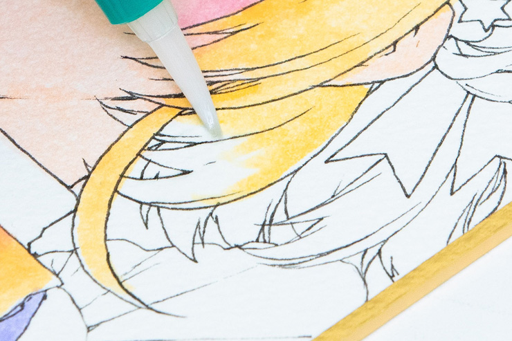
Like we did with the skin, when coloring the hair we have to make sure that we don't end up with streaks of pigment. In order to create a cohesive look, the ends of the hair that face outwards are shaded with the same light blue undertone (491) we used on the lighter parts of the clothes.

After adding the undertone, we dilute it with a water brush to blend it with the base color of the hair. If the colors are quite different in hue, like in the case of this illustration where we've used yellow and blue, we recommend that you wait until the yellow base (020) is dry.
"If you do this step before the yellow base dries, the colors will end up mixing together and giving birth to an unwelcome shade of green. Be sure to figure out what kind of hair color you're aiming for before you get started!" (Kawana)

Add darker shadows following the shape of each hair section
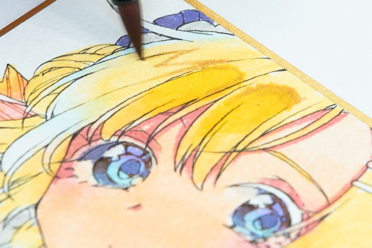
Highlights are essential for painting shiny-looking hair and are created by leaving the base hair color intact. Apply a darker color (992) than the base on the underside of the highlighted areas and blend it out with the base color marker to create a gradient.

"When I'm done with the shadows, I put in the highlights. The trick is to add highlights while keeping the light source in mind. Because the eyes and head are spherical, it's important to place the highlights in an arch shape instead of using dots. The key is to make the texture stand out while maintaining the shape of each part." (Kawana)

Using a darker hair color to create natural-looking hair tufts
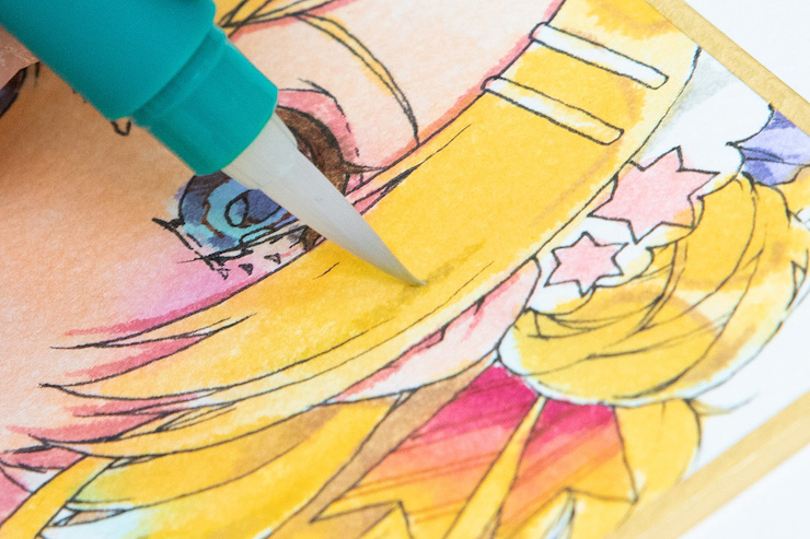
Finally, we use a darker color to emphasize the tufts of hair. Our shiny-looking hair is almost finished!
"A lot of people wonder how to create natural-looking hair bundles. You can create natural shapes by adding some lines in a darker color (they should look almost like an extension of the line art). The darkest shadows should be pointed and as sharp as possible to create a beautiful finish, so make sure to let the paper dry thoroughly before doing this!" (Kawana)

The finishing touches are the eye highlights and stitching

When it comes to coloring and highlighting the eyes, the trick is not to be afraid of white-out!
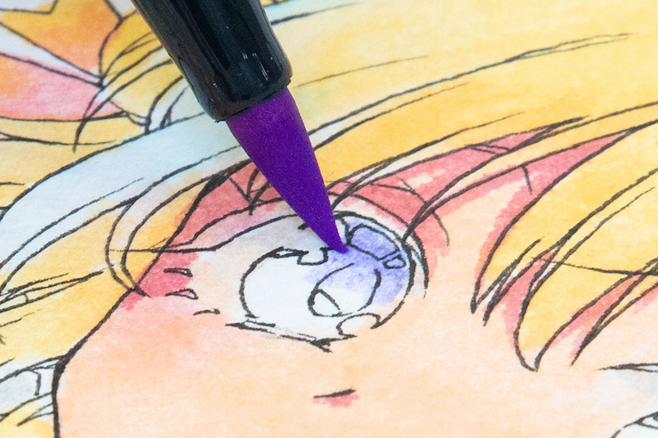
We start by adding shadows to the eye scleras.
"Using the same undertone we used for clothes and hair can be effective to make the illustration look more cohesive." (Kawana)

Start coloring the eyes only when the previous color has dried completely!

"Since it's a small area, I make sure it dries well before I start coloring it, so the markers won't bleed. For my hair and skin, I paint from the lightest areas to the darkest, but for my eyes, I tend to start from the darkest parts first." (Kawana)
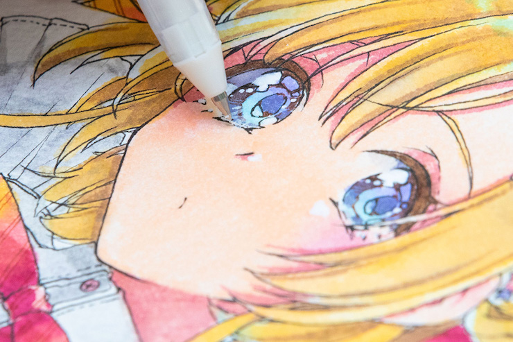
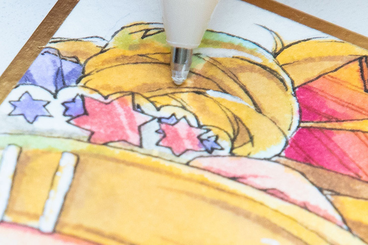
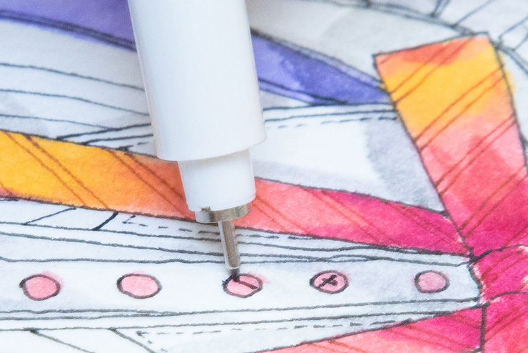
Finally, it's time to highlight the eyes and bring the character to life. We'll use a white-out pen.
"Instead of leaving blank areas as we did for the hair, this time I'm adding the highlights by using a white-out pen. I add highlights to the details of the eyes as they are to make them sparkle." (Kawana)

White is added to clothes, hair, and skin. The crisp effect of the white-out in contrast with the beautiful gradients we created makes the texture of the smaller details really stand out.
"Some people think of white-out as a tool for correction, but if you think of it as 'another special color', you'll be able to bring your work to another level. Try adding white right next to the areas you want to emphasize in your line art (creating edges) or using white to draw unruly hair, and so on." (Kawana)

The technique of using a fine liner pen to draw small details is also useful to create texture in the finishing stages of your work! You can use a fine liner pen of the same color as the line art to draw in the final details on buttons and to emphasize the character's eye lines.
"By drawing the finer details at the end of the process instead of at the beginning, you can avoid focusing too much on the details and ending up compromising the naturalness of the illustration, and you can also prevent colors from bleeding." (Kawana)

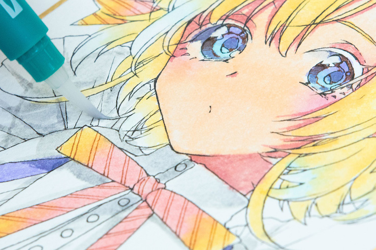
Finished!

A water brush and the N00 colorless blender are the secret to bold, expressive artwork!

── You draw lovely, translucent-looking illustrations with markers. What made you start to color by hand?

川名さん
At first, I was planning to start doing digital illustrations on my PC... but I just couldn't get used to the drawing tablet! (laughs) However, I decided I wanted to draw illustrations so pretty that they might as well have been colored digitally. That's what brought me to color my works using markers.

── Why did you choose markers over other coloring tools?

川名さん
Because of my laziness, I guess? (laughs) If I were using watercolors, I would need to prepare a brush wash with water and a palette where I would have to mix the colors first. With markers, you can start coloring straight away ーand you can still mix colors together. I find it very convenient that you can just take your markers out and start working on your drawings on the spot. I also like the fact that at conventions or events I don't have to spread out hundreds of art tools on my table.

── This time, we asked you to use Tombow's ABT series. What did you think of them?

川名さん
First of all, the colors are very nice. There are many colors that appeal to the eye of an illustrator, so if you can find a color you like, I think that will improve the finish and appearance of your work. Another advantage for artists is that there are a lot of grays, which makes it easy to add variations to the shadows. It's also nice that these markers don't leave traces on the paper, so the result was very even, although that may also have to do with the quality of the paper.

── Do you have any advice for people who want to try their hand at drawing with markers?

川名さん
I think everyone will want to buy skin colors, so first, you should get one skin-colored marker. Second, I strongly advise getting a water brush too! The range of colors you can recreate is completely different without a water brush. If you get a color you don't want on the tip of the brush, you can just rub the tip on a scrap piece of paper until it's completely clean. This way, you can keep using the same brush for a long time.


Also, I think it's a good idea to stick to light colors at the beginning, not dark colors. Darker colors surely catch the eye, but when coloring a character, you can create beautiful gradients by just applying multiple layers of the same, lighter colors. So I think it's good to start with lighter colors to get used to drawing on your favorite type of paper, see what kind of colors you can recreate, and then increase your color variation.


As a reference, I would use 12 colors for an illustration about the size of the mini-paper we used today, and in general, I use no more than 24 colors.
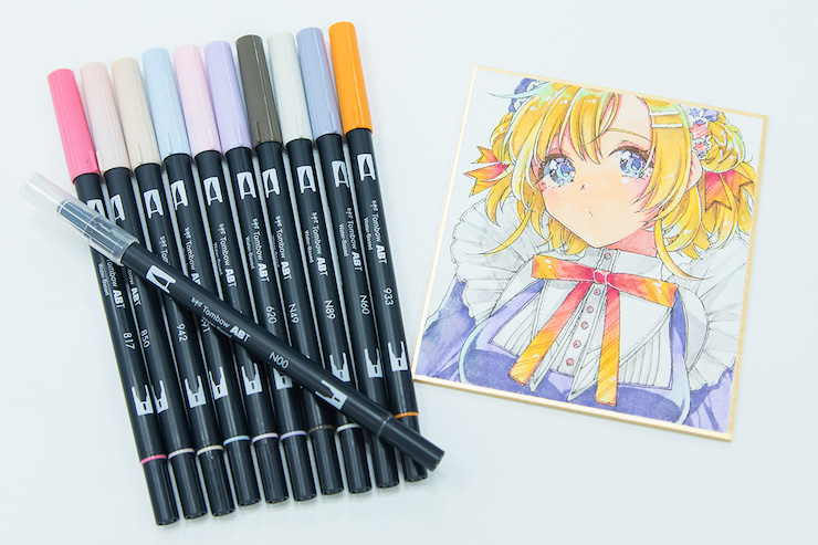
These are the ABT markers we used for today's demonstration. There are fewer than you'd think, aren't there? We've also learned that the N00 colorless blender is a valuable ally when it comes to detailed correction work.


"It's totally okay to buy your favorite colors at first, but I recommend getting a range of light-colored markers that you can also use to create darker shades by painting multiple coats on top of each other. The ABT markers come in beautiful light colors as well, and you're unlikely to get an uneven result even by applying multiple coats. The ABT are beautiful even in light colors, so I promise you'll achieve that translucent-looking finish! Be fearless in your approach. I'm sure there are works that only someone like you can create!" (Kawana)

The list of colors we used:

817, 850, 942, 491, 620, N49, N89, N60, 933, N00, 761, 020, 772, 992

ABT water-based graphic markers product information
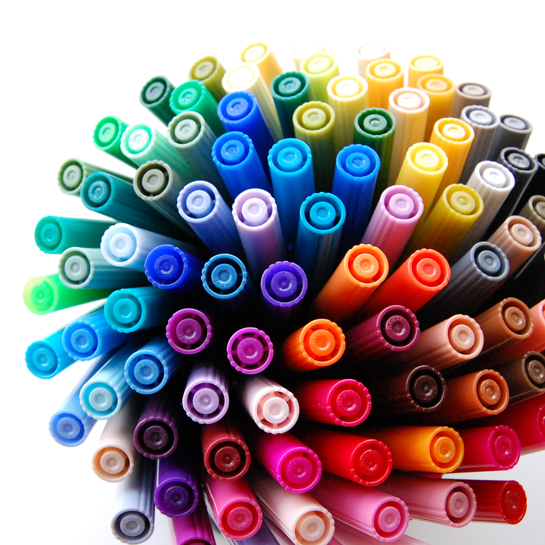
ABT's strength lies in its tips and ink.


These twin-tipped markers feature both a brush tip, which is flexible and allows you to draw freely while balancing thick and thin lines, and a fine tip, to master even the smallest details. There are currently 108 types of water-based colors available, designed for well-balanced color composition, and they include a full range of grays that are indispensable for any artist. The water-based dye ink comes in vivid colors and lends itself to a wide variety of expressive techniques, and the ability to easily blend colors is another quality of the ABT line. By mixing and matching colors, the range of colors you can create is infinite.


To the official website

Provided by: 株式会社トンボ鉛筆 / Planning & Production:pixiv

Newest articles tagged making-of

  • The Making of 13 Copic Drawings - A Lesson in Coloring

    The Making of 13 Copic Drawings - A Lesson in Coloring

  • The Making of 15 Watercolor and Colored Pencil Drawings - A Glimpse Behind the Scenes

    The Making of 15 Watercolor and Colored Pencil Drawings - A Glimpse Behind the Scenes

  • Animations of Works In Progress - Capturing the Creative Process

    Animations of Works In Progress - Capturing the Creative Process

  • Wait a second! (Almost) Useless Tutorials

    Wait a second! (Almost) Useless Tutorials

If you liked making-of, you will also love...

  • How To Create Pixel Art GIFs? An Interview With Illustrator Yuuta Toyoi

    How To Create Pixel Art GIFs? An Interview With Illustrator Yuuta Toyoi

  • Drawing Coloring Tutorials: Cel-shading & Thick Painting

    Drawing Coloring Tutorials: Cel-shading & Thick Painting

  • A making-of and interview with the popular artist Chiho! Unveiling the secrets behind her colorful and delicate drawings!

    A making-of and interview with the popular artist Chiho! Unveiling the secrets behind her colorful and delicate drawings!

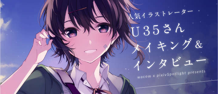
  • What are the steps for charming characters and beautiful hues? A making-of and interview with U35!

    What are the steps for charming characters and beautiful hues? A making-of and interview with U35!

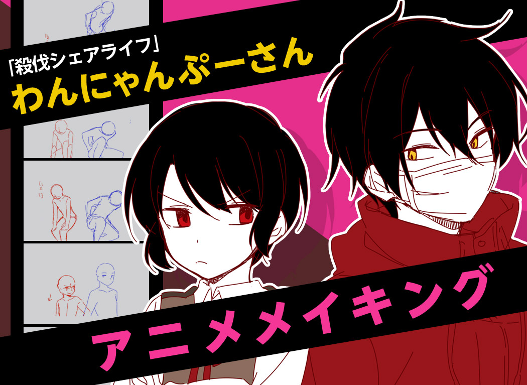
  • Interview with the artist “Wannyanpuu” and making of “Ugoira!” The particulars behind the creator’s craftsmanship.

    Interview with the artist “Wannyanpuu” and making of “Ugoira!” The particulars behind the creator’s craftsmanship.

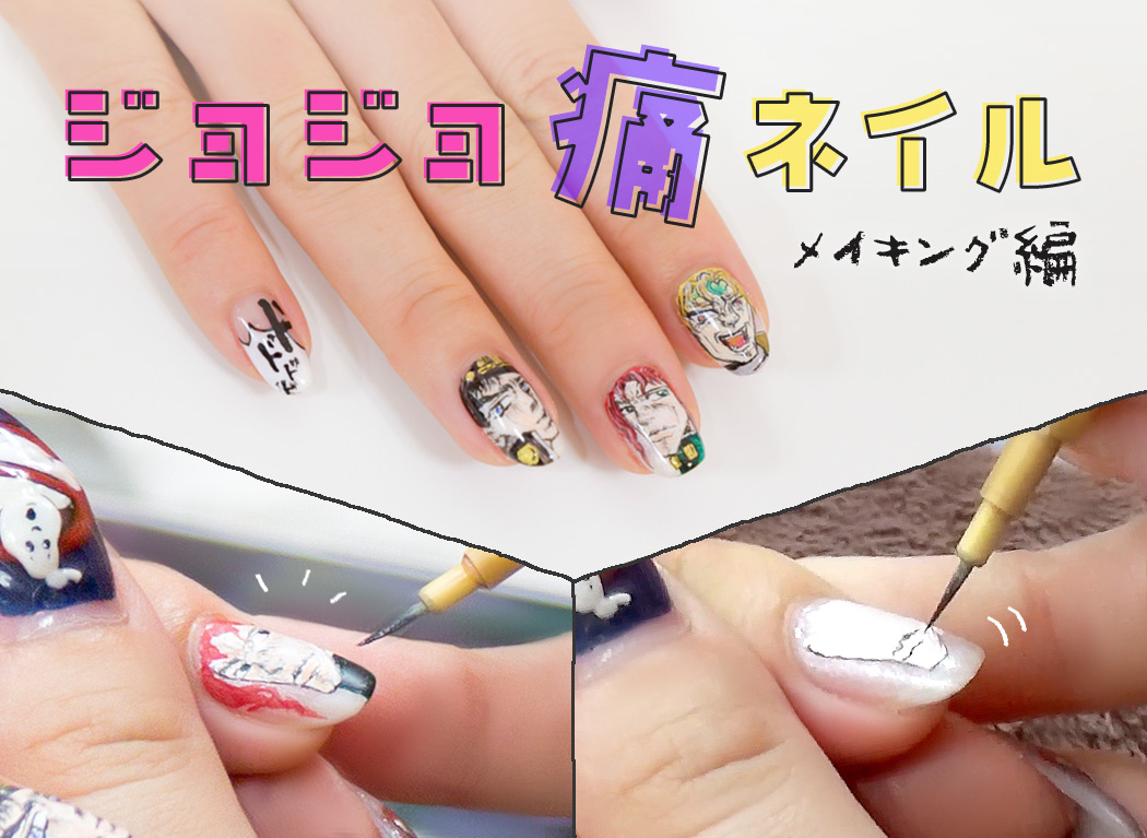
  • How to go about doing Ita-Nail art! Tutorial for Noriaki Kakyoin Nails (Jojo’s Bizarre Adventure)

    How to go about doing Ita-Nail art! Tutorial for Noriaki Kakyoin Nails (Jojo’s Bizarre Adventure)

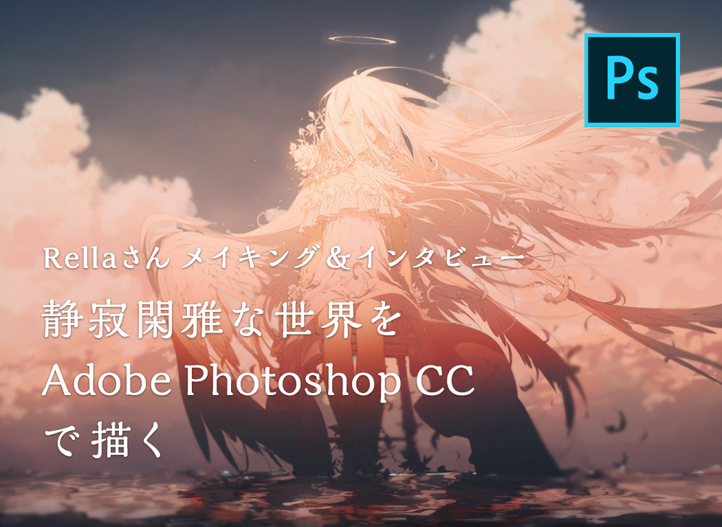
  • Rella making-of and interview - Drawing a peaceful and elegant world with Adobe Photoshop CC

    Rella making-of and interview - Drawing a peaceful and elegant world with Adobe Photoshop CC

Share this article
  • Share
  • Post
  • Share
  • Post

Tags:

  • interview
  • making-of
  • traditional
  • useful
Follow pixivision on Facebook!
Find us on X too!
Follow @pixivision
Stay updated with pixivision's daily features!

Newest articles tagged Interviews

  • [Artist’s Spotlight] An interview with designer and illustrator John Kafka - Where traditional painting meets contemporary fashion

    [Artist’s Spotlight] An interview with designer and illustrator John Kafka - Where traditional painting meets contemporary fashion

  • Behind the scenes with illustrator Tokkyu! How does she refine her personal style and add sparkle to her work?

    Behind the scenes with illustrator Tokkyu! How does she refine her personal style and add sparkle to her work?

  • Interview with Mimimi, the Grand Prize winner of the pixiv High Schoolers Illustration Contest 2025 - “Illustration is just a part of my life.”

    Interview with Mimimi, the Grand Prize winner of the pixiv High Schoolers Illustration Contest 2025 - “Illustration is just a part of my life.”

  • Behind the scenes with illustrator NAKDI! How does she bring characters to life and why does she like sharing works-in-progress?

    Behind the scenes with illustrator NAKDI! How does she bring characters to life and why does she like sharing works-in-progress?

View more▶︎

Follow pixivision's
official accounts!

p-chanMonthly Ranking
  • Illustrations

    Drawings of Pools at Night - After ...

  • Illustrations

    Drawings of White Bikinis VS Black ...

  • Illustrations

    Drawings of One-Piece Swimsuits - A...

  • Illustrations

    Drawings of Ponytails - Pony Expres...

  • Illustrations

    [Featured Articles] pixiv's Most Ic...

p-chanFeatured
  • Illustrations

    Drawings of White vs. Black Bikinis...

  • Illustrations

    Fan Art Featuring Genshin Impact's ...

  • Illustrations

    Drawings Tagged with "Striking Blue...

  • Illustrations

    Drawings Tagged “WTF This is Scary”...

  • Illustrations

    Fan Art of Cyrene from Honkai: Star...

Follow pixivision's
official accounts!

  • Top
  • About pixivision
  • Suggest a theme
  • English
  • 简体中文
  • 繁體中文
  • 한국어
  • ภาษาไทย
  • Bahasa Melayu
  • 日本語
  • pixivision
  • About pixiv Inc.
  • Terms of Use
  • Contact Us
  • Advertising
  • Privacy Policy
©pixiv