A making-of and interview with the popular artist Chiho! Unveiling the secrets behind her colorful and delicate drawings!
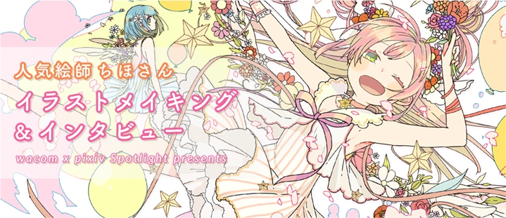
Illustrator Chiho collaborated with earth music&ecology Japan Label and took care of several Vocaloid related illustrations, such as 1925 and Melancolic. Her girly and cute drawing style made her really popular!
Chiho’s works are delicate yet incisive, with plenty of details and recurring motifs, while the color used remind of pop art. Today, on pixivision, we bring you an exclusive interview with the artist where she tells us how and why she started drawing, and a step by step drawing process explanation!
Chiho drew a really cute and cheerful pink-haired character just for us. Let’s follow her in the process!
1. Sketch
Composition, flow and movement
Recently I’ve been using a lot of stationary composition, so I thought I’d give you something more dynamic.
I use very plain lines in my illustrations, so I usually create some movement when working on the composition. This time, I chose my main character to be at the center of the canvas, creating a sense of movement with the hair, the flowers and leaves underneath the feathers, and the clouds.
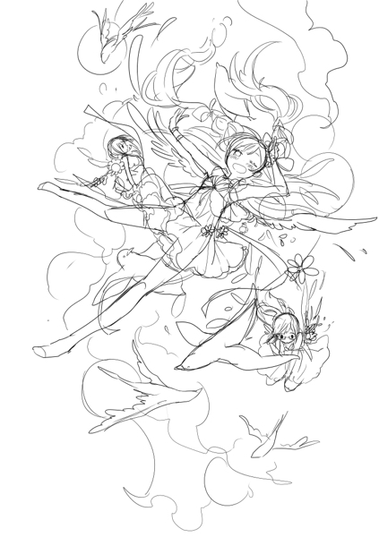
During the sketch phase I decide the theme and the composition, and when I’m fast it takes me about an hour. When I’m struggling, though, it can take up to 2 or 3 days... When I’m stuck, I try to keep on drawing anyway.
Thinking about colors
One of my friends is getting married soon, so I will think about that for the colors (lol).
The girl in the middle is going to wear a white dress. I want everything around her to be colorful and happy.
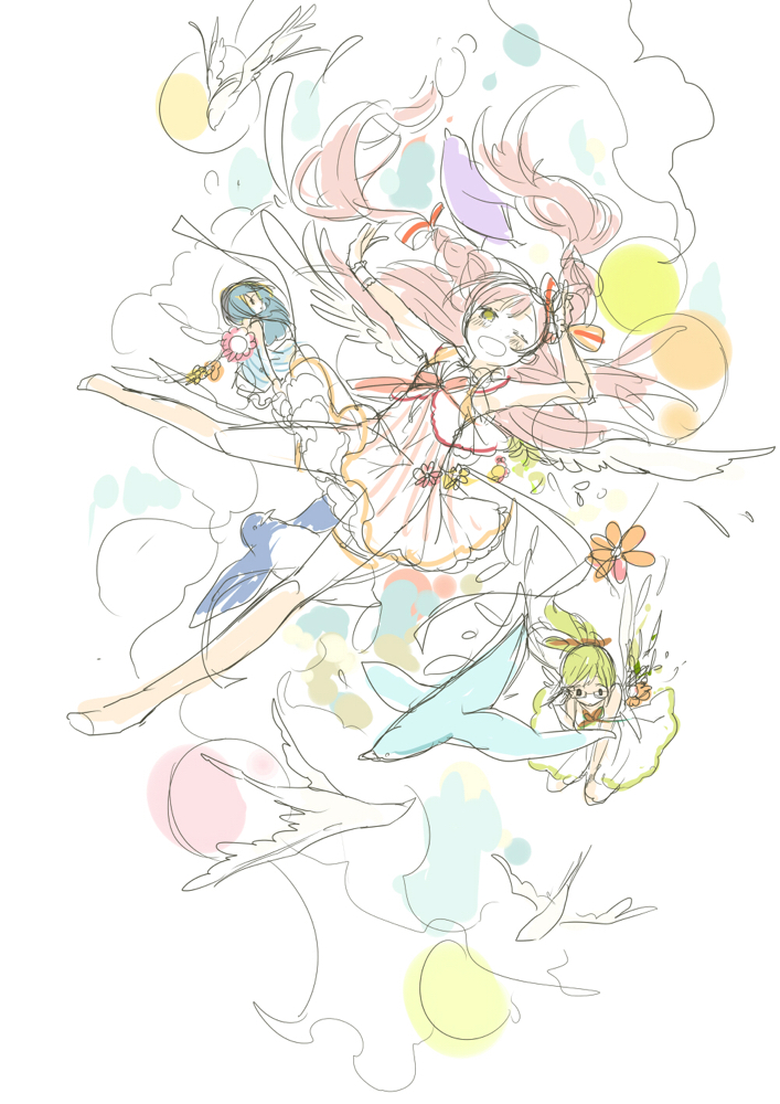
2. Lineart
The lineart is the step that takes most time. I would say from a couple of days to a week. If we talk about hours, then it’ll be between 8 and 20 hours.
When I draw my lineart I pay attention to the hair, of course, but also to the overall flow. I also like long, continuous lines, so I draw, erase and repeat until I’m satisfied with my strokes.
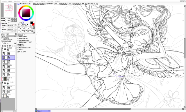
3. Layers
Using the selection pen and the automatic selection tool, I divide the drawing into different parts: hair, skin, clothes and so on. Each part has a dedicated layer. I tend to erase everything that is under the layers I will need.
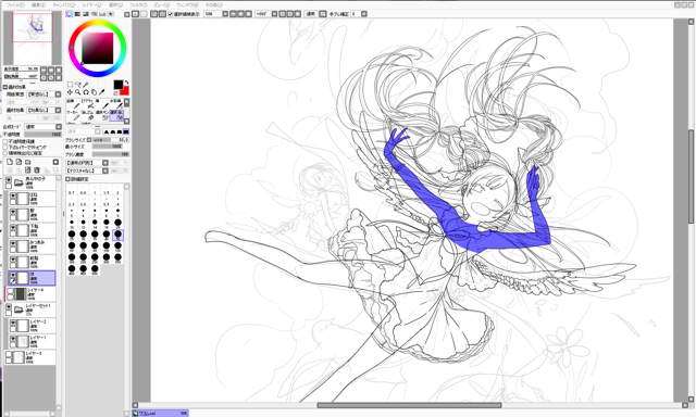
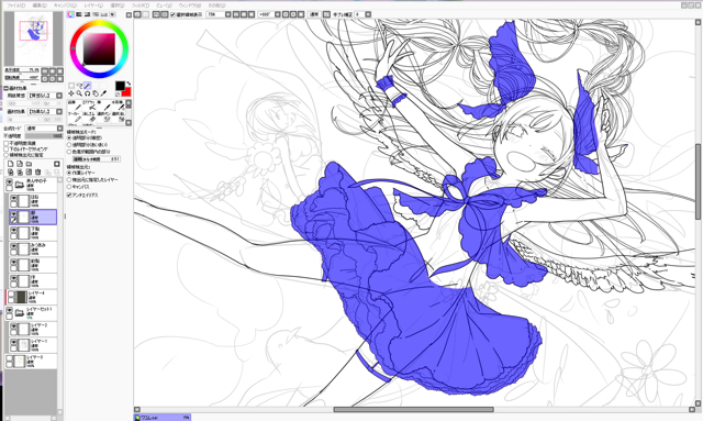
It’s a tough process. Hair and clothes are the most annoying parts - there are always some lines overlapping and I have to pay great attention to what I’m doing. Sometimes the layer number is as low as 50, but when I’m into a really detailed work they can become a hundred real quick.
Also, I group layers into folders. For example, there will be a “human” folder which will contain all the layers for both the linearts and the color layers for the skin, the hair and so on.
4. Coloring
Coloring usually takes me about 3 to 10 hours - it depends on the illustration. In this case, it took me about 7 hours.
Coloring human skin
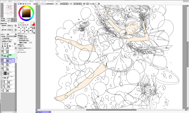
When I have to color a girl’s skin, I’m careful not to overdo it and not to add too many shadows. I love coloring the skin, so sometimes I exaggerate, but it’s just because I’m always fixing the shadows. (It all depends on your style, though!)
Coloring hair
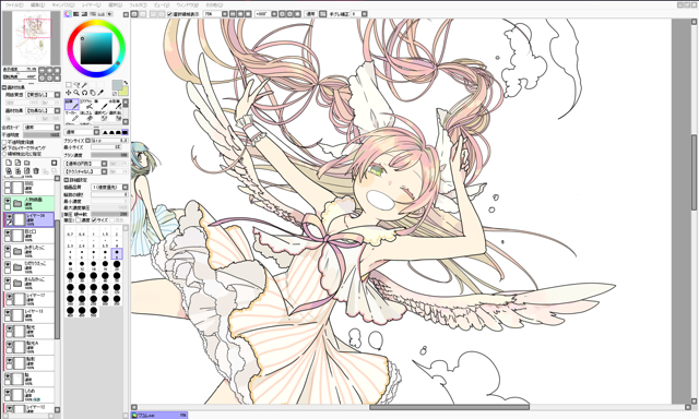
If I want to make the hair look soft and light, I mix different colors together. On the contrary, if I’m looking for a firmer effect, I just use very few colors.
Coloring backgrounds & details
After using the basic colors (green for the grass and white for the clouds) I correct the illustration by adding other colors.
This time I’m using warm colors, so if I ended up using a saturated cold color it would stand out - and not in a good way. That’s why I’m using a yellowish blue for the sky - it goes well with the overall atmosphere.
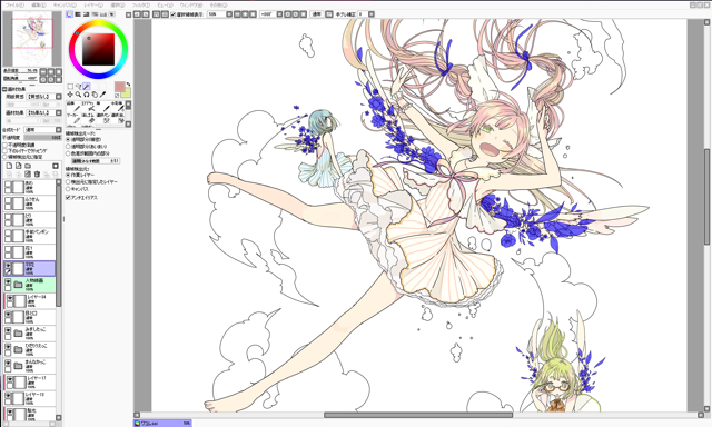
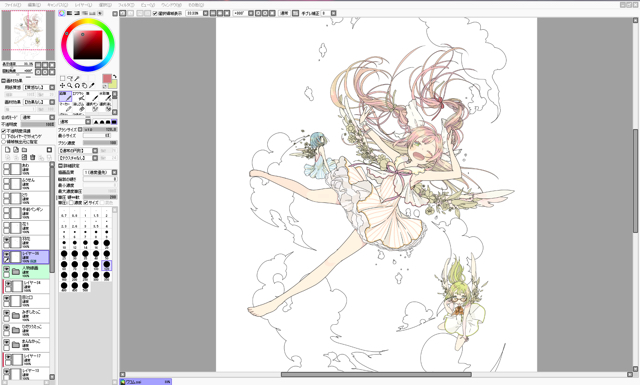
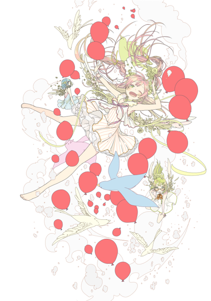
Here I just finished coloring the balloons. I wanted to put some emphasis on them by choosing a vivid pink, but in the end it was too much and I had to adjust the colors choosing some less saturated variations.
Adjusting tints according to the eye-level
The bouquet the girl with the pink hair is holding didn’t stand out at all, so I added some violet to make it really stick out of the picture. Also, since the flowers around the wings were taking the focus away from the protagonist, I made the colors slightly lighter so the attention would go to the girl’s face.
This way, even if the color of the hair is pretty similar to the girl’s skin, it doesn’t give a blurred overall impression. I added some brightness by making the balloons around her face yellow.
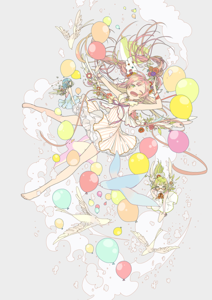
I choose the colors just during the process. In no way I decide which colors to use before I start. I was very careful so that two close balloons or flowers would not have the same color.
By the way, this time I didn’t use any texture or other materials. My linework is pretty strong and neat, so I tend to use solid colors to make up for it. When I feel like using a paper texture, though, I usually choose Japanese patterns.
5. Placing small objects and accessories
When it comes to placing small objects, balance is important
Even if the lineart looks messy at the beginning, sometimes it all comes together as soon as you finish coloring. When I’m satisfied, I start adding details such as flowers or stars. Since I’m working with vertical composition, I place these small objects over an imaginary vertical line. What was important to me, though, was to create a sense of falling and floating.
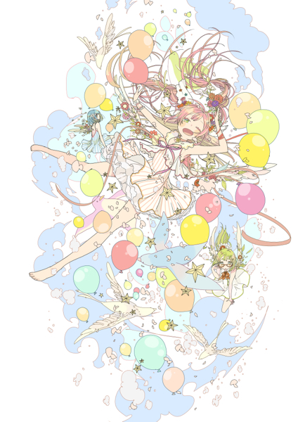
I overdid it a little, so it’s time to change the color of the lineart.
For the background lineart I used light blue, pink and yellow, while for the protagonist I used a brown with a hint of pink.
I used Photoshop to merge all the character related layers and used a very light drop shadow effect on the final product. Even after this step, I have to make some final color adjustments.
*Drop shadow: an effect consisting of casting a shadow under an object, giving the impression that it’s floating.
6. Done!
The hardest part was the hair. I gave braids a shot, this time! It was hard drawing all the bundles of hair falling out the braids. I had to redraw the lineart a lot of times before I was completely satisfied.
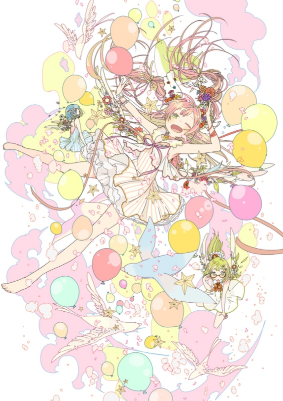
Thank you so much, Chiho! In the next page you’ll learn about what she focuses on when she draws and how her workspace looks like.
