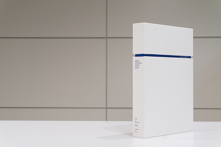
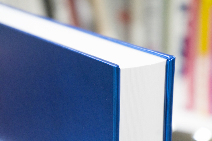
10 years of pixiv combined with the latest Japanese technology--632 pages, 4cm thick, 3kg. Take a look at "pixiv archive 2007-2017" binding!
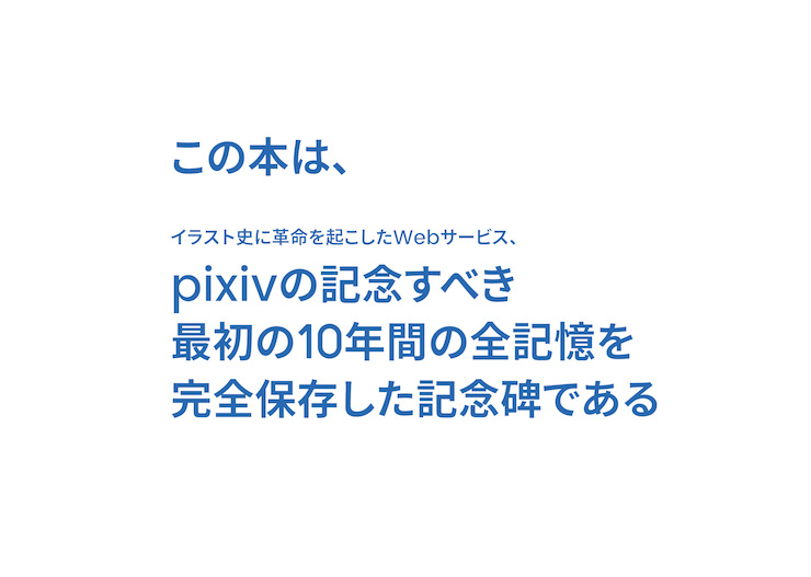
More than 65 million artworks have been submitted to the website in the past 10 years. As a summary of this enormous number of contribution, we are proud to announce the commemorative art book "pixiv archive 2007-2017", which summarizes trends and movement of this decade.
The first thing you'll notice is its "monolith" design, a very special binding that you won't find in any bookstore.
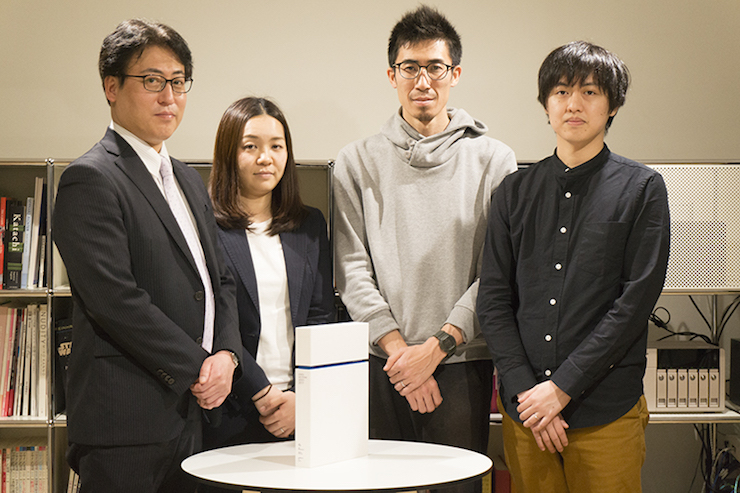
We asked the design team BALCOLONY. and Kyoritsu Printing, who was in charge of the printing and binding of this book, about how this tome came to life.
BALCOLONY Yohei Sometani (hereafter: Sometani/BALCOLONY):
There's a project on pixivison called "DESKWATCH", which follows the production process behind famous creators, and we were featured in one of their past coverages.
That time, our production process video became quite a big hit, and eventually we started talking about "a commemorative art book to celebrate pixiv's 10th anniversary". That's how it started.
Sometani/BALCOLONY:
At first, I thought it was nuts! (laughs)
I remember worrying about the potential volume of a book that was supposed to include 10 years of data. I also asked numerous times whether they really wanted to gather all that data into a single book.
BALCOLONY Yuta Kato (hereafter: Kato/BALCOLONY):
The first concept was to feature a decade of illustrations. When I heard it, I thought that was a ridiculous amount of illustrations to feature in a single art book. Honestly, it sounded a little bit crazy! (laughs)
Normally, when we design a manga or a magazine book, we work on package designs assuming that they will be consumed commercially in a relatively short span. Creating a binding for pixiv's 10th-anniversary art book was a process similar to making a decade of pixiv data into a single shape. We tackled it as a cultural project that would be left behind to posterity, rather than as a commercial book.
Kato/BALCOLONY.:
We were very honored to be commissioned a work like this. We knew it was going to be hard, but we decided to try and give our best.
I had no idea it was gonna be this hard!!
(*This interview was carried out mid-process)
Sometani/BALCOLONY.:
Talking to pixiv about the initial concept of the art book, we understood that this was not going to be an ordinary collection. It was going to be a monument tracing the history of pixiv, focusing on the trajectory of the service and on its milestones.
While thinking deeply about the appropriate design for a monumental work supposed to fit 10 years of data, some controversies emerged among the in-house designers.
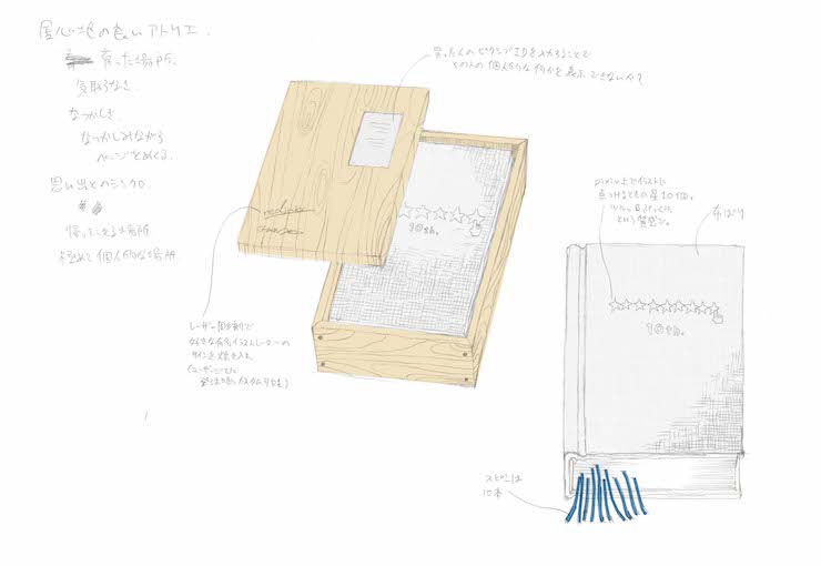
Sometani/BALCOLONY.:
This was the initial idea.
pixiv is a comfortable place for creators, so we started from the image of "a place where days go by, the room where I grew up" until we reached the concept "creator's room".
We thought it would be nice to try making a book with interior-like parts, such as wood or fabric materials.
Kato/BALCOLONY.:
This is the second concept. I thought that I wanted to give a "data" feeling to various parts of the binding with an image packed with 10 years worth of data, records and logs. For that reason, I embossed and simulated a silhouette like an HDD.
The external case has a futuristic vibe to it, and it was supposed to come with a rainbow-colored film. The concept is that of a holographic memory, an optical memory. This is a "data collection", rather than a book.
Many more ideas came from this design, such as incorporating real data-like elements in the book. We all got very excited thinking about using electronic paper for the cover.
Every time you'd pick the book up, the cover would change, its design would change. We came to the conclusion that that would have been amazing!
Kato/BALCOLONY.:
Different illustrations would be displayed each time depending on the user's preferences, or maybe the cover could display artworks that were posted at the same time you decided to open your book. Or it could display your ID and icon...
We had a lot of fun thinking about how a book like that could become a very personal experience connected to one's individual memories.
Kato/BALCOLONY.:
Well... We were considering various ideas at the same time, but the price of making an art book with such a great number of pages was already an issue, even before starting to think about electronic paper.
We decided to chill with the ideas and face reality instead. (laughs)
The editor in charge gave us a fantastic request, which is to "make a legend out of this tome". And that encouraged us to create the best processing and to come up with design ideas that would give an impact, such as shaping the outer box into something jagged.
Sometani/BALCOLONY.:
We also thought it would be a good idea to use plike paper (a paper which feels like rubber to the touch) for the cover, thus giving it an unusual texture.
These concept sheets are the results of continuous adjustment, so that the "data collection" motif, which we mentioned earlier, can be manifested with a realistic cost, as well as partial removal of that "digital data vibe" after careful analysis of the concept.
Our previous concept sheets give an impression that pixiv's 10 years worth of data are stored in realistic hardware such as an HDD or a server.
Indeed, data uploaded by artists on pixiv exist as digital data on a server which can be disassembled into 0 and 1, but we believe that both artists and viewers of the artworks on pixiv do not recognize those artworks as mere digital data... And we proceeded based on that belief.
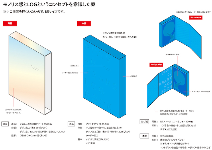
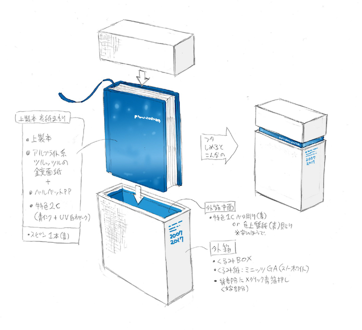
Artists pour their feelings into their artworks and the viewers become inspired and emotionally attached to said artworks. To call these artworks "digital" design did not sit quite well with us. This project is less an accumulation of digital data and more of pixiv users' contribution and action--in other words, this is an accumulation of their memories and records and so we thought of giving that accumulation an intuitive form. As we discussed it further, we eventually decided to change the outer design from that of a book to a "monolith".
From the early stage of our concept sheets, "blue cuboid silhouette looks good" has been a constant opinion among us. When I was wondering just what was so charming about that image, we came to a discussion about it being a monolith and I think that was one of the deciding factors.
And finally, we submitted these concept sheets.
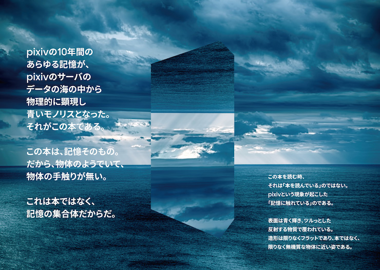
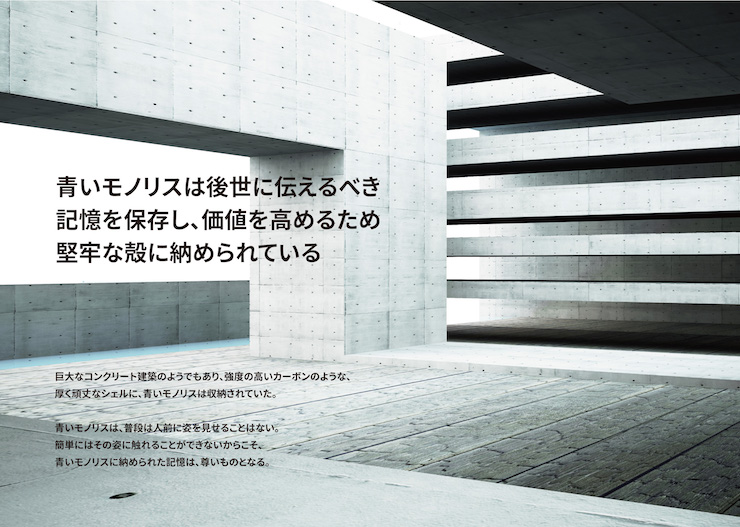
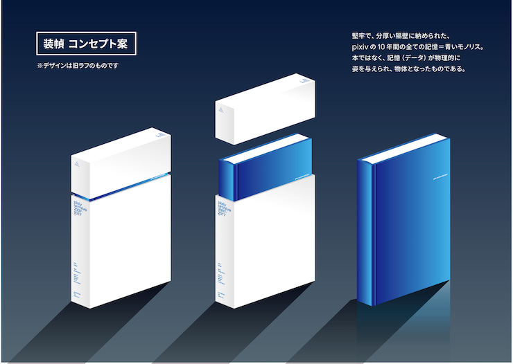
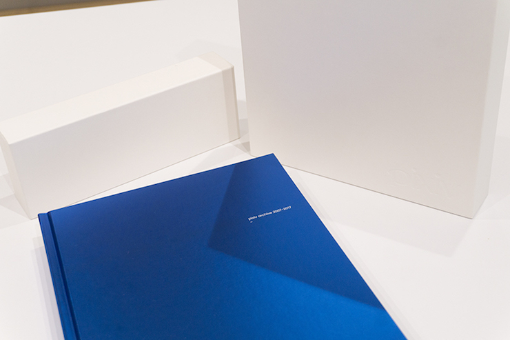
This monolith is more of a "blue object that contains the wisdom of creators and illustrators" than a "data collection". In order to preserve this object, we use a firm shell to protect it and that refers to the monolith's case.
The design up until this point is feasible, but there is still the issue of whether it can be brought to life. We have discussed that matter with Kyoritsu Printing.
After looking at the concept sheets, I thought, "How on earth are we going to make this...?" (laughs)
This monolith requires methods that we have never done before and I remember freezing in place, wondering where to start. But I could feel the designers' passion for this project through these concept sheets and I thought I wanted to fulfill their requests to the best of my ability.
We have had ideas such as a bookmaking technique to make the book easier to open or special processing of the binding and cover. However, we have never had a request to print a book this thick, huge, heavy, and rich of trinkets.
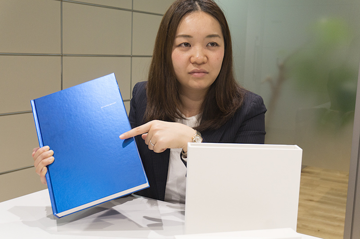
Well... After taking off the white case, I remember going "Wow!" at the sight of the blue cover. The moment I picked it up, I remember thinking it was so heavy!! (laughs)
Kato/BALCOLONY.:
It is not easy to tell from the photo, but the monolith is definitely a blunt weapon. I think it is dangerous because if we drop it, it might even break a bone or two (laughs).
Kato/BALCOLONY.:
Kyoritsu Printing has accepted our ridiculous "blue monolith" order and has brought this monolith to life, all the while staying true to our concept of creating a cuboid blue and brilliant stone, instead of just a book with a hardcover.
Sometani/BALCOLONY.:
We submitted some detailed requests too, such as not having that "gap" between the hardcovers and the pages inside, the adjustment of the book's six sides, and the presentation of the edges of the sides. Kyoritsu Printing did so many alterations for us and this is the result.
-- What do you mean by "the gap"?
You can check a hardcover book to confirm it, but most hardcover books have a gap of normally about 5mm between the covers (the thick, rigid covers) and the pages inside. This gap is common in hardcover books. However, since the concept of this particular book is a "monolith", we received a request to reduce that gap as much as possible. And so we considered getting in contact with a collaborating company to make the gap of this book less than 1mm.
However, the people who worked on it were at loss for words because they "have done the same thing on books up to A5 size, but never on an A4 book with this size and thickness" and so they had to go through many trials and errors.
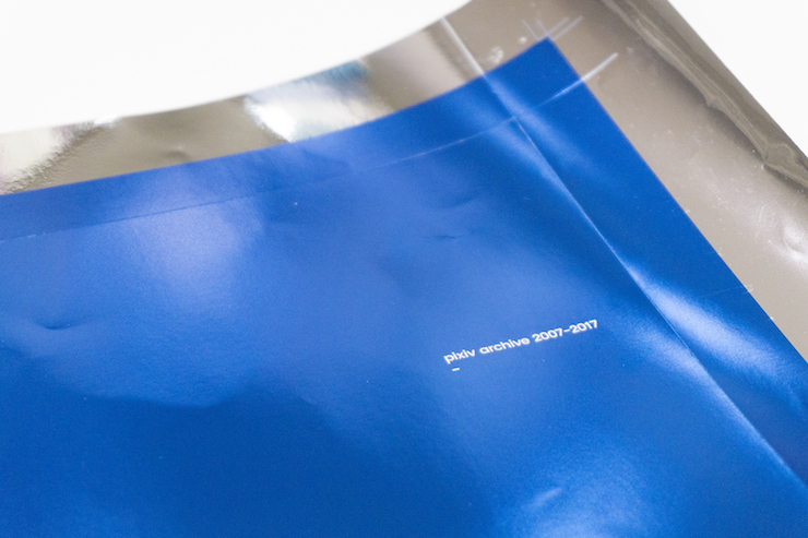
For example, we have managed to skillfully fit the title "pixiv archive 2007-2017" in the gap between the upper part and lower part of the case. We recreated the case numerous times before we reached the perfect thickness. This case is made of layers of components and I think a case this thick is in itself a rare sight. According to BALCOLONY.'s concept, the case functions as a solid shell to wrap around the monolith and I think we did quite a good job creating that.
Takahashi/Kyoritsu Printing:
The cover is blue with a luster finish because we use a special aluminum metallized paper for it.
The blue that BALCOLONY. wants is hard to get and we had to mix our own inks several times. However, after many trials and errors, we managed to produce a really beautiful color. Blue has always been that one color that is not very printing friendly. We achieved this glorious and brilliant blue by using our own ink mixture and printing the blue color twice.
Subsequently, the words on the cover, such as the title, are printed in tiny letters. Nevertheless, the printing came out clear. I think it is also not easy to find such a visible printing of letters of this size.
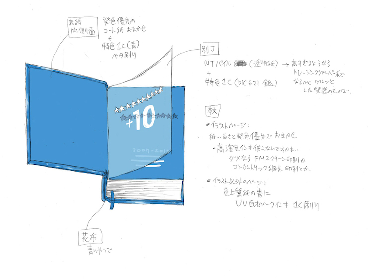
And... I know this is not the most interesting topic, but please allow me to talk about the "blank leaf".
A blank leaf refers to a blank page found at the beginning of a hardcover book and so many ordinary paperbacks you would see in bookstores do not have it. This blank page is normally chosen from fine quality papers in several types of colors, but the blank leaf of this particular book has its own traits.
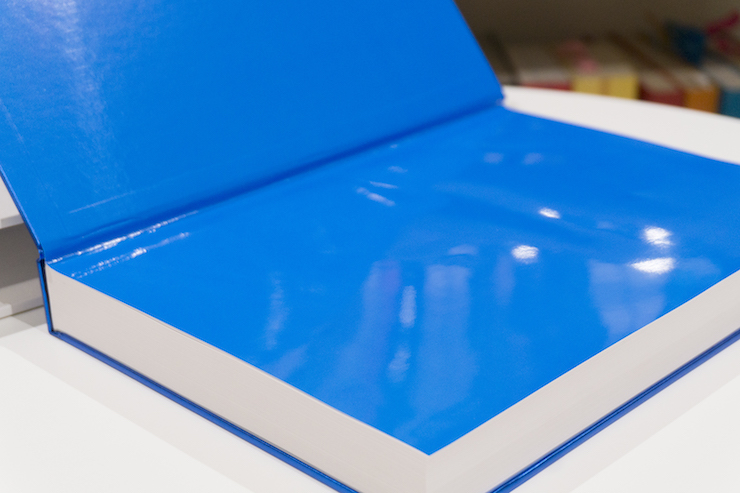
Since the concept is "blue monolith", we wanted to remove anything analog and use things that give off a 'robotic' vibe wherever practicable. We scourged through many fine quality papers and color papers, but we could not find anything that fits our vision. Eventually, we had a special blue ink made for this book's blank leaf and had the entire surface printed with that color and then press-coated. I would like to think that the final result embodies our obsession over every little detail that people may not realize with a single glance.
Digital data submitted to pixiv are in RGB (red, green, blue) format. On the other hand, the printing industry uses the CMYK (cyan, magenta, yellow, black) format, which consists of 4 colors. A brilliant color on the PC screen may come out dull after being printed and that is a problem that arises during the color conversion. It was a barrier that we could not easily overcome with technology.
In order to recreate the mind-blowing sensation that pixiv's users experience when viewing an artwork through their screens, we use Kaleido®, which is a special type of ink that has a remarkably higher rate of recreation compared to regular CMYK inks. As the result, all 624 pages of the book are sent for printing in their RGB format.
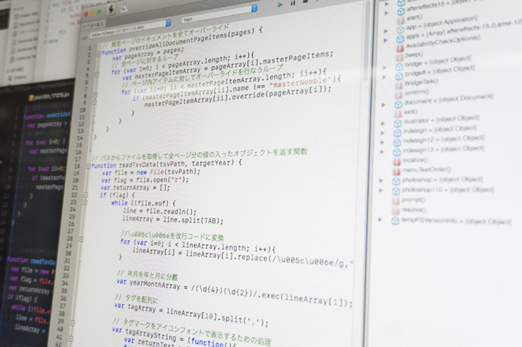
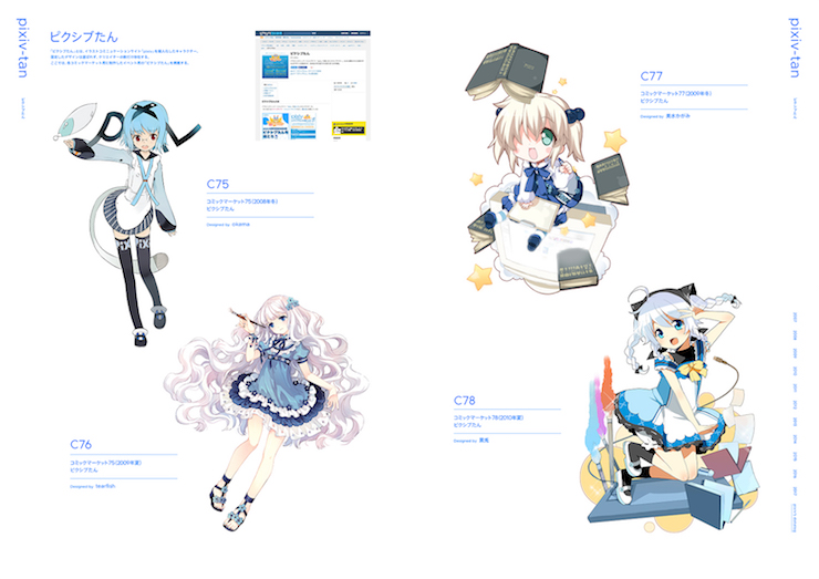
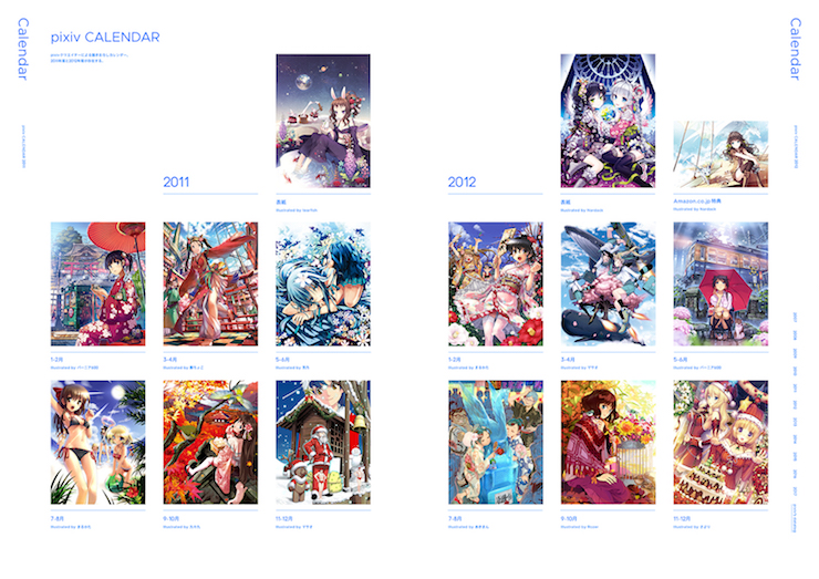
Out of 632 pages, about 500 of them show illustration rankings of the decade. In order to handle those pages, we built a system which automatically composes the base using a layout software called "InDesign". That was a first even for us at BALCOLONY..
There are 8 illustration rankings in a month, times that with 12 months and 10 years and we get a total of 960 rankings. Depending on the situation, there is a possibility that some illustrations appear on more than one ranking; hence replacements will occur after correction by the editorial supervision and decision regarding the landscape orientation. I thought of creating a structure that can flexibly adapt to such changes.
Furthermore, by building the script, we can create a prototype that shows us the final result of the entire page layout; for as many times as we need. Ultimately, we managed to allocate enough time for design alteration and I think we made the right choice by choosing this method.
"pixiv archive 2007-2017" is not just a simple book of illustrations. I think it will be an archive capable of invoking different emotions in those who see it, because as they flip through the pages they will experience the change that pixiv has brought to Japan's illustration scene since the day of its birth.
I think at the end of the day, paper is still the strongest medium to preserve history.
It is easy to obtain data from the Internet, but when the server disappears, so will the data. When it comes to preserving information, I think digital data still is still vulnerable.
On the contrary, Japanese printing technology allows a book to last for at least 100 years when it is kept in favorable conditions. I believe the combination of paper books and the library provides for a stable archive in terms of preserving, maintaining, and accessing information. That is where I find the significance of making a paper form of pixiv, a service on the Internet.
Kato/BALCOLONY.:
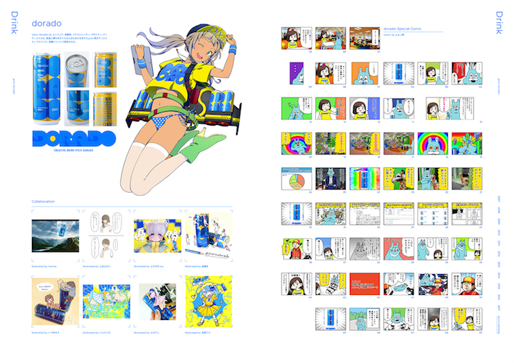
This book keeps not only illustrations, but also secondary data such as pixiv events, collaboration projects, the change in the number of users in the span of 10 years. I think this is quite a special book in which one can see the summary of what happened and what changed during the 10 years since pixiv, an SNS platform that focuses on illustrations, appeared.
With its scale, this book provides us with a clear view of what happened in Japan's illustration scene at the beginning of the 21st century. And a book like this might not be produced again anytime soon. I think we have managed to create a historical volume that scholars can use as their reference when they look back at the history of Japan's illustration scenes decades from now.
Nakamura/Kyoritsu Printing:
Giving data the shape of a physical book and keeping it with us--I think this project provides us with a reason to reevaluate the value of books in the age where e-books are flourishing.
We have done everything we could, so I hope many people will get this book.
Takahashi/Kyoritsu Printing:
This book was a real challenge for our company. I think it can even be said that this book tested the limit of the book-making industry's technology. I am proud of this book and I cannot wait for many people to see it as the crystallization of precise book-making technology and Japan's world-renowned printing technology.
"pixiv archive 2007-2017" is pixiv's 10th-anniversary art book, produced with careful details by BALCOLONY. and Kyoritsu Printing.
It contains 632 pages, it is 4cm thick, and it weighs about 3kg. The binding design is that of a "monolith". All illustrations in this book are submitted in their RGB format and printed with Kaleido® ink using only the best of Japan's printing technology.
As the result, this book can only be ordered until April 2 and it takes 2 months to produce. There will only be 3,000 copies of it. This book will not be sold at any bookstore and it will not be reprinted.
The book is indeed a bit pricey, but please consider using this once-in-a-decade opportunity to add this book to your collection!
▼Check out pixiv 10th-anniversary art book website!▼


![Drawings Tagged with #pixivSakuraEffect - [Limited Time!] Flower Shower](https://i.pximg.net/c/1200x630_q80_a2_g1_u1_icr0:0.178:1:0.548/img-original/img/2025/04/04/08/37/42/128934669_p0.jpg)