Keeping camera angle in mind can significantly change the way you approach drawing. Here's what happens when a professional animator reviews and corrects amateur illustrations!
Interview by Ichibo Harada @HEW
To celebrate the 10th anniversary of the well-known anime production company Wit Studio, an illustration contest was held based on some of the studio's anime, including Vivy: Flourite Eye's Song, Ranking of Kings, Vampire in the Garden, Bubble, and Onipan!
Those who participated in this contest had the opportunity to receive feedback from a professional animator.
What do professional animators take into account when drawing? We had the company president and working animator, Kyoji Asano, take a look at the submissions and share his thoughts.

- Kyoji Asano
- Character designer and animator; cofounder and CEO of Wit Studio, Inc.After working for Production I.G., he became one of the founders of Wit Studio. Notable works include Psycho-Pass (character designer, chief animation director), seasons 1-3 of the Attack on Titan anime series (character designer, chief animation director), and the Spy x Family anime series (chief animation director).
If this was a photograph, where would the photographer be?
── Thank you for joining us today. I bet you don’t have that many opportunities to spend time looking at fan art.

That's true. I was really happy to see how much time and love was put into these pieces, and it was fascinating to see all the works, each with its distinct personality.
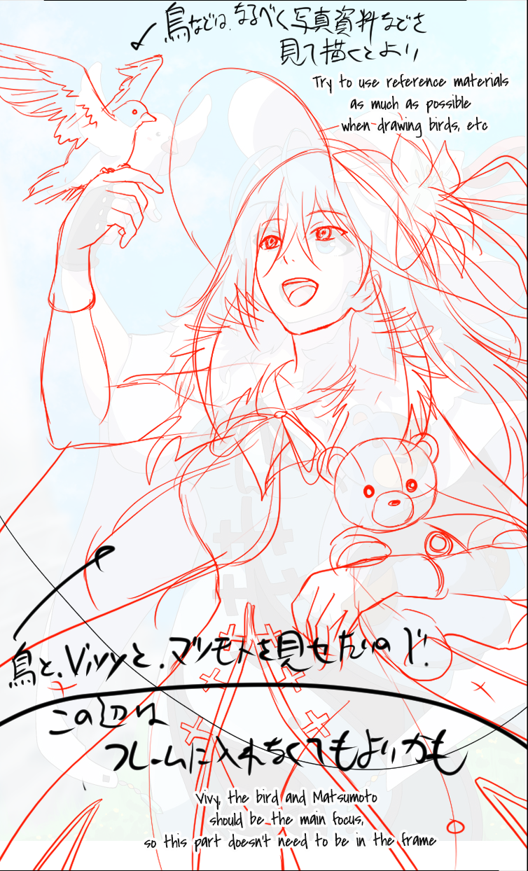
── The artworks shown above are, respectively, the original entry by artist Yasei no Gorilla K (野生のゴリラK) and your feedback. The subject is Vivy, the protagonist of Vivy: Fluorite Eye's Song, and you suggested that the artist zoom in on her a little more.

At first glance, the space at the bottom seemed a little empty. I think the main focus was supposed to be on Vivy, the bird, and Matsumoto, so I thought it would be better to focus the spotlight more obviously on these three. As a result, I lowered the camera and went for a low-angle shot. In the original illustration, the camera was pointed at Vivy's face, so the lower half of her body is seen from above, making the bottom of the artwork look empty.
── I see. Even when drawing a character from the front, adjusting the camera position can give the illustration a completely different feel.

That's right. Even for those who are used to drawing, settling on a good camera angle can take some trial and error. But think about it this way: if this were a photograph, would the photographer be standing right in front of the subject? Crouching? Standing off to the side? This can significantly change the way you draw.
── What did you like about the original illustration?

It looks like the artist got the coloring just right, so I hope they'll keep it up. However, I believe the result would be even better if they dared to have a little bit more fun while drawing. Being clean and straightforward is one approach, but they could also benefit from actively seeking out challenges, such as increasing contrast, which can help them learn about different color shades.
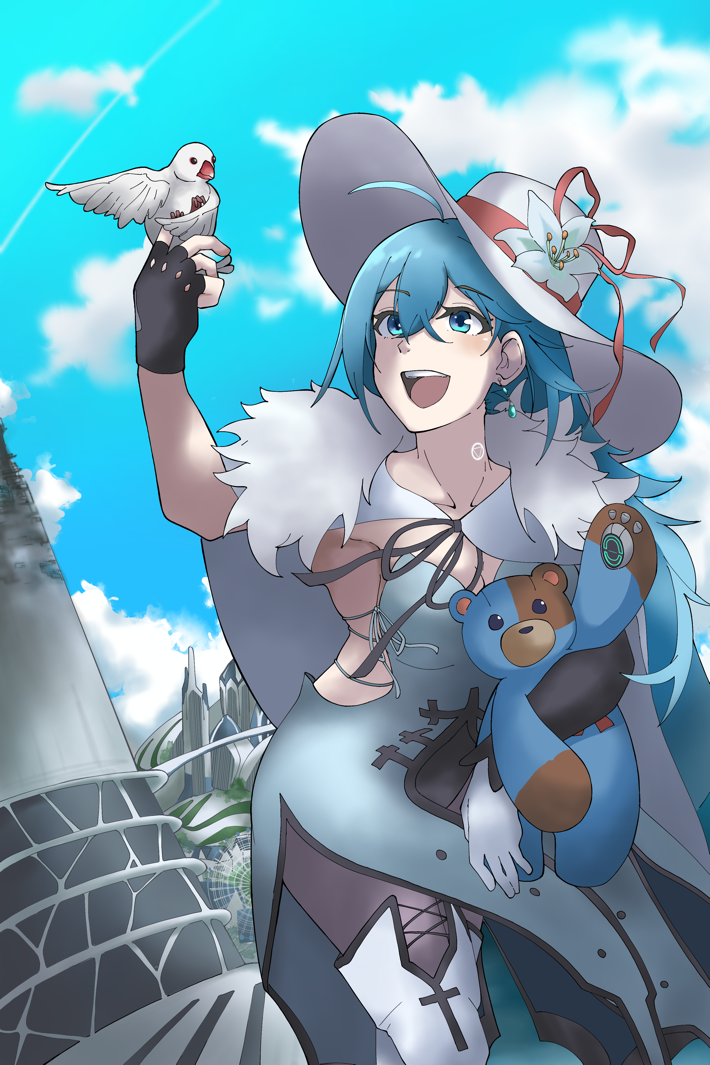
Here's the final piece, revised and improved by the artist!
How can I visually express what I want to convey?
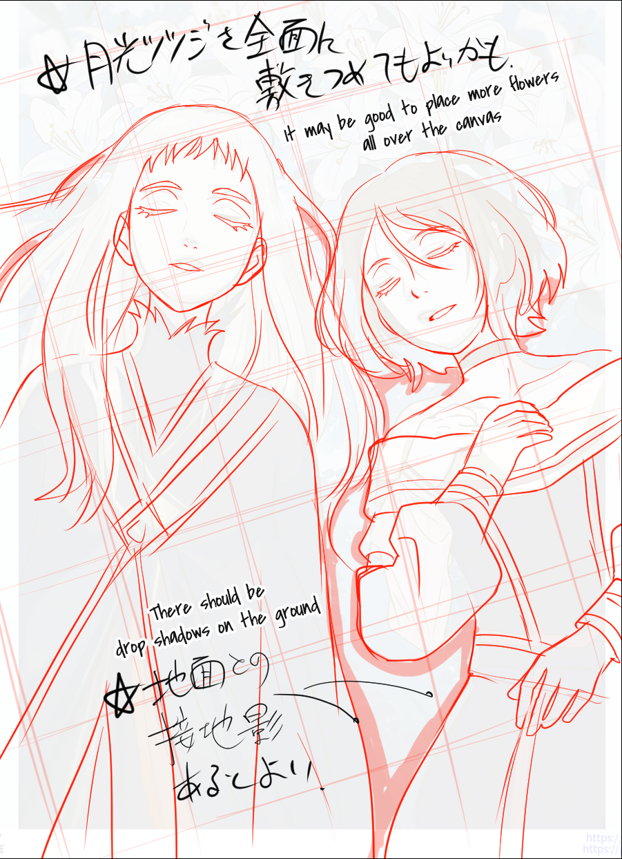
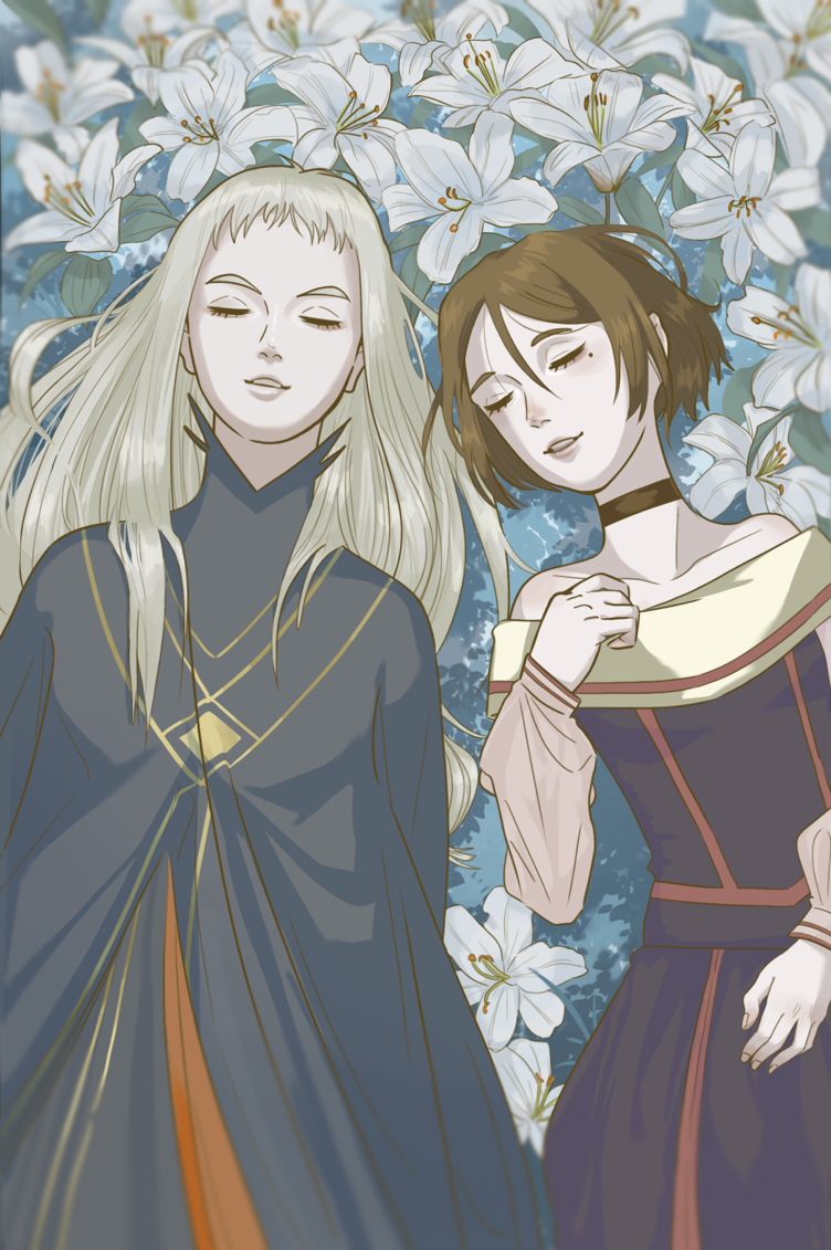
── The next piece is by artist Tonbo (とんぼ). The illustration shows Momo and Fine from Vampire in the Garden taking a nap. As part of your feedback, you made suggestions for how to draw their hair.

When I first saw this artwork, I was confused for a moment, wondering if the characters were lying down or standing up. The shadows of the two characters on the ground were difficult to discern. Also, when people are standing, gravity causes their hair to fall smoothly toward their feet, but when they’re lying down, the back of their heads is pushed down, causing the hair to spread and curl in random places. I adjusted the shadows and hair to clearly convey that the two characters are lying down.
── You also reduced their distance from each other.

Yes, to emphasize their relationship, but finding the perfect balance was important since they are a human and a vampire and it didn’t feel right to have them too close together.
── In other words, you came up with a specific interpretation, which is also based on how the characters feel about each other and how they interact.

That's right. In my revision, both of them look peaceful with their eyes closed, but if I had even one of them lying there with their eyes open, it’d give the impression that the characters are experiencing different emotions. When I draw, I always think about how to visually express what I want to convey.
── What did you like about the original illustration?

On top of the general color scheme, I can tell that the artist took time to think about how to realistically portray the creases and shadows on the characters’ clothes, and used reference materials to draw the flowers. These are all good skills that they should continue to hone.
Here's the final piece, revised and improved by the artist!
Dividing the canvas into far, medium, and close fields
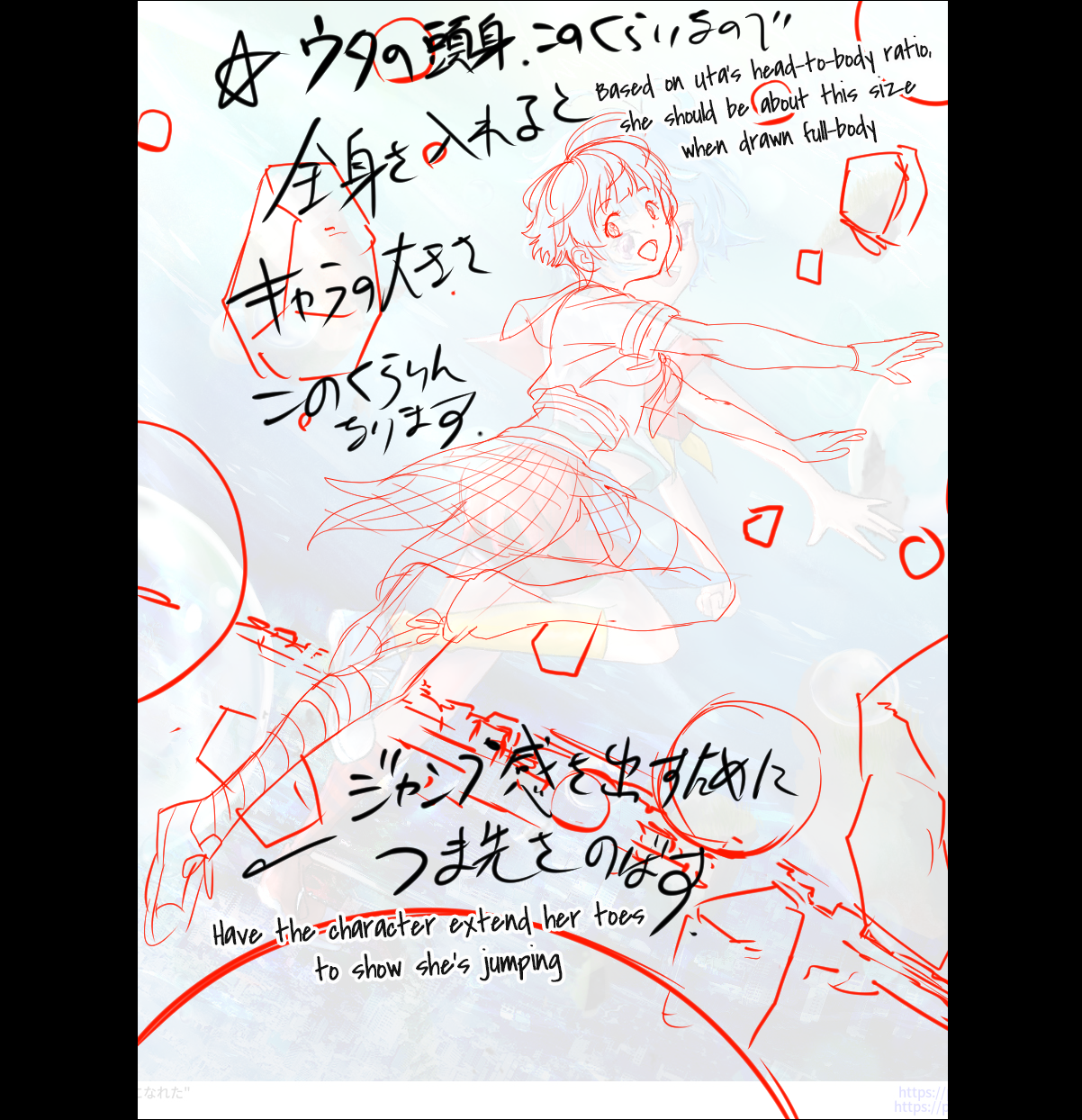
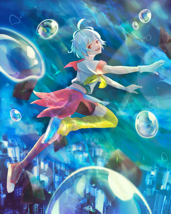
── Next is a piece by artist Aoi Seno (青井せの) that depicts Uta from Bubble. In your feedback, you increased the character's head-to-body ratio.

I think the artist wanted to show the character parkouring in the air, so it'd be better to draw her limbs longer to express a sense of dynamism. Also, having the character extend her toes is a subtle but effective way to show that she's in the middle of a jump.
── The artist admitted they had a hard time placing the bubbles and debris.

It's fine to scatter them around randomly, but you might want to divide the canvas into three layers according to distance.
── Three layers?

Yes. Far, medium, and close, based on the camera position. For example, if you want to place Uta in the middle, it might be good to have something in the close field between the camera and the character. You can also blur out the far and near areas to create a sense of depth if you want the focus of your illustration to be in the middle field. Capturing depth in a three-layer structure should make it simpler to work with the screen composition. It's hard to decide both the placement of objects and the position of the camera in one go, so it's best to place the objects first and then try moving them around.
── We're circling back to the concept of camera position.

That makes me sound like I'm always talking about work. How embarrassing. (laughs) The protagonist, Hibiki, is most likely playing the role of the photographer in this illustration. The artist probably drew Uta from Hibiki's point of view. In this case, the scenery could convey the feelings that Hibiki and Uta have for each other. I think it’d be interesting to blur out everything but Uta, to convey that Hibiki only has eyes for Uta.
── What did you like about the original illustration?

Here's the final piece, revised and improved by the artist!
Portraying a scene of “being the only two in the world”
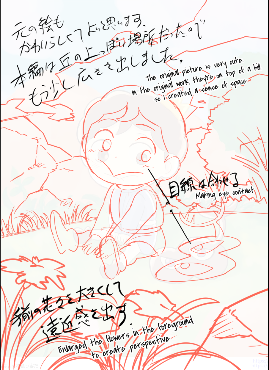
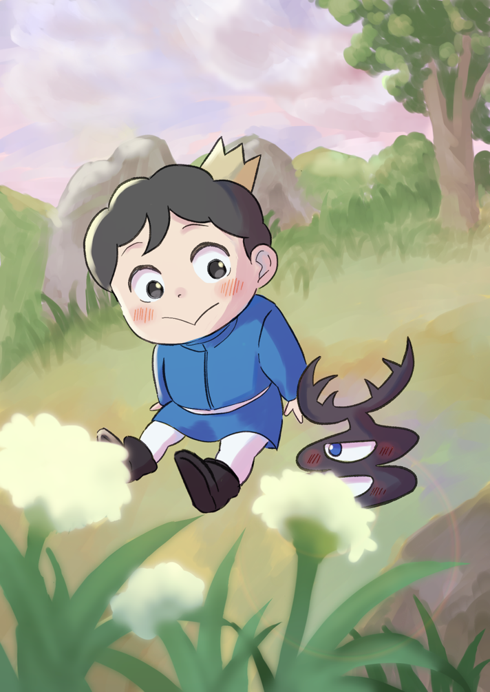
── Last but not least is this artwork by artist Tonari no Kyaku wa Yoku Kaki Kuu Kyaku Da (隣の客はよく柿食う客だ), depicting Bojji and Kage from Ranking of Kings.

I had a hard time correcting this one. I was worried that if I made any changes to it, I might compromise the original flavor... However, since this was fan art based on the Ranking of Kings anime, I made some alterations in the form of suggestions that better reflected the anime production team's vision of the world.
Bojji and Kage first meet on a hill, right? So another good choice is to curve the ground as if it were a hill and place trees in the background that match the curve of the ground. In addition, I left the area around them open to convey that they're alone in this place. I also emphasized the flowers in the foreground according to the concept of far, medium, and near fields that I talked about before. This makes the space seem less empty, while also creating a tranquil atmosphere.
── It's more obvious that Kage and Boji are looking at each other in your corrections.

The two characters were already looking at each other in the original illustration, but I thought it’d be better to show it in a more direct way to help the viewer understand their relationship. However, the fact that Bojji's face is turned away but his gaze is fixed on Kage is intriguing because it conveys his shyness, so I kept it.
── What did you like about the original illustration?

The artist created a warm, picture-book-like world. I only corrected their work because it was required for this project, but they shouldn't be forced to follow my advice. They could just as well stick to their own style.
The world extends beyond the frame
── How did you practice drawing when you were younger?

I'd like to say by practicing figure drawing and sketching... but I wasn't really into either of those things. (laughs) But I did a lot of sketching through my work. Like when I was drawing a poster for a certain title. By drawing rough sketches over and over again, I somehow began to understand how to create a good composition.
The goal when designing a poster is to introduce the work in a way that is appealing. You can learn a lot just by looking at posters of different works. So I studied posters that I thought would be useful and drew a lot of rough sketches, which I think resulted in a lot of practice.
── Many people say that if you want to get better at drawing, you shouldn't only look at illustrations but also at real-life materials such as photographs and movies. What do you think about that?

I’m not sure that’s true. I think that saying that you should not only use 2D references when drawing a 2D illustration is also a limiting worldview in its own way. I think you should be able to incorporate everything you take in, whether 2D or 3D, into a single illustration.
── In other words, we should keep an open mind to all ideas.

Exactly. Also, it seems to me that you can draw more dynamically if you don't think too much within the boundaries of a frame. Oh, but seeing things with your own eyes is crucial. When you go up to a high place and look down on the city, you enjoy the vastness of the land below you, don't you? As much as one would like to express that sense of vastness, it’s difficult to do so because if you’re painting, you’re necessarily limited by the size of your canvas. Whether it's an illustration, a photograph, or a film, each piece takes place within a frame. But the world extends beyond it. When I keep this in mind, even if I'm still drawing within a limited space, my art end up feeling a little different.
When you feel discouraged, think "Eureka!"
── What advice would you give to aspiring animators?

Drawing will help you improve, of course. Gaining experience will naturally make you better, so go ahead and try drawing a hundred pictures for starters. I also often tell young people that they need to develop the ability to switch between looking at their own work subjectively and objectively.
You may feel confident in your abilities while you are drawing, only to look at your work the next day and wonder what the heck you were thinking. When this happens, don't be discouraged; instead, use the fact that you've managed to see things objectively to improve your art.
── In other words, you should take advantage of the voice in your head that says, "What the heck?!"

Your creative process will speed up more as you start to hear that voice earlier and earlier. The ability to control the switch between viewing your own work subjectively and objectively is a powerful thing. It's okay to go for a walk or grab a cup of coffee if it helps you switch from subjective to objective thinking. Whatever it is, you have to find a method that works for you.
Perhaps it's because I'm getting older, but whenever I spot a mistake in my illustration, that's when I think "Eureka!" because once you see a flaw, all you have to do is fix it.
── I see, so switching perspectives like that can be a boon! So you never get discouraged when you're working on something?

Of course, I have my down days, but I've lived long enough to know that what goes down must eventually come back up. I also have a few tricks to motivate myself, such as revisiting anime and manga that I enjoyed when I was younger.
── Younger people in particular may experience times when they are discouraged by their lack of ability and are unable to enjoy the act of creation. Your words will be very encouraging to them!
