pixiv High Schoolers Illustration Contest 2025 results - From an unprecedented 1,497 submissions, the winner is...?!
After a rigorous judging process, the winning works for the pixiv High Schoolers Illustration Contest 2025, held by pixiv in the summer of 2025, have been chosen!
Now in its eighth year, the contest's theme for 2025 was “time.” A record-breaking 1,497 entries were submitted, over 200 more than last year! The contest saw a remarkable level of growth in both technique and artistic expression, with many outstanding works that made the judges’ decisions tougher than ever.
The creator judges for this year’s contest were five popular illustrators: haruo (head judge), Uraura Ura, Terada Tera, lack, and Rolua.
Each judge carefully examined all entries, considering how each artist interpreted the theme, the overall atmosphere of the illustration, and its technical and expressive quality. They also read the titles and captions to better understand the creators’ intentions and the emotion behind their works.
Both the Grand Prize and the Illustrator Panel Awards had many strong contenders, sparking passionate discussion among the judges. They were torn between a variety of high-quality entries, and had to deeply deliberate which works stood out over others.
After much careful consideration, the final award-winning pieces were decided.
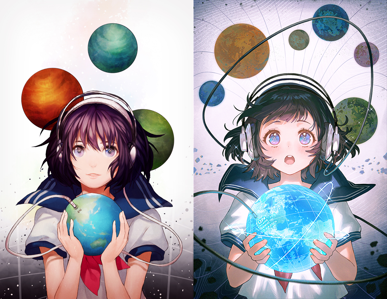
The Grand Prize
This is the prize awarded to the work selected as the best illustration among all the entries. The winner will receive 200,000 JPY in prize money.


The Panel’s Critique
Uraura Ura: The artist demonstrates a refined mastery of color expression, especially in the shading. The drawing skill is exceptional, and the attention to fine details, like the hair, really shines through. The composition naturally guides the viewer’s eye, showing strong technical ability. While a great work can be created through knowledge and technique alone, this piece goes beyond that. It has genuine artistic sense that immediately drew me in. This artist already seems capable of working professionally.
Terada Tera: The bold perspective and dynamic angles create a wonderful sense of floating, while motifs like clocks and flowers add narrative depth. The predominantly white palette gives a calm, serene impression, beautifully contrasted with vivid accent colors and highlights. The balance between powerful composition and delicate detail is exquisite. I was truly captivated.
haruo: The artist skillfully makes full use of various digital painting tools and techniques. They create a mysterious sense of floating, as if the subject is being pulled forward and backward at the same time. Having the character be enveloped by a scrapbook evokes not nostalgia, but a feeling of being swept away in the flow of accumulated memories, which is very impressive.
lack: I was immediately drawn to this fresh concept. There have been works that use photos or books to represent time and memory, but this is the first time I’ve seen a character literally placed within a scrapbook. It’s a concept that feels uniquely human, something beyond the reach of AI, and I love that. Turning a carefully developed concept into a piece that communicates clearly is no easy task, but this artist has achieved that beautifully.
Rolua: Among past Grand Prize winners, many works expressed the theme by depicting spaces or environments, but this one conveys everything powerfully through the character herself, which I found compelling. The color choices are lovely as well. As lack mentioned, translating an abstract idea into a visual composition like this is difficult, yet the artist has done it with great success.
haruo: This piece is both a triumph of imagination and a showcase of skill. While past Grand Prize works often featured dense compositions with complex scenery, this one stands out with its open, conceptual visual approach, as if the artist has made imagination itself visible. It feels new, like a breath of fresh air breaking from tradition.
Uraura Ura: I can’t wait to see how far this artist will go. I truly hope they keep reaching for the top!
Illustrator Panel Awards
These are works selected by the panel of judges, all active creators, based on each of their unique perspectives as illustrators themselves. Each winning illustrator will receive a 30,000 JPY Amazon gift card.
The Uraura Ura Award


Uraura Ura: I was moved by this artist’s decision to use traditional media in this digital age. I believe they entered the contest with the clear intention of expressing the time poured into the artwork itself. That’s easy to say in words, but incredibly difficult to achieve without real technical mastery, and they pulled it off brilliantly. If I had encountered this piece when I was in high school, I might have put down my own brush! The level of skill is simply astounding. Truly amazing is the only way to describe it. I’m grateful to have seen this work.
Rolua: It’s captivating to see traditionally painted works in this day and age. The rendering is so precise and intricate that, at first glance, it could easily be mistaken for a photograph.
Terada Tera: At first, I didn't realize it was drawn traditionally, which makes it even more astonishing! The texture of the brushstrokes beautifully conveys the humidity of the scene and the quiet flow of time. It also creates a wonderful sense of stillness and serenity.
lack: I believe this piece was created using Copic markers or watercolor, and the fact that the artist was able to depict the surface of the water with such skill is remarkable. Their artistic ability is extremely high. It feels on par with that of an art university student.
haruo: You can feel time itself flowing through the waves. The level of technical mastery is so impressive that it’s hard to believe this was done with traditional media. It’s the kind of work that makes me think, “If this artist ever published an art book, I’d buy it immediately.” An absolutely beautiful piece.
The Terada Tera Award


Terada Tera: The ruined, post-apocalyptic atmosphere contrasted with the motif of a school moving toward the future is deeply moving. The use of light and shadow centered on shades of blue is beautiful, conveying both stillness and sadness at once. The writing on the blackboard and the crumbling classroom vividly weave a story. The textured finish and the rendering of the atmosphere are also lovely.
Rolua: The direction of the light and the decaying ruins serve as a metaphor for the past, giving the image a dreamlike, introspective quality that I found very beautiful. I think that a few years after graduating high school, when the artist looks back on this piece, they’ll feel an even deeper emotional connection to it.
haruo: Both the choice of motif and the lighting show a strong sense of contrast. There’s a powerful quietness in the scene, yet the lush greenery and flowers swaying in the wind give it a vibrant sense of life.
Uraura Ura: In terms of capturing time within an artwork, this piece shows outstanding expressive and conceptual ability. It’s a work that leaves a lasting impression.
lack: The way this image emerged from the theme of time is excellent. It’s a piece that instantly communicates its concept while also inviting deeper interpretation through its fine details. Truly an exceptional work.
The haruo Award


haruo: The color palette is chic yet vibrant, and that contrast really drew me in. I love the bright, whimsical feeling of traveling through time and space in an ordinary car. The artist also entered last year, and I can really see how much their work has grown since then. The current level of detail gives the whole piece a great texture and atmosphere, though if I were to add one small note, I’d say the area outside the car could have been developed a bit more.
Terada Tera: The characters' expressions are so lively. The illustration exudes a strong sense of joy.
Uraura Ura: The stylization and color choices are wonderful.
Rolua: The facial expression and overall polish of the artwork are impressive, and the vividness of the piece makes it really appealing.
lack: There’s a real sense of energy in this work. I get the feeling this artist could adapt their style and approach in many ways. They have the potential to succeed across a wide range of artistic directions.
The lack Award


lack: The lighting and rendering technique are both outstanding, resulting in a deeply moving and visually captivating illustration. The piece beautifully depicts the emotions of a young elementary school girl who is being drawn toward the limitless world of middle school, yet still carries a vague sense of unease and a reluctance to move on. The work expresses these complex feelings perfectly. The way the theme of “time” is conveyed at a glance is fantastic.
Rolua: As lack mentioned, the emotion the artist wants to express comes through very clearly. The title 来ないでッ! (lit. Get away from me!) fits perfectly for this little girl who seems determined to stay in elementary school. The high level of technical skill also makes this a wonderful, memorable piece.
Terada Tera: Beyond the dramatic lighting, I was impressed by how carefully the artist rendered difficult areas such as the folds in the clothing and the creases of the skirt. The attention to detail really stands out.
haruo: The artist instantly communicated a difficult theme through strong visuals. You can feel the hope that comes from personal experience and the emotional weight of that moment. It’s a touching, emotionally resonant piece.
lack: It’s amazing that this was drawn by a high school student. Expressing this much emotion with a character turned away from the viewer like this shows tremendous talent. I’m really looking forward to seeing what they create next.
The Rolua Award


Rolua: Even though the composition, color palette, and pose are kept simple, the illustration has a wonderful, dramatic presence. You can almost see the girl breathing and moving around the scene. It’s impressive how the artist manages to balance the completeness of the artwork as a whole with the strong life presence of the character and motifs. This piece would work beautifully as an animation. I also love how the theme of “time” is expressed by repeating the same person from different time periods within the same frame.
Terada Tera: The contrast in the colors is striking and stylish, and the balance with the cute character design is really charming.
lack: The “OK” written on the ribbon is actually made from “KEEP OUT” cautionary tape. That’s such a clever touch. I love that the illustration includes small details that invite deeper interpretation of the story.
haruo: There’s so much to discover when you look closely. The way the artist incorporates playful, subtle references throughout the piece feels very natural and confident.
The Corporate Sponsor Awards
The works featured here were chosen by our sponsors. Each of the artists will receive a variety of creative production-related goods and other items from each respective company. Here are the comments from each company.
The CLIP STUDIO PAINT Award


The composition skillfully conveys the idea that even though the methods may change, what humans do remains the same. The playful details, vivid yet warm color palette, and careful brushwork make the piece endlessly engaging to look at. The more you look, the more you can imagine the story behind it. Are these two characters an ancestor and their descendant, or perhaps the same person throughout time? It’s a work that invites many interpretations and can be enjoyed on multiple levels.
The Copic Award


The composition and balance of each element are outstanding, and the expressions of the kittens, in awe of the strange place they've wandered into, are vividly depicted. The dome-shaped interior and the dynamic, lifelike creatures create an undeniable sense of excitement. By limiting the color palette to a specific range, the artist has created a strong sense of unity and stylishness. This artist obviously enjoys drawing a wide variety of subjects, and hopefully they'll continue exploring that interest by creating many more works in the future.
The KADOKAWA Kitora Award

月の刻、古都を行く。
by うみ

Among the group of friends walking straight ahead without looking around, the girl who suddenly glances up at the sky is the protagonist. From her expression, you can feel the moment when a passing breeze reveals the moon to her, and she's captivated by its beauty. The composition, where the moon isn’t directly visible but reflected in the girl’s eyes, is brilliantly executed. Though it captures just a fleeting instant amid the noise and energy of a festival, it makes you certain that this girl will never forget this scene. It’s a story that beautifully embodies the theme of "time,” depicting an eternal moment within a single heartbeat.
The Pocari Sweat Award


The CalorieMate Award


The Maruman Award


As part of its corporate branding, Maruman upholds the vision of being a "Creative Support Company," providing services that enable everyone to be creative. There are moments when we lose track of time because we’re completely absorbed in what we love; those moments can become our greatest strengths and the source of new ideas and value in our lives. From the finely rendered details of this artwork, we could truly feel that passionate, focused spirit, which is why it was chosen to receive this award.
The Shoei Awards 1

The gentle color palette envelops the entire piece, creating a wonderfully soothing atmosphere. The combination of the pencil case motif, the character’s expression, and the summer vibe evokes a deep sense of nostalgia. Depending on the paper it’s printed on, this artwork could take on a variety of uniquely expressive qualities.
The Shoei Awards 2


The warm atmosphere of this piece draws you in and makes you imagine the story behind it. Every detail has been rendered with great care, creating a work so engaging that you lose track of time while admiring it. While it’s already captivating on a digital screen, the texture and depth of its colors would likely stand out even more beautifully when printed.
The Shoei Awards 3


The entire illustration conveys a strong sense of story and beautifully embodies the theme of time. The vivid colors fill the canvas with energy, giving the viewer a cheerful, uplifting feeling. The color expression is stunning, and it’s easy to imagine how vibrant and striking it would look when printed on paper.
The Born Digital Award


We were deeply impressed by the composition, which depicts the entire room as if viewed through a fisheye lens. With an astronaut floating at the center, the objects are arranged in a circular pattern that evokes the passage of time and memory. The level of detail is remarkable, revealing something new each time you look at it. It’s simply a joy to explore, full of hidden touches that make you want to keep searching. We even found ourselves turning the laptop upside down and tilting it different ways to find hidden secrets. Incidentally, the donut shape is famous for being the first model many beginners try to create when learning new 3D modelling software. Maybe that’s a sign! We hope you’ll give 3D CG art a try someday.
The Kikan S/Small S Award


We were overwhelmed by the sheer number of items filling the canvas and the incredible precision of the rendering. The well-worn school bag and sneakers, the powered-off game console, and the overlapping instruments... Each detail invites the viewer to piece together the girl’s background and feel the passage of time through the objects surrounding her. Despite the vast number of elements, the artist ensures the girl herself doesn’t get lost in the scene; her white skin, the folds of her clothing, and the carefully balanced colors all bring her presence to the forefront. We were captivated by both Shirafu (the artist)'s skill and the dedication it must have taken to complete such a thoroughly realized work.
The Wacom Award


The ring placed on top, the watches and glasses arranged around the table, the fingers tenderly touching the photo, and the reflection of a figure in the cup, all feel like fragments of time and memories, powerfully evoking the contest's theme. The calm sepia tones add a sense of nostalgia and warmth, inviting the viewer to imagine the story behind the scene. We were deeply impressed by the artist’s meticulous attention to detail and expressive ability. We look forward to seeing more of their wonderful works in the future.
The Next Creator Awards
The Next Creator Awards/Zenkoku Douga Create Koshien

All of the judges agreed that this artist's talent is simply undeniable! The Zenkoku Douga Create Koshien (lit. "National Video Creation Contest") is all about celebrating the unique creativity and free-spirited ideas that only high school students can express. Komori Shiwasu (the artist)’s fresh and original composition sparked the most excitement for how it might translate into some dynamic entries for our contest, which is why we selected this work. The art seems to feature elementary school students, but we’re very much looking forward to seeing a high school student version!
The Awards of Excellence
These are the works that did not win the Illustrator Panel awards, but did catch the eye of our judges.


Rolua: Overall, the illustration is full of charm and expressive faces. I especially like the cheerful girl on the left. If I were to change one small thing, it would be nice to have one more prominent character in the scene. I enjoy works that show the same person across multiple points in time, so this piece was really fun to look at.
haruo: This artist clearly has strong technical skills, and I could tell that the simplified facial expressions were a deliberate, thoughtful choice.


Uraura Ura: Simply put, this is an excellent piece. I personally find it difficult to work with black, so I truly admire how the artist has used it so effectively here. The work is already very appealing as it is, but I think it could be even stronger if the astronaut were placed a bit more toward the center and the Earth were rendered with a little more detail.
haruo: The contrast is beautiful, and even the roughness of the brushwork becomes part of the artwork’s charm. It’s a piece that really draws you in.


haruo: The youthful perspective of connecting time with appetite feels fresh and original.
Uraura Ura: It’s charmingly reminiscent of high school and brings a smile to my face.


Uraura Ura: The vivid colors immediately caught my eye.
Terada Tera: The brushwork has a wonderful texture, and the use of shadows and color is precise and beautiful.
haruo: There weren’t many works that featured such a close-up composition of the character, which makes this piece stand out all the more.

刹那、痛みすら忘れて
by きき

haruo: The piece is powerful when viewed from a distance, yet even up close, the bold and dynamic brushstrokes give it great energy. That’s what makes it so captivating.
lack: I wonder if this was drawn in Procreate. The unique texture of the brushes gives the artwork a really nice character. It has a strong sense of individuality.


lack: Their artistic skill is very high, and the overall atmosphere of the illustration is excellent. I thought it was a very well-made piece.
Uraura Ura: Choosing Cinderella as the motif for the theme of “time” is a wonderful idea. The level of completion and polish in the artwork also shows strong technical ability.
haruo: Because the artist has solid technique, the illustration carries a real sense of power.


Rolua: The many motifs included in the piece suit the girl well, and the overall composition feels very cohesive. The illustration itself is drawn in a very cute and appealing way. One element that could be seen as either a strong or weak point is that, given the title 変貌 (lit. Metamorphosis) and caption, the girl blends too naturally with the surrounding motifs. A bit more contrast or separation might have made the concept even stronger.


lack: It’s so polished that you could easily imagine it as a poster with “Visit Kyoto!” written on it. It’s as professional as a commercial illustration.
haruo: The quality is so high that it wouldn’t feel out of place as the main visual for the pixiv High Schooler Illustration Contest itself.


Rolua: What caught my attention was how the piece feels like an animation flowing from left to right, yet still stands strong as a single illustration.
haruo: They rendered each pose very skillfully, and the wide horizontal format really enhances the composition.
Terada Tera: The presentation is beautiful. As haruo mentioned, the use of the horizontal layout, the depiction of the four seasons, and the overall composition all work together wonderfully.


Rolua: The depiction and the intended message align perfectly. The concept of peeling an apple as a metaphor for growing older, where each layer brings you closer to nothingness, is very clever. Even choosing to use fruit to express that idea was inspired.
haruo: It feels like the artist carefully considered how viewers might interpret the piece. The apple can be seen as a metaphor for an adult, and depending on one’s perspective, it could represent ripening or decaying. It’s a fascinating and thought-provoking work.
Terada Tera: It’s wonderful that the artist took on such a challenging form of expression. This is the kind of illustration that stirs the imagination and excites the viewer, inviting many interpretations from a single image.


lack: I found it really interesting that the artist viewed a coin laundry as a “place where you become aware of time.”
haruo: That’s a perspective you don’t often see from high school students. The depiction of the scene through the washing machine’s door is stylish and very well done.

haruo: This artist has submitted multiple works, but this one stands out with a different tone and style. It feels like we’re seeing a new side of their creativity.
lack: They won the Grand Prize in 2023, and after seeing this piece, it’s easy to understand why. The level of skill on display is truly impressive.


lack: Even when viewed up close, the quality is on a professional, commercial level. It’s so beautiful and perfectly finished that there’s really nothing more to say. It’s a completely polished work.


Terada Tera: The vivid complementary colors and the balanced mix of warm and cool tones create a pleasing harmony that gives the entire illustration a lively, energetic feel.
haruo: There were many works depicting classrooms from a third-person perspective, but this one stands out with an atmosphere reminiscent of Impressionist art.


Uraura Ura: The artist clearly has strong technical skill, and the overall color scheme gives the piece a very cool and stylish look.
haruo: It’s a powerful and striking illustration. I could easily imagine presenting it with a sliding animation. The drawing in the lower left appears to be a record or study of marine life.
lack: If the composition focused a bit more closely on the dinosaur and the person, it could be even stronger.


haruo: The full moon, transformation, an urn, a searchlight, an emergency button... While the composition itself is simple, the motifs packed within it convey a powerful sense of story and emotions such as anger, fear, and sorrow. It’s a striking and deeply impactful piece.

haruo: The cool and dark tones within the predominantly warm-colored scene highlight the weight and stillness of silence, creating a strong sense of contrast. It almost feels as if you can faintly hear the sound of cicadas and children playing in the distance.


haruo: The color palette and the character’s pose beautifully capture the feeling of a single fleeting moment.

haruo: Among the many works that combined different points in time into a single image, this one stood out as having the most character. The artist uses bold colors that I personally wouldn’t easily think to use, and the way the illustration on the edge of a book's pages resembles a mural is a wonderful touch.


Rolua: I like how the piece blends past works the artist has drawn with the kinds of illustrations they’ve admired as ideals. That mix gives a real sense of the passage of time. Still, since the artist already has such strong drawing ability, I think adding one more clear visual element could make the message even easier to grasp.
lack: For example, even just adding a realistic hand and a pencil could make the concept much more immediately understandable.
haruo: Yes, that kind of addition would instantly shift the perspective, making the subject, the artist themselves, more obvious.


Rolua: It’s a very well-drawn piece with beautiful colors. I just wish the theme of “time” came through a little more clearly. That would have made it even stronger.


haruo: Just as the title 遅すぎたんだ、僕は (lit. “I Was Too Late”) suggests, the use of vivid colors to express the negative emotions of the boy who can’t bring himself to celebrate the couple in the foreground is beautifully done.
Terada Tera: The coloring and linework are both incredibly careful and refined.

haruo: Even if their forms may one day fade away, the way the artist vividly and brilliantly portrays the lasting memories and emotions shared only between the two, as if those feelings are soaking into their very bodies, is truly captivating. It’s decadent and beautifully aesthetic.


haruo: I like the cinematic feeling of the piece. The way the artist uses the morning glory as a metaphor for the delicate and fleeting nature of life is beautiful.


haruo: The drawing itself is a little rough, but the use of color creates a strong impact that really drew me in.


haruo: Although it’s a farewell scene, the characters' bold and expressive looks, rather than looking subdued or somber, makes this piece especially captivating.


haruo: The atmosphere of the space where people are gathered below is very striking.


haruo: Simply put, the art is very skillfully done, and the contrast gives it a cool, striking look.


haruo: The beautiful use of color and the strong sense of energy conveyed through the artwork are truly captivating.

Terada Tera: The soft layering of colors and the sense of transparency are delicate and beautiful.

Terada Tera: The composition creates a strong sense of story and powerfully conveys the theme.


haruo: The use of color is outstanding, easily among the best of all the entries.


haruo: The atmosphere is wonderful, and the artwork is very well executed. It might have been even stronger if the theme of "time" came through a little more clearly.


Terada Tera: The contrast and composition are perfectly executed. It’s an incredibly cool piece. The use of black gives the artwork a powerful sense of both beauty and intensity, enhancing its eerie atmosphere.


Title: 通り雨 (toori ame, lit. "Passing Shower")
Artist: Suzuno Suzuran
About the Review Process
haruo: There were so many works that felt worthy of the Grand Prize that narrowing it down was really difficult. Every illustration was of a high level. After careful consideration of things like the emotion behind the work, the excellence of the ideas, and how well each matched the theme, we ultimately reached a unanimous decision.
lack: Since digital painting has become the norm, I could really feel how artists are mastering the tools and expanding the depth and expressive range of their art. I’ve been a judge for this contest before, and I can say high school students have evolved even further this year.
Terada Tera: The strong feeling of love put into each piece came through clearly. Viewing these works, I discovered many new ideas and had some revelations. There were many techniques and styles that surprised me and I learned a lot as a viewer too. There’s no single correct answer in art, as everyone has their own interpretations and creative touches. If I could say one thing, it would be this: thinking about how to captivate and move many people while creating might make the process even more enjoyable and enriching.
Rolua: As I looked through the works, I couldn’t help but remember my own illustrations from when I was in high school... and I definitely wasn’t this good! (laughs) Everyone’s work was so skillful, it was almost scary!
Uraura Ura: The pixiv High Schooler Illustration Contest already existed when I was a high school student, but back then I only admired it from afar and never entered. I think I avoided it because I didn’t want to lose by comparison. So I have deep respect for everyone who entered. You have the courage and determination that I lacked.
haruo: Some people may have decided not to apply because they felt they couldn’t create a work they were satisfied with, but honestly, you’ll never be completely satisfied. By submitting your work anyway, even if you don’t win, your work can still be seen by others, and someone out there may be impacted by it. That kind of connection grows from putting your work out there.
lack: Art only means something when it’s shared. Compared to those who were too scared to apply, everyone who chose to step into the arena deserves praise.
Rolua: Of course, I want to say congratulations to those who won, but I also don’t want the others to feel discouraged. I couldn’t draw this well when I was in high school either, but now I’m working professionally as an illustrator. High schoolers still have so much time to grow, so I hope you keep moving forward and absorbing everything you can.
Uraura Ura: Yes, exactly. Not winning doesn’t mean you can’t become an illustrator. No matter how many years pass, as long as you keep drawing, even little by little, I believe opportunities will come. So please, keep creating.
haruo: Also, in contests, sometimes ideas just happen to overlap with others, or the judges’ personal tastes influence the outcome. There are many excellent works that don’t end up winning. So please don’t think not winning means you lack skill. That’s not the case.
lack: Some of the participants are already showing a level of individuality and artistic identity that’s amazing to see. It’s awe-inspiring and exciting to imagine their futures.
Terada Tera: If this contest can serve as a catalyst for new challenges and realizations, that would make me very happy. I want to give a big round of applause for the courage and energy that drove you all to take action and submit your work! Please continue to use that strength to spread the joy of drawing.
haruo: Once again, thank you so much to everyone who submitted! And also to those who viewed the artworks and to everyone else involved in the contest, you all made this a deeply fulfilling experience. The time it took to create the 1,497 works submitted, and the time people spent viewing them, are enormous. The fact that so much time was devoted to this contest means it has surely become a small part of history, which I'm honored to be a part of. I hope that from here on, we can continue to stay connected through illustration.


What is pixiv's High Schoolers Illustration Contest 2025?
Launched in 2018 to provide a platform for high school students to seize new creative opportunities, this annual contest celebrates the next generation of illustrators.