A making-of and interview with the popular artist Chiho! Unveiling the secrets behind her colorful and delicate drawings!
An early graphics tablet debut!
-How did you start drawing?
If we’re talking about drawing, I started back in kindergarten. During elementary school I went through the Microsoft Paint phase, but I started properly only when I was in middle school.
One day, my father came back home with a brand new computer. At the time they were quite expensive, and everyone in my family (starting from my mother) was shocked. To win us back, though, he bought me and my sister a graphics tablet (lol). I think it was a Bamboo Comic? I wasn’t into drawing on computer until I got my tablet, I got into digital art because I got one!
-That was a rare way to start out, immediately with a pen tablet.
I agree! Together with the tablet, my father also got us Adobe Illustrator. I had no idea how to use it, so it was a trial and error process. It took some time to realize that, in spite of the name, it was really hard to draw illustrations with that software.
There was no save function back then, so I just left the window open until I finished what I was drawing. It usually took about a week! That was probably the time when my eyesight started getting worse… (lol)
-Were you inspired by any illustrators or mangaka?
By Arina Tanemura. I lived in a time when Phantom Thief Jeanne was really popular! I remember often visiting a website where her fans could gather and talk about her works.
-I have the impression that your drawing style evolved quite a lot.
The truth is I used to draw huge, sparkly eyes (similar to Tanemura’s style). You can still find evidence of the influence that style had on me if you look at how I draw hair or petals. In middle school I started to read doujinshi and that influenced the way I draw after that.
A big turning point for me was when I started making animation movies after entering university. To animate something you need to prepare a huge amount of drawings, so I had to simplify my style. I was also drawing deformed characters to use in my comic strips, and people seemed to like that. The way I drew the eyes were very similar to Momoko Sakura’s. I thought that style might fit me better and I started changing the head-to-body proportions little by little, until I got where I am now.
Find your balance through composition and colors
-What’s the most important thing for you when drawing?
Balance. For me, an illustration is like a seesaw. I don’t mean it literally goes back and forth, of course! However, if you put much more effort on one side compared to the other, it will be very visible and the overall balance will be compromised.
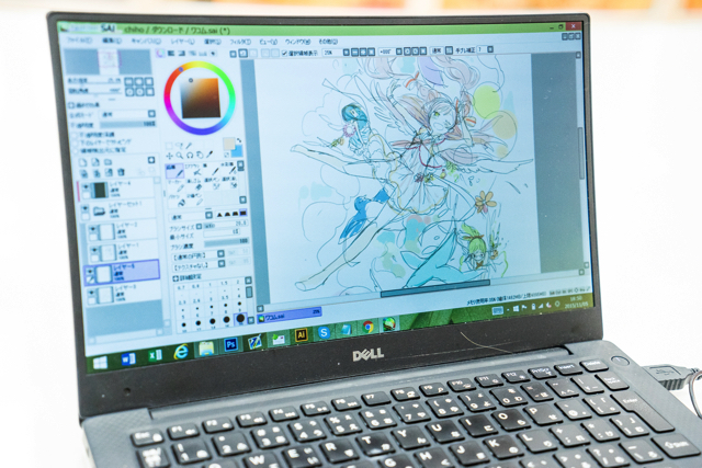
For example, in this illustration (see below), I started out by drawing just a few details. However, I felt Miku and Rin looked kinda heavy and that the action was all concentrated on the right side. So I added some more details on the left and adjusted the balance by extending the tree branches. This way, the composition is well-balanced but the artwork is still very dynamic.

Finding the right balance by adding or removing details is quite convenient. There’s a rabbit in the lower right corner, and when I placed a pumpkin on the left side it became too heavy. I tried to fix everything by adding some more animals so that they would catch the viewer’s eye. I really put a lot of thoughts into this process.
-When did you became so self conscious about the balance in your works?
I would say it was 6-7 years ago, after I started working on some illustrations for the VOCALOID series. It was not just about drawing what I liked, but also about leading whoever saw the picture to look exactly at what I wanted.
-It seems like you’re able to look at your illustrations quite objectively.
When you post your works on pixiv, feedbacks come directly at you. That helped me a lot to understand what people liked or how I should draw things to make them more appealing.
Even when I draw my own characters, I always keep in mind what people will like. If it’s a girl, I will make her skirt very short and give her a petty look, making her look straight at the viewer. I want people to fall in love with my girl characters, you know (lol)
-I see! Tell us something about the colors you like to use.
When I add colors, I pay attention to the character silhouette. It’s important for me to make it stand out from the background.
And even with coloring, I think balance is important. If there’s some bright red anywhere in the picture, the viewer’s eye will be drawn to that. I experiment a lot: sometimes I choose strong colors for the characters, sometimes I shift the focus far away from them. In the second case, however, I have to think about how to make those colors stand out a little bit less. Left/right color balance is important as well.
I play a lot with brightness and saturation. I use SAI, and I find the “Saturation” tool in the “Brightness/Contrast” tab really useful. If you use pastel colors from the beginning it’s easy to end up with an under-sat
-You don’t use Photoshop a lot, right?
I use mainly SAI. I just use Photoshop for the last adjustments! For example, if one of my illustrations is gonna be printed out, I convert it from RGB to CMYK format using Photoshop.
Adjusting the colors is really hard... I failed several times! When you convert a document in CMYK format, the yellow-green and blue-green tones tend to weaken a lot. Can you imagine how much I struggle to paint Miku’s hair? (wry grin)
When it comes to doujinshi, I usually try to print them at home to check the final result. As you can imagine, though, the quality of a home printer is not very high... For the illustrations I do for work, I usually ask one of the publishing company designers to fix the colors for me - I just hand in the RGB version.
“Cintiq” for the performance, “Intuos4” for the portability
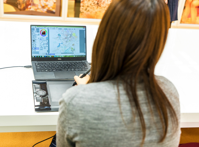
-Tell us about your work environment!
My desktop computer is a Mac, but I installed Windows with Boot Camp. The data can get heavy really fast, so I need a powerful machine.
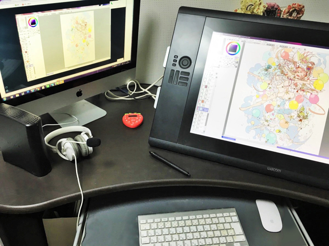
My main graphics tablet is a 24’’ Cintiq 24HD liquid crystal tablet. The thing I like the most is about that it allows me to draw faster! It’s basically like drawing on paper. I went all-in when I bought it 4 years ago and now I honestly couldn’t live without it.
My second tablet is an Intuos4. It’s easy to carry around, so I use it when I’m not at home - like for Obon and New Year’s vacation. If I have my Intuous4, I can face any kind of drawing-related emergency: deadlines, sudden job offers...
Just connect it to your PC with a USB cable and you’re ready to go. Light and convenient! Personally, I also like to use my Intuos4 to draw the most detailed parts - with the Cintiq 24HD is just like drawing on paper, so the linework can get pretty rough sometimes.
Both Cintiq and Intuos are releasing a lot of new models. Sometimes I look them up to check out their performances and I end up wanting them so bad... (lol) The newest Cintiq (Cintiq 27QHD), for example, comes with detachable function keys... Convenient, isn’t it? The resolution is way better, too. The body and the base come separately, so I could set it up myself and decide the position that works best for me... I think. With the tablet I have now, I had to ask one of my friends to help me set it up.
-Any recommendations for shortcut keys?
I also use CLIP STUDIO PAINT, so I set up the same keys to work with both SAI and CLIP STUDIO PAINT. G key for the pen, M for the round brush. In CLIP PAINT STUDIO, pressing G twice activates the paint bucket tool, but you can’t set two keys in SAI so I had to use the F key. The Alt key is for the eyedropper tool.
-Tell us about the music you listen when you draw and how you motivate yourself!
Actually, I don’t usually listen to music when I work. I like a silent room! When I draw CD covers, though, I play that CD in loop.
The hardest part for me is drawing the lineart, so I usually listen to some music or look at Twitter or pixiv to motivate myself. I don’t get much work done if I do this but... (lol) Sometimes I have a Red Bull. There are some days when I just can’t be happy with what I draw because everything looks weird. And nothing good can come out of a weird sketch! Those days I just try to relax and don’t force myself to draw.
“I’m so glad to be alive!”
-You have many projects going on: from CD jackets to book covers, and your collaboration with earth music&ecology. What do you pay the most attention to when doing your job?
I try my best to understand what my employer wants to express and what the focal points of their work are. I try to draw my characters as cool (or cute) as I possibly can.
I adapt the illustration composition and overall atmosphere according to where and how my work is going to be used. With my recent earth music&ecology collaboration, I tried my best to keep Miku’s uniqueness of the character while making it fashionable and more adult. I achieved this by making her legs skinnier and longer, and to evolve her style from manga-like to design-like.
When my work is going to be used in a movie or videoclip, I try to incorporate the style of the song into my illustration. I also have to consider how the thumbnail is going to look - it has to look cute and easily understandable, even with its small size.
-I see what you mean. The thumbnail for 1925 looks gorgeous!
Thank you! I’m so glad that so many people got to know my work through 1925 and Melancholic.
* 1925, Melancholic...... VOCALOID songs. Chiho worked on the illustrations.
-Your artbook Poemi Poemi just released this September!
I didn’t realize I was drawing so much... It’s a deeply emotional experience for me. Sometimes I still wonder “Are my artworks any good?”... But seeing people buying my artbook and receiving comments are really exciting. I might be exaggerating, but I am so thankful to be alive (lol)!!
I’m looking forward to new challenges. Maybe some original works and a manga...
-Thank you very much. Final question: any messages for middle school and high school students dreaming to become artists?
You would be surprised at how many things you can achieve if you just try. I admired over illustrators and mangaka from the past, and when I saw their works in the bookstores I would think “They’re so special. I could never do something like this”. But if you do your very best, anything can happen!
You only live once, and it’s a “first come, first served” kind of game. Let’s work hard, okay? I’ll be waiting for you at Comiket on the 3rd day!

- You would be surprised at how many things you can achieve if you just try. I admired over illustrators and mangaka from the past, and when I saw their works in the bookstores I would think “They’re so special. I could never do something like this”. But if you do your very best, anything can happen! 人生一度きり、やったもん勝ちっぽいです。がんばりましょう……! あとコミケ3日目出るのでよろしくおなしゃす! You only live once, and it’s a “first come, first served” kind of game. Let’s work hard, okay? I’ll be waiting for you at Comiket on the 3rd day!
- <ul>
<li>Illustrator. Born in Hokkaido in 1988. Has been drawing illustrations for VOCALOID songs since 2008. Her most famous works feature 1925, Melancholic, and a collaboration with earth music&ecology Japan Label.</li>
<li>
</li></ul>
Chiho’s Artbook
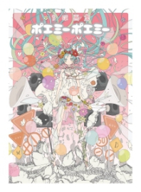
Popular VOCALOID illustrator Chiho’s first artbook.
This artbook includes Chiho’s most famous works, including VOCALOID illustrations, book covers, tie-ups and doujinshi, all in for the fans to see.
Chiho’s graphics tablet - the newest model!

Wacom Intuos Pro Professional Graphics Tablet combines Wacom’s finest pen capabilities with intuitive multi-touch support. Gain precision and control, and take advantage of all the pressure-sensitive capabilities in your favorite creative software.
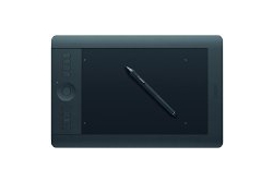
Wacom Intuos Pro Professional Graphics Tablet combines Wacom’s finest pen capabilities with intuitive multi-touch support. Gain precision and control, and take advantage of all the pressure-sensitive capabilities in your favorite creative software.