Piclive blurs the line between reality and fiction. Behind The Scenes of Re:CREATORS Art Direction!

However, thinking about the concept, logo design and settings of all the anime, light novels and games appearing during this ambitious title is surely a lot of work.
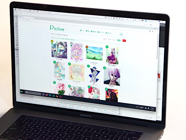
Moreover, a social network called Piclive, that looks a lot like pixiv, makes its appearance in Episode 1. It's one of the unique devices that this anime uses to give the setting a sense of realism.
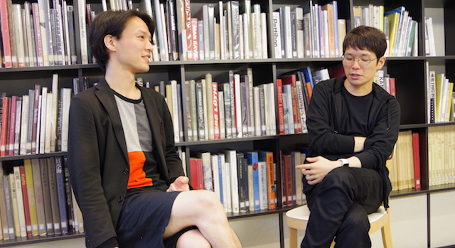
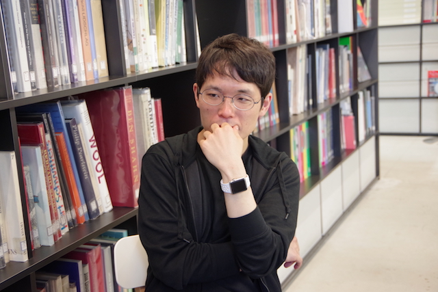
We talked with a few members of the art direction team, including Tomoyuki Arima, who takes care of all design aspects of the title.
It's hard to deal with Re:CREATORS. We interviewed two members of the design team, Arima and graphic designer Shinichiro Miyazaki, and asked them about the team activities and about the anime overall design, setting and story.
Article by Yuusuke Yamada
Editing by Tadashi Nagatani
Piclive exists to "blend into reality"
However, even though many titles appear in Re:CREATORS, the viewers are not properly experiencing them. Let's take Fate/Grand Order (FGO) as an example. It's an amazing title, right? And that's because we already know the history and backgrounds of the characters appearing in the game. The user understands, and this contributes to making it into a title that's easy to appreciate.
Still, in Re:CREATORS there's no such thing. We have to base everything on stereotypes.
Whether it's fantasy or robot animation, we have to start from elements that are easily recognizable. Having to express an illustration social network in a stereotyped way, we choose to make it look like pixiv.
I know it's probably too late to say sorry now, but... Sorry for doing this without telling you!
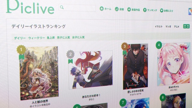
▲ Piclive ranking page as it appears in the anime.
Illustrations of characters appearing in the title are featured in the ranking as well, so you can understand that, in that world, they're really popular.
I experienced all this myself so I know what I'm talking about, but for a high school boy, receiving even a single like or comment on pixiv is immensely satisfying.
Rei Hiroe and the director Ei Aoki were both very conscious of the position of Piclive; they wanted to keep intact and express all those emotions that students feel while using pixiv.
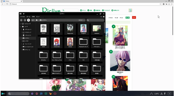
In that moment, you can see some PC folders, and if you're a young man who draws illustration you'll be able to relate to that scene so much. Your heart will probably hurt, and that's what we were going for when we created this title (laughs)
I think it's a good way to blend into reality.
By dissolving the bond between reality and fiction, you can recreate a very immersive feeling.
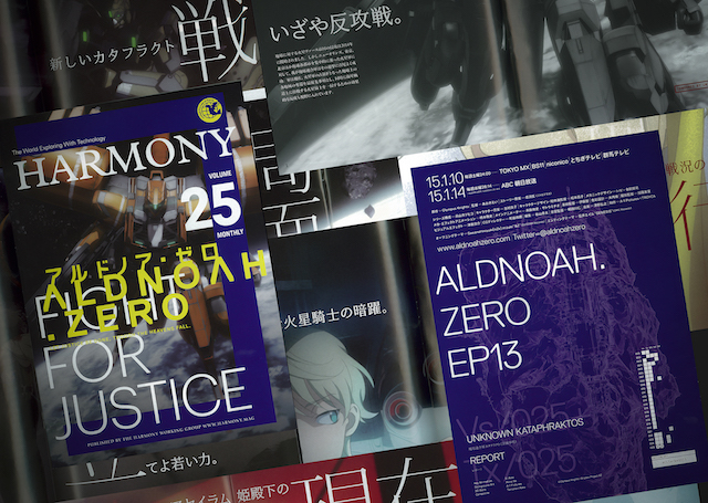
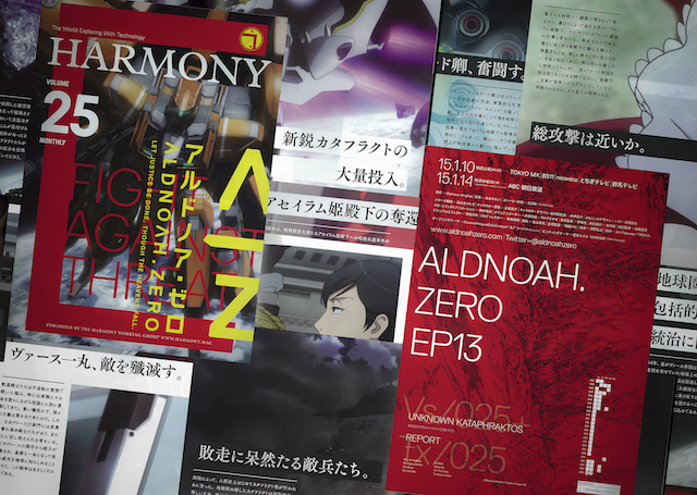
In the past, I've been working as a designer for director Ei Aoki's previous title ALDNOAH.ZERO, and I made a 16p booklet that was supposed to be released by the in-anime press. Then we placed them inside real shops.
Also, in order not to force those designs on the spectator, we make sure that Sōta uses those materials to look something up, have fun or things like that.
By the way, I have something very interesting to tell you...
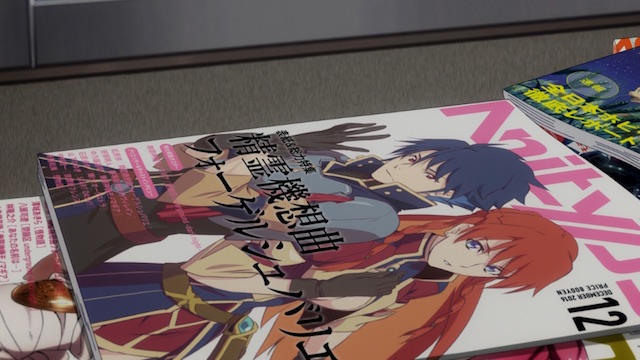
The cover of the magazine hidden under it portrays a character that really exists... Can you guess who?
Arima: We have different patterns for the cover of "Anitype", and each features elements that are not imaginary, that exist in reality.
Miyazaki Shinichiro: Some people on Twitter noticed it.
Arima: Actually, we used several images from existing Aniplex titles, that they were kind enough to share with us. And there it is, one more way to blend reality and fiction! We got this proposition from Aniplex producer, and we really wanted to do it as well.
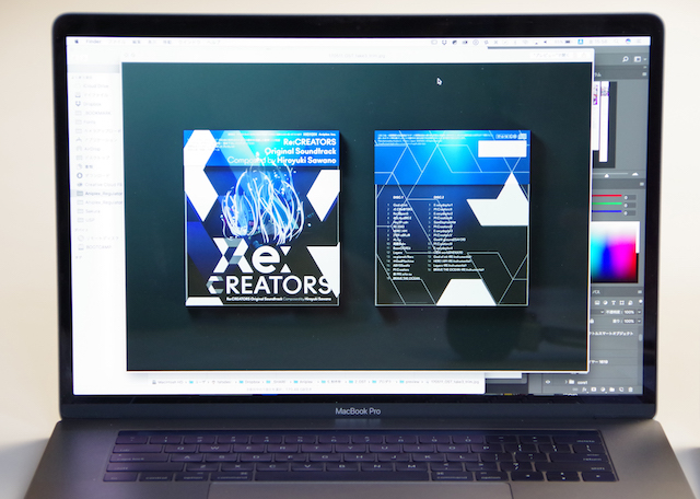
Also, the design for the soundtrack was completed right before this interview. The white part is printed on a transparent material, and when you take it off you'll be able to see an illustration. It's contextually connected to the main title, so you will definitely be surprised if you saw what it portrays.
Nonetheless, we always make our contents by featuring elements that can give the product a sense of coolness, in order to guarantee a certain quality, and only then work out ways to make the product more contextual.
About colors and shapes
-- When I saw Re:CREATORs title logo for the first time, I immediately thought about typography. What was the basic design concept?
The reason why Miyazaki and I came together is that we both wanted to take an anime-related experience and turn it into a well-rounded, consistent one. Really good things usually seem like they were thought by a single individual, and that's what we are going for.
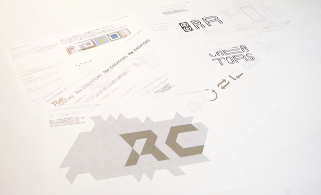
These materials can be accessed by any member of the team in any moment, in order to keep the direction of the work organic.
They usually have a very simple shape, but it can be rearranged to create a multitude of different silhouettes. Re:CREATORS is the same: we choose the tangram as a motif as a metaphor to express the multitude of titles that come together in the anime.
We decided to use the same colors for ads and when the topic is Re:CREATORS. Implying that there are two powers, we wanted to think about a color that represented neither of them. In the end, we settled for purple.
For example, if in a certain illustration there are both the protagonist of a robot anime and the warrior from a fantasy title, we need to make sure that such illustration is still tolerable by adding blank margins and keeping it simple.
About reconstructing creations and history
-- It feels very close to the concept of "fan fiction".
If that happens, it will be like the battle between punk and pop, a meta viewpoint will come up naturally. I feel like Re:CREATORS has shown this contrast in animation.
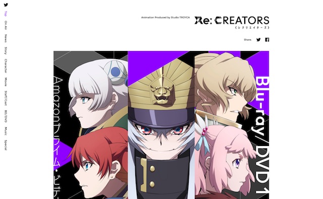
>> Re:CREATORS Official Website (Japanese)
>> Re:CREATORS Official Twitter (Japanese)
TV anime Re:CREATORS currently broadcasting!
TOKYO MX・BS11・Gunma TV・Tochigi TV: every Sat. 23:30~ABC Asahi broadcast: every Sat. 26:29~
TV Aichi: every Tue. 26:05~
AT-X: every Thu. 23:30~
※ Transmission schedule might undergo some changes.
Exclusive distribution via Amazon Prime Video
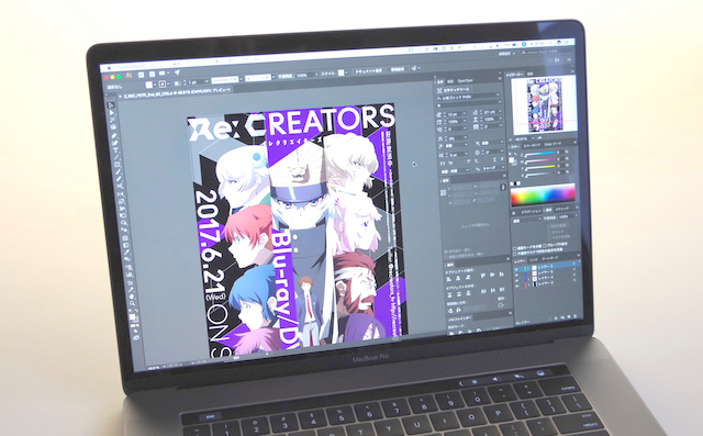
Blu-ray&DVD “Re:CREATORS 1”
On sale from June 21th 2017 (Wed)Complete Limited Edition Blu-ray: ¥6,800+tax / ANZX-13351~13352
Complete Limited Edition Blu-ray: ¥5,800+tax/ ANZB-13351~13352
【Featured Episodes】
#01・#02
【Complete Limited Edition Specials】Regular Disc + Bonus Diskc (tot. 2 discs)
Illustrated cover by author Rei Hiroe
Rearrangement bonus CD by Hiroyuki Sawano
"Anitype" magazine
・Cover character design by Ryuuichi Makino
・40p bonus contents including staff/cast interviews
Special features:
・Creditless OP theme “gravityWall”
・Creditless ED theme ”NEWLOOK”
PV & CM collection
WEB Trailer
※The contents on the regular disc are a "director's cut" version, and are different from the TV broadcast.
“Re:CREATORS ORIGINAL SOUNDTRACK”
On sale from June 14th 2017 (Wed)
¥3,500+tax SVWC70267~70268
【Contents】
”Re:CREATORS” OST by Hiroyuki Sawano (2 CDs)
・original art
・Booklet featuring Hiroyuki Sayano interview