We asked one of the winners of the “Copic Award 2020” contest, ym, for tips - Just how do you color by hand when you’ve got only one shot?!
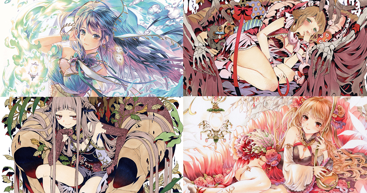
The world of alcohol-based Copic Markers is a broad one. By mixing and blending the already-robust variety of colors, it wouldn’t be an exaggeration to say the number of creatable hues is endless. Even so, surely there must be people who struggle to master these markers.
What tricks are used with Copics to create beautiful illustrations? Besides copious amounts of practice, what other things should you be aware of? We asked ym, the winner of the pixiv award in the Copic Award 2020 hosted by the Copic brand, to explain all sorts of things beginner artists are concerned with.
An unusual history of selling illustrations via online auction sites
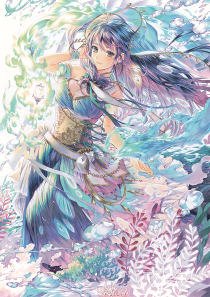
── I was astounded by the incredible amount of detail in your award-winning illustration, “The Ocean’s Paradise”. How many different colored Copics did you use?
── How long did it take to create this illustration?
── Creating something of this quality in only one week is amazing...! How many years have you been an artist?
── Do you have any experience creating illustrations professionally?
Koga: My name is Koga. I’m a pixiv staff member assigned to the “Copic Award 2020”. When we first saw your submission, there were many people among the Copic staff who were really excited and wanted to know “Who drew this?!” The folks there keep track of the prominent artists who use Copics. But you're not prominent in either the professional or fan art spheres, so they were shocked to discover “there’s someone who can draw like this?!” Considering that one of the contest’s objectives is to discover talented artists, you're an ideal winner of the “Copic Award 2020”.
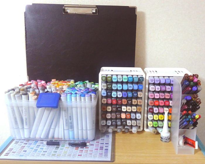
I'm honored. Oh, but I might've been mistaken when I said earlier that I never drew professionally, because I've sold my illustrations on online auction sites in the past. They have a category for "hand-drawn illustrations." When I tried to think of a way to earn money working from home, the first thing I thought of was selling the originals of my illustrations. So I do make money off my illustrations this way.
── Now that you mention it, there is a tag for "hand-drawn illustrations," isn't there! But that certainly is an unusual work history. What made you decide to participate in "Copic Award 2020"?
── I'm curious, what was the result of your sister's submission to the contest...?
Drawing paper? Watercolor paper? The deep world of selecting paper!
── Please tell us about the concept behind your award-winning illustration, "The Ocean's Paradise".
── Earlier, you said that you'd only learned about the "Copic Award 2020" contest a week before the deadline. What was your production schedule like?
── Which means it only took you about 3 days to color it?
── What was the size of the original illustration?
── To achieve such detail with that size of paper the original must have been extremely impressive. Do you have any preferences when it comes to paper type?
I'm not terribly picky, but I often tend to use drawing paper for my illustrations. With drawing paper, the colors come out nice and strong, giving exactly the impression I'm trying to achieve. Along that vein, gradations come out nicer on watercolor paper. But the colors have a tendency to bleed into each other, so watercolor paper isn't ideal when I'm trying to draw something particularly detailed. For the illustration I submitted to this contest, I used Copic-brand Premium Bond Paper. Even light colors show up nicely on this paper, so I think it's perfect for illustrations with a muted color scheme as well. Choosing what kind of paper to use can be quite difficult. I try to make a point to test out all kinds of paper to learn what kinds of illustrations they are and aren't suitable for.
── Come to think of it, there a few illustrations among your past works that used especially crisp colors. Were those also done on drawing paper?
── I was surprised to see that there wasn't even the slightest unevenness in your color application.
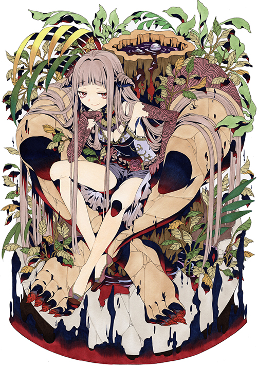
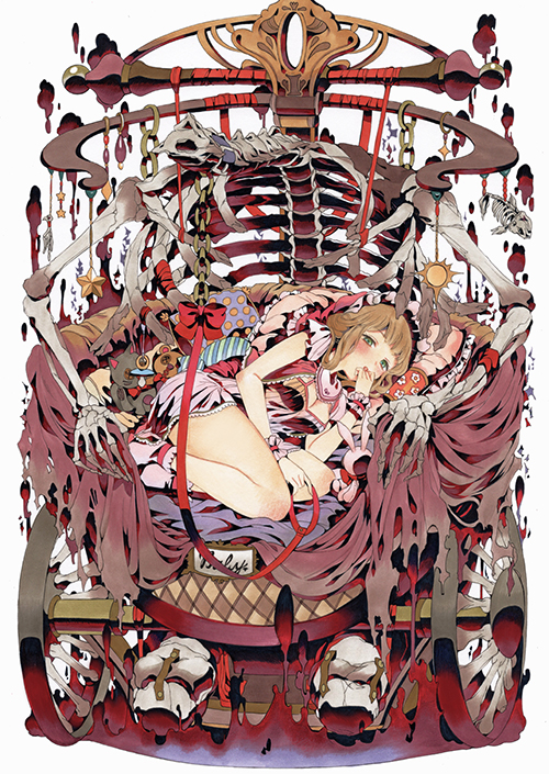
That was just me coloring very quickly, before the ink had a chance to dry. (laughs) When that doesn't work, I use a colored pencil to correct the unevenness. I usually try to fix any mistakes I make with a colored pencil. If I try to forcibly fix mistakes using only Copics, the colors tend to separate (due to differences in the size of the pigment grains, the colors can look glaringly different), and the mistake ends up looking even worse after…
── It's quite difficult to correct mistakes made while coloring by hand, so this is a very useful tip! In the winning illustration, did you also go back after and use a colored pencil to add the rosy flush to the character's cheeks?
── Do you use any art supplies outside of the Copic brand?
When you decide "color areas", it creates a sense of congruity for the entire piece
── The color scheme is always a single attempt, isn't it? To what degree do you plan it out beforehand?
For "Copic Award", they had something called key colors, but I always select about 3 main colors to be the theme for that piece for my other works. For example, if you color the character's skirt red, your first instinct will probably be to use a darker red for the shading on the skirt. But if you've already used blue in another area and done the shading there in darker blue, it will look random and incongruous when you look at the piece overall. In this situation, I'd do the shading in both areas with a reddish purple or bluish purple, which would instantly draw the entire piece together. By deciding your key colors from the very beginning, you'll be able to see which colors you should use for the finer details. If you decide your key colors ahead of time, I think you’ll instantly see an improvement in the finished product, even for those who are inexperienced with using Copics.
── Is there a technique for creating a sense of congruity even when using a variety of colors?
── What do you mean by "color areas"?
You mentally break a single illustration up into sections, such as "top left area", "bottom right area", etc. If you take the illustration I submitted to the contest as an example, the top left has a yellow light and the bottom right has a blue light. And if you look closely, you’ll notice that I used quite a few different colors in this single illustration. I decide from the beginning which areas will be which colors, and as I approach the contrasting area, I use an increasing amount of that area’s color. I also take an occasional step back while working, which is important for checking the balance of colors in the illustration.
── What should you do if you feel that the various areas don't fit together when you look at the illustration from a distance?
── To what degree can you picture the finished product in your head before you've even started coloring it?
I try to have the balance of colors all decided before I start coloring. But if you plan it out in too much detail ahead of time, there's no room to change things while you're coloring if you think it looks off. That's why I try to approach it with the mindset of “if it’s off, it’s off, so it’ll just be in the final version.” When you make a tiny mistake, it's better not to immediately try and correct it. Instead, make adjustments overall as you go to compensate for the mistake. My initial plan for my entry to the contest was actually to use slightly darker shades of blue and more purple. But while I was drawing I got the impression that the illustration wasn't warm enough, so that plan changed.
── Since it's hard to fix mistakes when you're working with Copics, it seems difficult to strike a perfect balance between planning it out ahead of time and thinking on the fly while you're working.
The "accidents" you make when drawing by hand are the fun part
── This is a common stumbling block for newbie artists, but how do you handle coloring gradations?
── There are many artists who start with the lighter colors first, but you are in the camp of starting with the darker colors, I see.
── Is there anything you can think of for newbies to practice that'll help them improve?
Before anything else, I think it's important to get used to the nib (the tip of the pen). Copic markers are much more expensive than ordinary markers, so people can't help but try to use them sparingly, but I think it's better to practice using them a lot so you can get used to the nib.
── What is something that you pay particular attention to when you practice?
Even if it’s just for practice, I make sure that once I start an illustration, I follow through until it’s complete. Also, this isn’t necessarily for practice, but I make a point of listing one or two new illustrations a week on online auction sites, so I have to be constantly creating to keep up with that quota.
── When you're creating art for a living, you can't afford to compromise, right?
The buyer will be disappointed if the quality is poor. Also, in the case of online auctions, you're often told the customer's preferences. If they're spending money to buy your illustration, it's hard to straight-out reject their request. Of course, it would be difficult to accommodate exceptionally heavy-handed requests, but when they ask for something like "I'd like an illustration that has shades of pink as its main colors", I do my best to comply.
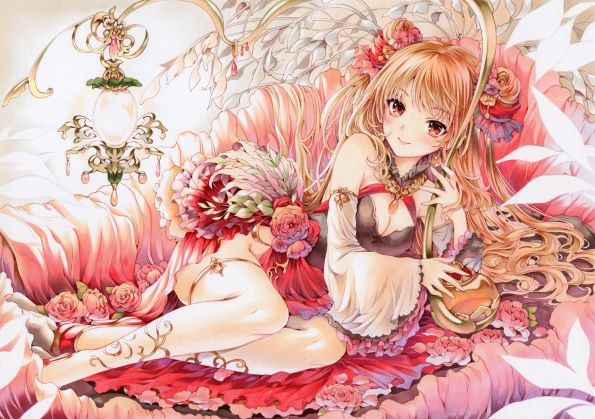
── I see, so you not only get requests about the type of character to draw, but also about things like the color scheme. I get the feeling that you are very conscious of the customer's opinion while creating illustrations for sale.
It's becoming rare to purchase handmade art in this day and age, so those who do are very particular about the piece they receive. But they also clearly tell me their preferences and impressions. Receiving feedback from many people fuels my desire to continue creating. I think that in some ways the fact that my work has a clear price tag attached to it has helped me to grow a lot.
── Which do you think is more important when drawing with Copics: patience or intuition?
When it comes to selecting your colors, definitely intuition. But in order to complete an illustration that accurately expresses what you want it to, I think patience and perseverance are the most crucial in the end. After all, it's impossible to totally capture the image in your mind as perfectly as you pictured it.
── You said that intuition is important for choosing colors, but what kind of things can you do to develop your intuition?
Personally, I make a point of remembering which colors stand out to me during the course of my everyday life. When I feel the scenery is especially beautiful or certain colors really complement each other, I try to quickly jot down my impression along with roughly which shades of Copic markers I think the colors I saw correspond to. Despite this, I don’t have all that much confidence in my ability to choose colors. So when I’m actually working on a piece, I find it’s important to carefully draw tiny test patches to check how the colors work together, and figure out which best match with the image I have in mind.
── That also takes a lot of patience. Do you have any experience with digital art?
I do create a bit of digital art as well, but the computer in my house is so old that once I hit about 5 layers it crashes and I can't continue. (laughs) I actually started out working digitally but found I enjoy hand-drawing better. I like that you have a physical piece of artwork in front of you when you're finished. The intensity of not being able to hit the 'undo' button and the repetitive motions of physically drawing are also enjoyable for me. To add to that, digital art is useful for expressing the image you have in your head exactly as it is, but when you're drawing by hand, you sometimes end up creating something you hadn't expected. As an artist, I enjoy those accidents more than anything.
See all of the other winning illustrations from the "Copic Award 2020" contest here!
Copic Award 2020 marks the 3rd time this contest was held. Unbelievably, 4321 illustrations were submitted by artists from around the world.
Like ym, the other artists also submitted amazing illustrations, so please check them out!
>>Announcement of the Results of the "Copic Award 2020" Contest<<
![[Artist’s Spotlight] An interview with designer and illustrator John Kafka - Where traditional painting meets contemporary fashion](https://i.pximg.net/imgaz/upload/20260810/573420973.jpg)