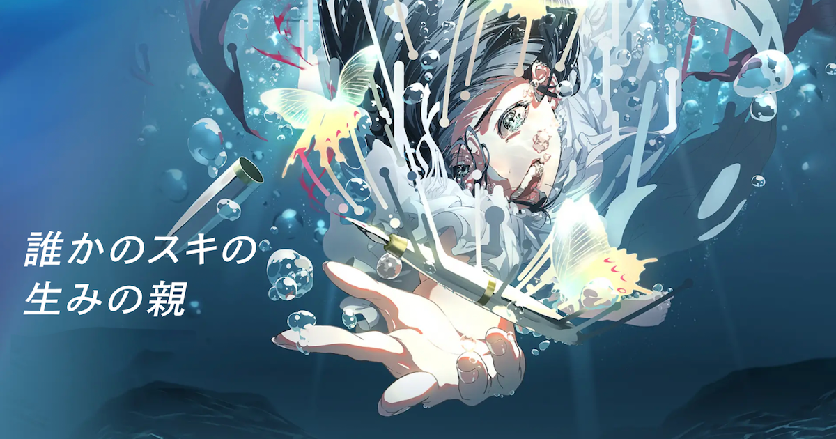
The fundamentals of design according to Y's, the company behind Kemono Friends' design work
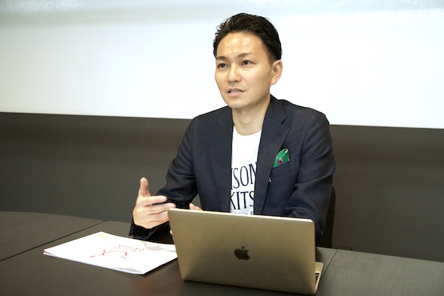
In this two-parts article, we covered what kind of approach it took for Kemono Friends' logo to be born, and how it matched the project's worldview. What's design according to Y's? What kind of education makes the creation of this kind of contents possible? Ryuhei Yoneda spoke to us about these topics and more.
In the second part, we talk about design teaching methods and about the young designers working for the company.
Part 1: As logical as possible. "Design" according to Y's the company behind Kemono Friends logo
■ Everyone can become a designer
For example, there's something that is totally forbidden to say when it comes to design. Can you guess what it is?
"I designed the logo like this just because". "I chose this color just because". If someone mentions the words "just because" when presenting an idea to me, I have them start all over.
If they don't come up with a logical reason, how can I judge their work? And how can the client judge their work? An education about the basic points of design (margins, alignment, fonts, etc) and scolding on praising based on this policy creates productive designers who don't create things just because. The point is to waste less time!
Still, I don't want to be hated (laughs)
■ Be invested in the contents to come up with an image
For example, if we take Kemono Friends, you'll just need to take a look at Serval-chan's illustration to figure out it's an anthropomorphized version of a serval.
After that, by observing the character setting and its animation, you'll have to figure out what her personality is and what she likes. It serves as a base for the design.
Since Kemono Friends is such a colorful and lively title with many energetic characters, it goes without saying that using colors with a low luminance and a low saturation would not be a very good idea.
One part of me wanted to bring the design into my own field and try to receive a positive response from users, but in the end, it's much better to work as if we were designers from the client's company. Using the charm of the title and our own design tricks to make the best work possible.
That's why even once we get our hands on the reference materials, we tend not to propose various designs to the client; instead, we think back to the client's words and find ways to implement those wishes and emotions and implement them. In other words, it's a matter of how much you can pull the ideas that the client or the person who is planning the project brought us.
■ The joy of working with your favorite titles

Aoi Nakamura: Nice to meet you!
Rikiya Ohsawa: Nice to meet you.
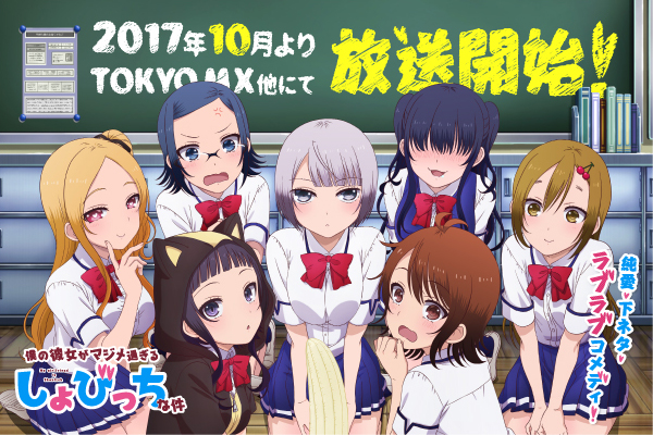
Ohsawa: This is my 3rd year. I've been working on the My Girlfriend is Shobitch website, and from now on I'm gonna be in charge of the advertisement and packaging. Talking about comics, I'm in charge of the binding of Girlish Number Shura and Idol Incidents.
Ohsawa: we always have a target, and I very much agree with Nakamura. Thankfully I'm often part of the target, so I can usually design things that go well together with my tastes.
Ohsawa: I studied design at a vocational school, but they never taught us the proper way to think when designing something. We learned how to use tools such as Illustrator and Photoshop. That's why I hardly knew about design at the time I joined this company.
As for the package design, I also propose a hand-drawn rough illustration of composition as a proposal to the client. When the "charm of character" I thought reaches the fans, I'm happy to have conveyed the right image. I especially love to see how my works are rated on social media.
Ohsawa: I like to stick to fine details. For example, I like adding elements that will make the fans be surprised and think things like "hey, isn't this that one thing which appeared at that one time!?"
So "abstract" keywords such as "fluffy" and "sparkling" are put out, and the concept was devised so that the cuteness of elementary school students depicted by the teacher there would stand out.
Ohsawa: I entered the company one year after Nakamura, so I haven't been working on many titles yet. I'd like to become the art director for a large number of works, and work with the logo design in order to develop a particular title's worldview as I did with Angel's 3Piece!